Table of Contents
It is also known as the CTA (Call to Action), and it is a marketing word intended to elicit a specific action from the reader.
The objective of a CTA is to direct your visitors or readers to take action, such as making a purchase, signing up for a service, providing feedback, or other activities. It’s critical to have a well-crafted call to action because site visitors or your readers may not always understand what you expect them to do on a webpage because there are so many things to do – read more, sign up for a newsletter, request a demo, provide feedback, and so on – that it’s easy to lose track of what you want them to do.
The call to action (CTA) may be found in various places such as newsletters, social media postings, blogs, and videos. Signup pages, buttons, and text lines are examples of how they might be used to collect information.
To their great regret, around 70% of firms do not have a CTA, and a significant proportion of organizations that do have a CTA do not know how to use it. Creating the ideal Call to Action will be discussed in detail in this post.
Let’s get this party started:
Understanding the Psychology of Effective CTA
Understanding the factors that contribute to a highly tempting offer (and why they work) is an essential first step in developing the most compelling call-to-action for almost any use case.
So, what is it that makes a CTA so effective? First, consider some of the complex and fast guidelines for crafting enticing calls to action to get you started.
1. Draw the audience’s attention
For a visitor to be convinced to take action, they must first become aware of the call to action. Make use of a mix of typeface, style, and page positioning to ensure that your CTA button or form stands out from the rest of the content—even during a cursory read of the document.
2. Submit a single, specific request
Your CTA is not the place to engage in high-stakes games of chance. Instead, make it very clear to your readers what you want them to do. Even though there are several methods to employ calls to action, the basic guideline is that they should all be aligned with a single conversion objective at the heart of your campaign.
3. Outline a clear course of action
Use straightforward language to create expectations and inform consumers of precisely what they will get due to clicking. To increase the likelihood that someone will click on your link, make it obvious what the next step is—whether that’s a price page to “compare phone plans,” an account creation form so that they can “start [their] free trial,” or a registration form so that they can “join [your] community.”
4. Inspire readers to take action by clicking
Make use of result-oriented language that is action-oriented. The fundamental strategy is to employ action verbs (such as “get,” “download,” “start,” “reserve,” and “grab”) to generate interest and momentum. You may also experiment with first-person point-of-view (“Give me my offer”), positive affirmations (“Yes, I want to 10X my ROI”), and generating a feeling of urgency (“Only a limited number of units are available. Take advantage of this opportunity now!”).
5. Optimize and test
When crafting calls to action, it’s sometimes beneficial to experiment with a few different alternatives. When it comes to optimizing content, one of the most straightforward things to adjust is the call to action (and even small changes can significantly impact your conversions). Intelligent Traffic uses artificial intelligence to assess your visitors and automatically show the most efficient call-to-action to each individual.
What Role Do CTAs Play in Your Marketing Campaigns?
When you design your landing page or marketing campaign around a single conversion objective, you will get the most outstanding results. In the form of a call to action, the conversion objective is communicated on the page. This might be in the form of a single button (click-through page) or a form with several fields (lead generation).
To effectively use CTAs at various stages of your marketing funnel, you should consider using a variety of different sorts. For example, when writing calls to action for your sales pages, landing pages, and lead generating forms, everything from the campaign aim to audience awareness should be considered.
These are the most typical forms of calls to action that marketers must be able to execute effectively.
- Lead Generation: A call to action for lead generation aids in the identification of potentially viable leads. The suggestion to download gated material, register for a forthcoming event or webinar, or seek a quotation from the sales team are examples of lead generation CTAs urging leads to raise their hands and offer information that helps qualify them for the sales team’s attention.
- CTAs with click-throughs: In many situations, lead nurturing efforts include call-to-action buttons mainly intended to get visitors to click on them. While this might be included in an email campaign, a social media ad, or a landing page, its primary goal is always to increase product awareness (“Get a sneak look at our next release”) and facilitate discovery (“Click to learn more about this wonderful device!”).
- Sales and signups: When placed in the appropriate location at the right time, calls to action have the potential to increase sales and convert leads into customers. That means focusing on prospects who are ready to “purchase now”—for example, those who click through to your sales landing page—and speaking in an action-oriented manner. Of course, there are certain exceptions, such as account creation pages (whether for a trial, paid account, or freemium version of the service) and online shopping carts. Please see this article for more information on how eCommerce businesses utilize landing pages to boost sales.) Take a look at 27 Ecommerce Landing Page Examples to Help You Increase Sales in 2020.
- Click-to-Call Buttons: Rather than requiring prospects to fill out a form or provide contact information, a click-to-call button offers them a direct route to your staff. Furthermore, click-to-call CTAs may be used in conjunction with A/B testing and call monitoring to increase lead generation further. If you want to see an example of how effectively this can work, have a look at how intelligent call tracking assisted one firm in generating 219 percent more leads.
- Social Engagement: Calls to action are used by brands that effectively market their goods and services on social media to increase engagement. Requesting that viewers “follow,” “share,” “like,” “comment,” or “hit the subscribe button,” you may improve your reach, boost your following, and develop connections with prospective clients.
Following that, we’ll look at some of the most common calls to action concepts.
CTA Ideas to Improve Your Conversion Rate
Include your CTA on the landing page
You have an eye-catching call-to-action, but you are dissatisfied with your conversion rate. What is the reason for the low numbers?
Perhaps your call-to-action is tucked away on a landing page with a lengthy navigation menu.
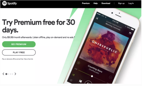
Don’t try to disguise your call to action. Check to verify that it is the very first picture that your buyer sees. Spotify’s landing page has a prominent call-to-action (CTA):
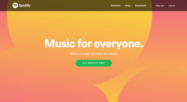
Spotify takes extra care to make the call-to-action (CTA) obvious, tasteful, and straightforward and emphasize it even more by making it green.
Including a call-to-action (CTA) on your landing page may raise conversion rates by as much as 80%. Everyone wants to see their sales and product signups grow. All of it can be yours with one fast remedy.
Keep your CTA simple.
It may seem to be simple for Spotify to keep the call-to-action as straightforward as possible. After all, it only has one thing to sell.
If your company provides various services, it may be tempting to show clients all of their options before allowing them to make a decision.
Make sure you don’t make the same mistake.
To increase conversion rates, you should avoid providing the client with an excessive number of options to choose from. Instead, keep things as basic as possible. In the past, Mozilla allowed complexity to run amuck:
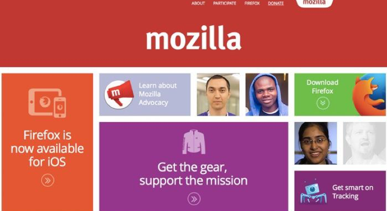
People were most likely sent to Mozilla’s website to download Firefox, not to purchase anything. As a result, it took an excessive amount of time to locate the download button.
Fortunately, Mozilla learned from its mistakes and changed its landing page to be less cumbersome:
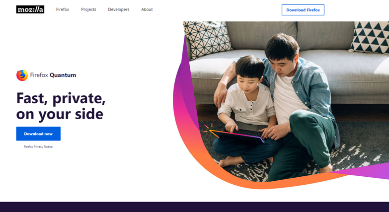
The single call-to-action is prominent, straightforward, and thriving in this instance. Your company should strive to achieve the same results.
Lead generation texts that are actionable
It is for a reason why CTAs are referred to as call-to-actions. You want the user to take immediate action. The goal is to give consumers the impression that you are speaking directly to them. If you don’t, you’ll wind up with a murky call to action:
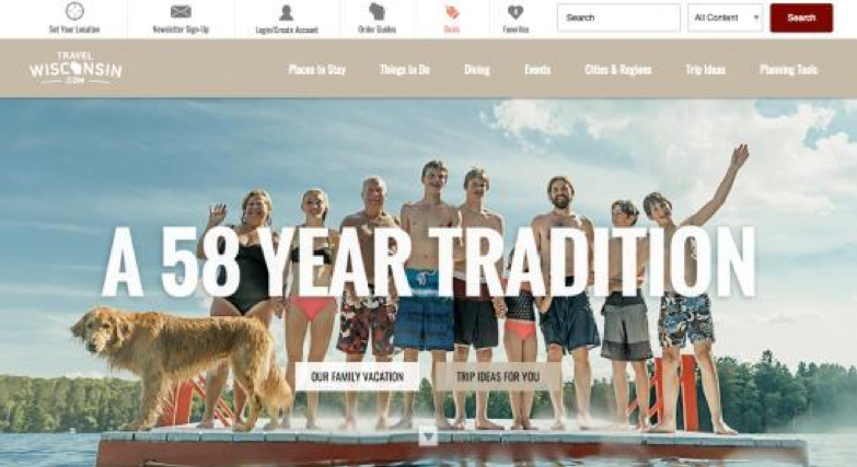
What is the purpose of using “our family vacation” as a call to action? What is the message that this sends to the user? Because it is unclear and does not give clear guidance, it does not deliver much value to buyers in the long run.
Listed below are some possible solutions to these problems:
- First, make use of active language: “purchase immediately,” “click on,” “subscribe to,” and “register now” are all phrases that drive the audience to do a particular action. The use of passive language is discouraged.
- Instill a sense of urgency: Provide a deadline by which action must be taken.
- Make use of powerful words: “get,” “purchase,” “shop,” “try,” “learn,” “create,” “sign up,” and “discover” are all examples of powerful verbs.
Particularly effective is Equinox, which displays how to utilize active language, generate a feeling of urgency, and use powerful words:
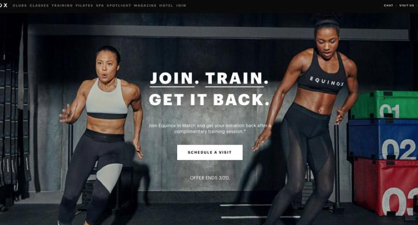
Shoppers may not understand precisely what it means to “get it back,” but the eye-catching picture, the “end of deal” date, and the powerful phrases combine to create a successful piece of advertising.
Businesses should constantly provide compelling reasons for customers to take action.
Make your CTA simple to understand
Simply using vital phrases and a straightforward structure is half the battle of creating a successful call to action that converts visitors into customers.
Following that, you must correctly crystallize your call-to-action statement. Next, examine your CTA and assess whether or not it is obvious. Here’s an illustration:
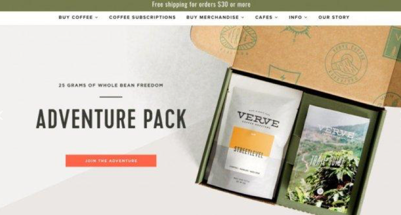
This looks to be an advertisement for a safari at first sight. But, in truth, it all comes down to coffee.
A significant change is being lost right now. The product on offer is coffee, which is a widely used and widely available commodity. Isn’t the phrase “Get Your Brew” more appealing?
Here’s an example of a CTA that is very clear:
It is important to note that the call-to-action uses previously established language and contains a power word and an action verb.
A crystal-clear call to action will eliminate consumer uncertainty while increasing user engagement.
The length of CTAs
When it comes to conversion, the length and substance of CTAs are also essential considerations.
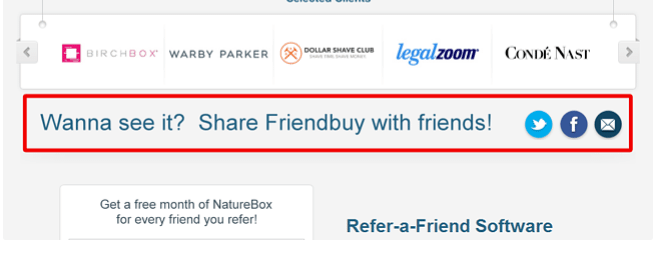
Any link that directs the user to do an action is a link to the content. Therefore, the writing on it should be snappy, concise, and visually appealing. To increase website traffic, Friendbuy uses widgets on the pages of the websites it works with.
They wanted to offer a sample version that was becoming more popular. But, unfortunately, their banner ad was a little too lengthy and difficult to understand.
They had a 1.44 percent CTR (Click-Through-Rate), which was not awful, but their marketers sought a higher conversion rate.
Two new call-to-action variants were deployed as part of an A/B test. The first variation had a click-through rate of 2.47 percent, while the second received a click-through rate of 4.49 percent.
The content of CTAs
The revised CTA-s were shorter and maintained a strong sense of purpose. The second form included the word “demo,” which is a phrase that almost everyone is familiar with.
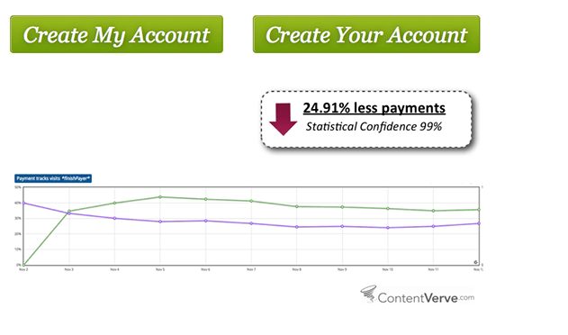
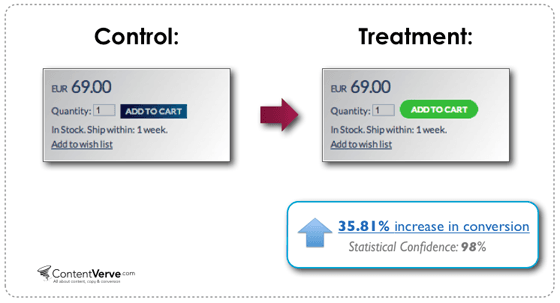
There are subtle differences that might boost – or even wreck – your interest rates. So the marketers at ContentVerve came up with the notion of altering the call-to-action on a payment page.
All they did was alter one word: “Create My Account” was changed to “Create Your Account,” and guess what happened?
The number of conversions on that specific page reduced by almost 25%! The use of a first-person perspective may attract greater attention and generate more clicks.
Despite the failing, this is not a very dismal test outcome. On the contrary, every test is beneficial as long as the findings give you fresh insights, regardless of whether the results support or refute your preconceptions.
Design of CTAs
As previously said, the location, content, and duration of CTA-s are all critical considerations.
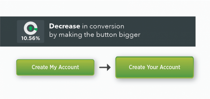
Furthermore, altering the appearance of these buttons might have a significant impact on their functionality.
We discuss everything and anything that comes to mind. Font size, color, forms, and anything in between. As seen in the example below, increasing the button’s size reduced conversion rates by 10.56 percent.
Try to be as logical as possible.
You may think it’s a good idea to have a large number of buttons on your different products—but reconsider.
It is preferable to have fewer buttons and to concentrate on your most essential lead magnets. The fewer call-to-action buttons you have, the more likely viewers will focus on and click on the lead magnet. Wordstream discovered that emails with a single call-to-action boosted clicks by 371 percent and purchases by 1,617 percent when sent to customers.
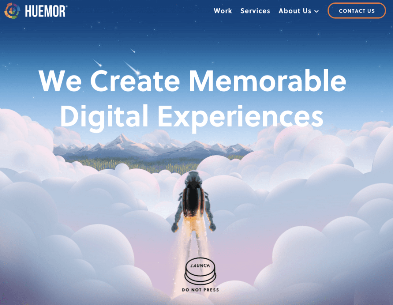
Here’s an illustration from Huemor:
Another suggestion is to make sure that visitors understand precisely what they need to do next and what they will get due to clicking on the link.
In a CTA popup on Blogging.org, readers can see what they will learn if they join the blogging course. These include things like free WordPress installation, training videos, and WordPress themes.

Dummy-test the user experience on your website
A fundamental design guideline is to leave whitespace and avoid cluttering up the visual environment. A substantial amount of whitespace pulls a visitor’s attention and draws them toward call-to-action buttons.
Look no further than Spotify if you’re looking for an illustration of this.
The amount of whitespace and the direct message is significant. Because there are simply a few alternatives available, viewers know what they are being asked to accomplish.
Another recommendation is to use heatmap tools to measure visitor activity and understand click patterns better.
A heatmap visual representation of the amount of activity on a web page that is represented by colors.
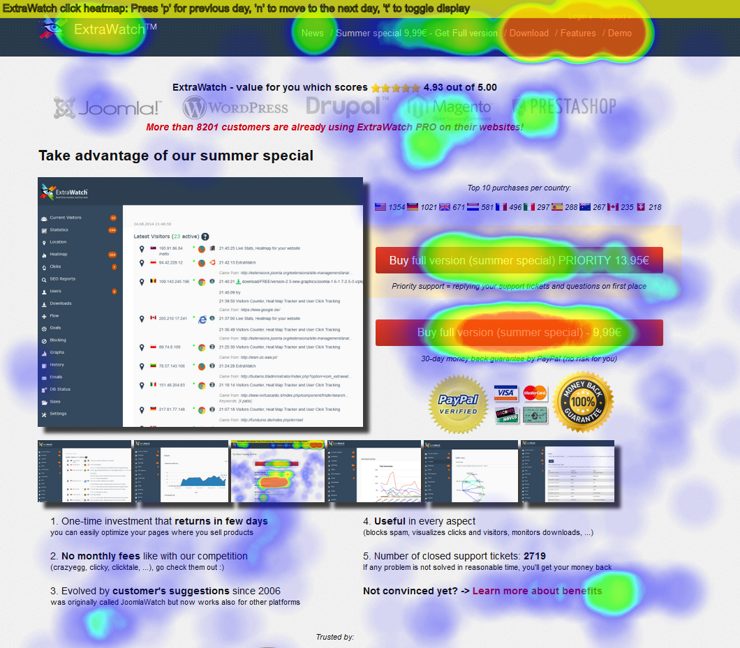
This allows you to identify whether or not there is action on your CTA and whether or not it should be placed in a new area. It also informs you of the parts that visitors misinterpret as links but which are not linked to any URLs in the first place.
Experiment with different CTA Button Shapes and Color Combinations
Finally, the only method to identify which CTA is the most effective for your website and emails is A/B testing and conversion rate optimization trials.
There are various tools available for testing, including Optimizely, VWO, and Adobe Target. You may use whatever device you choose as long as it enables you to test your content, text, design components, button shapes, and color combinations before publishing them.
As you experiment, you’ll discover that modest and easy modifications may have a significant impact on your click-through and conversion rates.
For example, according to ContentVerve’s test, a rounded green button performed far better than a blue rectangle. As a result, you may wish to investigate the implications of altering the design of your controls.
Color differences have also been shown to affect conversion rates.
Exploring color psychology research may help you pick the right colors for your project. For example, it was discovered by QuickSprout that having a red CTA button enhanced conversion rates by 21 percent.
However, you may use any color combination as long as it is eye-catching and does not clash with the primary colors of your brand or backdrop.
Through the use of color wheels, you may choose complementary colors or contrasting colors.
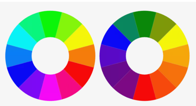
Colors opposed to one another are called complementary colors, such as pink and green or blue and orange. To discover the right colors, you may use tools such as Color Scheme Designer, Button Optimizer, or Canva.
Time Delay CTA Popups
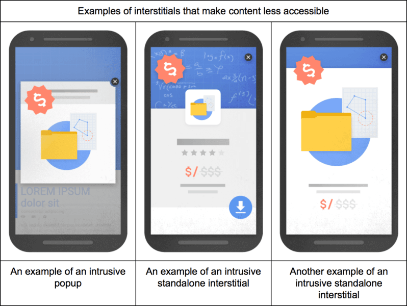
It’s possible that you’ve read some negative things about integrating popups, and you’re not necessarily incorrect. But, likely, you haven’t heard the whole tale.
Those popups that are deemed to be disruptive interstitials are subject to a penalty from Google. Popups that display when a visitor clicks on a Google mobile search result are included in this category. However, it does not cover sites viewed after the first page, nor does it hide delayed CTA popups.
Before providing a popup window, you should enable consumers to scroll down a few times. This provides readers with a significant amount of time to learn about what your site has to offer and choose whether or not they are interested in subscribing or signing up.
As an example, here’s something from OfficeVibe:

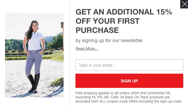
Several eCommerce companies deploy an exit-intent popup that offers discounts and promotions to persuade users to provide their email addresses. Because it’s the final opportunity to get an email, it’s common to feature an enticing offer.
For example, the offer from Horze for a 15 percent discount comes as the user is about to leave the site.
You should also be aware of the differences in CTA sizes between mobile and desktop devices. If the popup takes up the whole page on mobile and the dismiss button is difficult to find, the visitor is almost certain to abandon the website.
Recognize your devices
It’s no secret that creating a compelling call to action is critical to success. However, I strongly advise you to consider tailoring your call-to-action (CTA) to the device that your target audience is using.
Google believes desktop and tablet computers to be the same device since their screen sizes are almost identical. As a result, people use them for search in similar situations on both devices.
An example of this would be a person sitting on the sofa at night who happens to view an advertisement for a product they’re interested in while watching television. The next thing they’ll most likely do is get their laptop or tablet and look for further information on the subject matter.
On the other hand, mobile devices tend to exhibit different user behavior and search intent than desktop and tablet computers, making it wise to modify your call to action depending on the device.
Users who look for anything on their desktop or tablet computer are often still doing research and are not quite ready to make a purchase decision at this time.
Users who search for anything on their mobile phone, on the other hand, are often seeking “immediate satisfaction” or quick results.
Someone may be strolling down the street when they see an advertisement on a moving bus. They could rapidly whip out their phone and search for what they saw before the image fades from their memory.
In addition, rather than visiting a website to accomplish the required activity, their search will most likely end in a phone call to finish the task. Therefore, my recommendation is to build a CTA that is more focused on phone calls for your advertising that run on mobile devices.
It’s a good idea to use phrases like “call immediately to get started” or “call us now for additional information,” which should direct your target audience toward taking the action you want them to do.
It is possible to increase the effectiveness of this strategy in two ways:
- First, the option to specify a mobile preference for your advertisements is provided by Google, which enables you to select particular ads to only display for searches performed on mobile devices. Second, with this option, you can direct your call-to-action on increasing the number of phone calls.
- You may also activate call extensions, which will allow you to display your phone number alongside your advertisements on the site. This option is accessible for all devices, and I highly advise you to make use of it. However, Google automatically alters how your call extensions are presented on mobile searches, so you should know this. A little “Call” button will be displayed instead of your phone number, enabling you to call with only one touch. This is referred to as the “Click-to-Call” feature on Google’s website.
Final Thoughts
What worked for me and the other websites listed above may or may not work for you in the same way. And what didn’t work for them may turn out to be effective for you. So when it comes down to it, you’ll have to test your calls to action to figure out what works best for your audience.
The most important lesson from this blog article is that you should do A/B testing regularly. If you do not make an effort to enhance your conversion rates, they will not improve. So don’t be scared to put your ideas to the test!