Table of Contents
Product description pages on the internet are just as crucial as in-person trial rooms. Eighty-seven percent of buyers believe that the product content is the most significant consideration when selecting whether to purchase an item online since they cannot physically touch, feel, or smell the thing before making a purchase.
It is no longer essential to clutter your product page with unneeded information and striking product images to have a decent product page.
As a result, what constitutes a great product detail page is debatable.
To assist you in answering this issue and efficiently optimizing your product detail page, we’ll be presenting the finest product page examples, along with our thoughts on why we believe they’re so unique, in the following section. Let’s get started!
Glossier
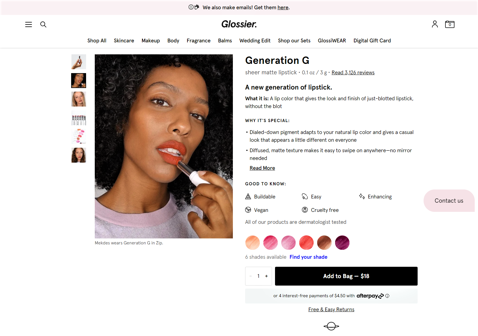
Glossier is an online beauty retailer that provides cosmetics in various hues and for multiple skin tones and kinds. In addition, they offer their matte lipstick on this website, which has an impressive product page.
What makes it great:
- Copy that is clear and concise, such as an email: Keep it as simple as possible when explaining your product. Glossier does not mince words when it comes to providing extensive material. Because the page design successfully sold the goods (in every sense of the word) without overwhelming the customer with information. Glossier, for example, uses collapsible dropdown menus and bullet points to emphasize its value proposition while also providing further information for clients who are interested in the more delicate elements. Generally speaking, it is thorough without detracting visitors’ attention away from the primary purpose of adding items to the bag.
- Customer reassurance: People have a strong desire to follow in the footsteps of others, which is well-known in the retail psychology field. As a result, in addition to the 3000+ positive ratings that serve as social evidence, Glossier goes above and above to provide further client comfort. This is a dermatologist-approved disclaimer that informs consumers that using the product is risk-free in most cases. Create an assurance statement on your product page to encourage prospective buyers to purchase those particular goods. Allow it to alleviate any concerns they may have regarding your goods or service.
- Buyers’ in-store experience: Because this is a cosmetic product, potential customers may be concerned about acquiring the correct shade. Glossier minimizes the need for additional deliberation time by displaying real-life models with various skin tones wearing this hue. Visitors should always get a sense of being in the shop, much like this product page.
AstleyClarke
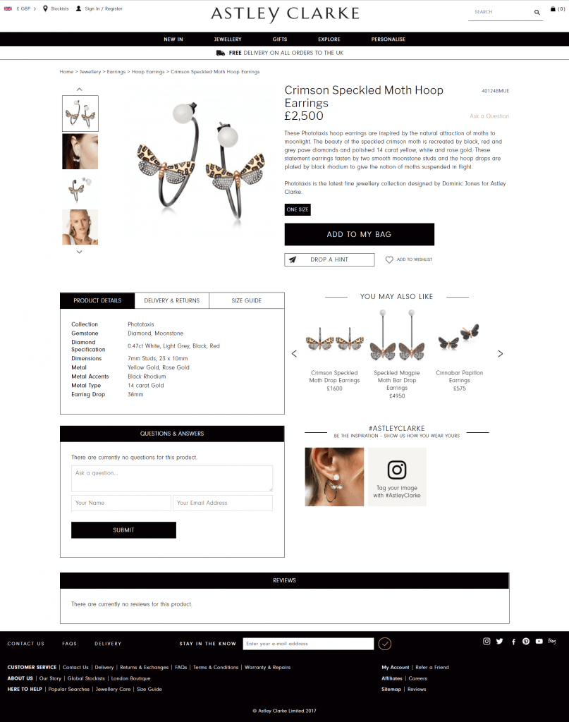
With their signature statement pieces of jewelry, AstleyClarke went over and above to make their product detail page as bold as the brand itself.
What makes it great:
- How to use and narrative the product: AstleyClarke isn’t sticking to the norm for features and design in the product description. All of it is skipped in favor of a narrative that explains how the product came to be. They also provide a short comment on how to effectively use this one-of-a-kind jewelry to assist their clients in getting the most out of it.
It may be worthwhile to consider adding a narrative about the goods on its product page if your stuff is provocative or unusual. - Compact design: On this page, you may discover every product information you need in a single look. AstleyClarke employs prominent borders to divide each page component, allowing for a quick glimpse at each piece. So that you may quickly switch between product specifications, size charts, shipping, and return policy without having to scroll. After clicking it, this avoids the need to browse endlessly to return to the ‘add to bag’ button.
Customers interested in this product detail area will find reviews and inquiries since they are separated easily. The best thing is that, even though it is pretty comprehensive, the design keeps the product page from being crowded. - Building a community: One of the things we enjoy most about this product page is how it discreetly invites you to become a member of its community. To be an inspiration, it asks that you share images of yourself and mention the company on social media. This appeals to the emotional nature of people. A unique technique to develop a network and social proof without being overbearing is to use a social media platform.
Farfetch
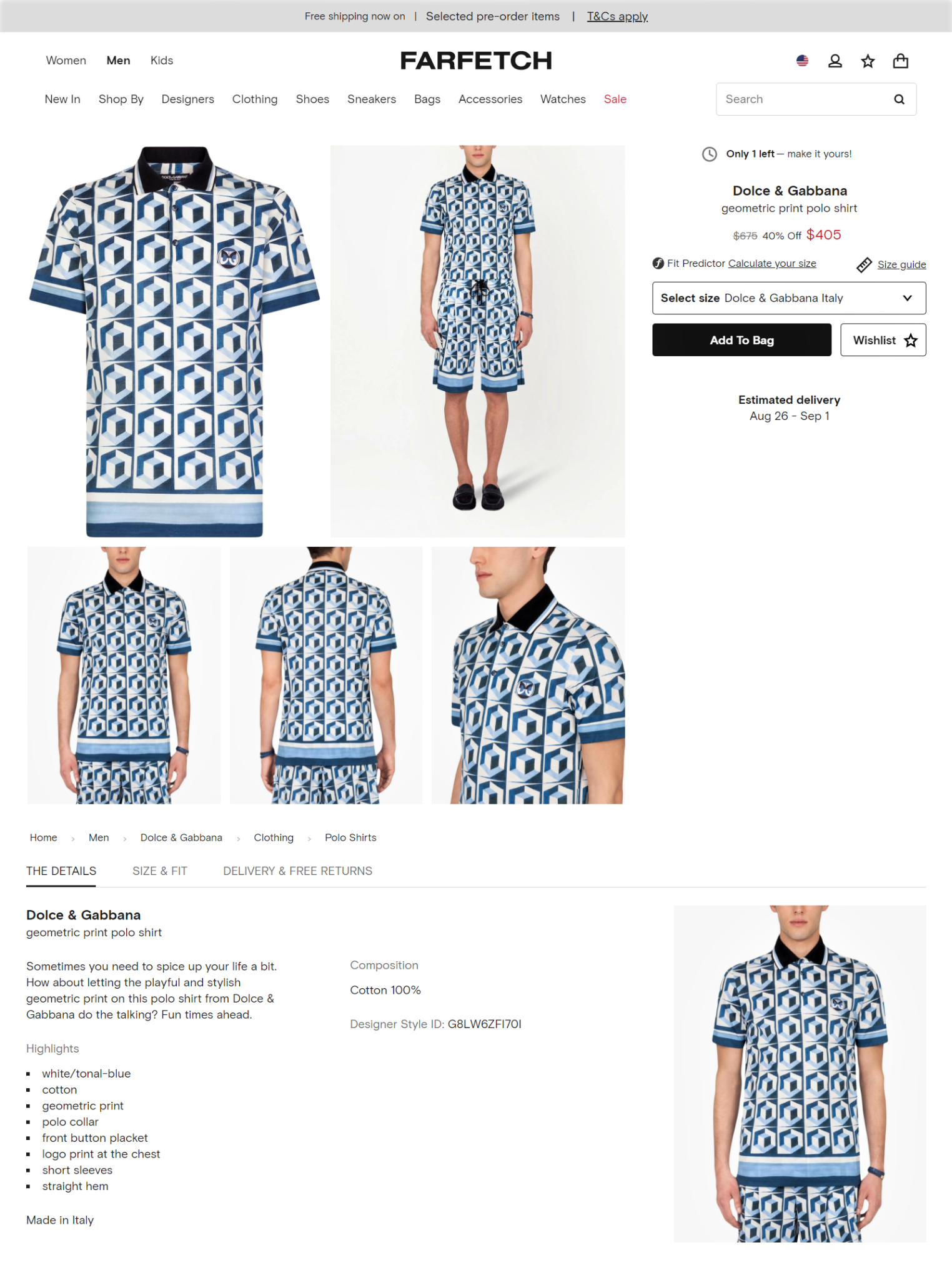
Farfetch provides a designer catalog that contains designs from many designers. In addition, it displays transparency on its product page while gathering information on client browsing habits.
What makes it great:
- Excellent use of the above-the-fold section: Farfetch adopts a straightforward approach by placing all crucial information above the fold on their website and app. They are not attempting to persuade you with a paragraph explaining why the product is so excellent in this part. Instead, rather than offering an attractive price, they introduce the scarcity strategy by displaying to you how many things are still available in their inventory.
They finish it off by making the CTA stand out and placing it just under the discount. The projected delivery date is also not ambiguous since it is expressed in the standard number of days. Instead, they mention precisely when days of the month you should anticipate your order to arrive. - Customer feedback: When a size guide is available, a fit predictor that forecasts your size shouldn’t feel so important to use. Farfetch, on the other hand, asks questions about your prior purchases from different designers to better predict your size in the popup. This is an excellent technique to obtain insight into client buying habits to make future suggestions. It also helps in determining the kind of things that your clients are more likely to purchase.
You should make sure that the product piece you plan to obtain insights genuinely works if you think about doing anything similar. In this instance, the predictor is effective since it provides you with your precise size. - Eliminates endless scrolling: Similar to AstleyClarke, Farfetch employs a toggle and sections to guide buyers through the product’s information rather than scrolling through. In this way, prospective consumers will have an easier time returning the CTA. As a result, you can browse through the product’s specifications, dimensions, and other critical information concerning shipping, returns, and warranty without having to navigate away from the page you’re on.
Buffy
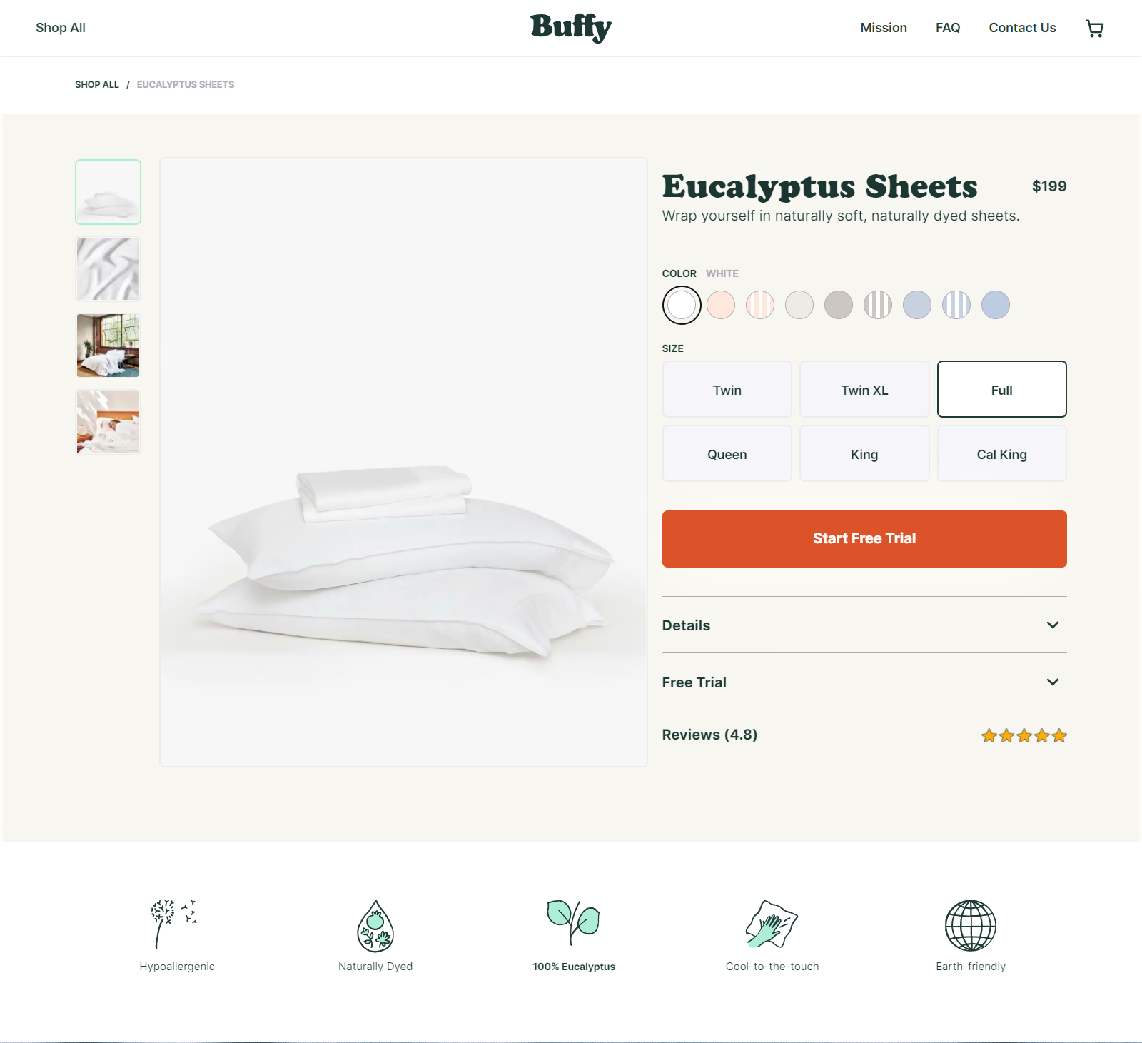
Buffy is dedicated to giving a complete consumer experience, beginning with their product and continuing through the product page.
What makes it great:
- Sensory appeal: As a tactile product, Buffy appeals to all of your senses. In a single word, SOFT, the text captures the whole experience you’ll have with the product and its features. With the color palette, there’s also another in-store experience to enjoy. You may preview what your sheets will look like in real-time by using this feature. In addition, by just being present on this page, you may get a sense of the product’s quality.
- The application of the endowment effect: The endowment effect is a psychological bias that causes people to put a more excellent value on what they already have. Buffy takes advantage of this psychological phenomenon by providing a 7-day free trial period during which you may try out and decide on the sheets. After this period has expired, they will charge you for the item. Customers respond positively to this since they are already enjoying the goods to a great extent. As a result, paying for something they appreciate will not be as stressful as paying for something they don’t understand. It’s an excellent strategy for attracting more first-time clients.
- Design with a caret: Depending on the information you seek, this product page employs a caret to embed extensive text related to each segment. If you wish to read the report, for example, you’ll click on the caret to open the dropdown menu, which will display the measurements, details, and care recommendations. Even though it may not be as successful as using a toggle to reduce page scroll, it is a viable option worth exploring.
Sonos
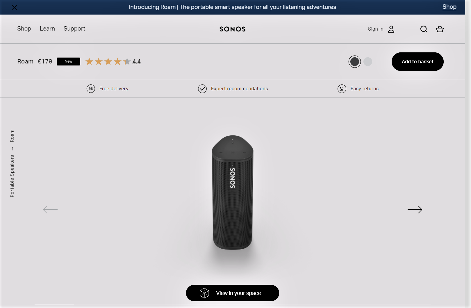
Sonos conveys the tale of its waterproof speaker product page straightforwardly, using unique content and product photography to tell the story of its product.
What makes it great:
- Fonts used strategically: The font size on this page is prioritized to improve scannability. Sonos uses more giant letters to communicate a more significant value offer. All remaining sections of the description are written in a smaller font size to accommodate readers who want to read the whole thing. The copy is fundamental and focuses only on the product’s mobility as one of its key benefits.
- Strategic photos: Unlike other product page photographs, which are just random images of a product, Sonos utilizes each print to create a narrative about the product. Their job is to accentuate each product’s distinct selling proposition strategically. The photographs depict the product being used in various scenarios, which helps to create a mental image that might impact purchasing choices. In addition, the call to action directs you to see this product in Augmented Reality.
ASOS
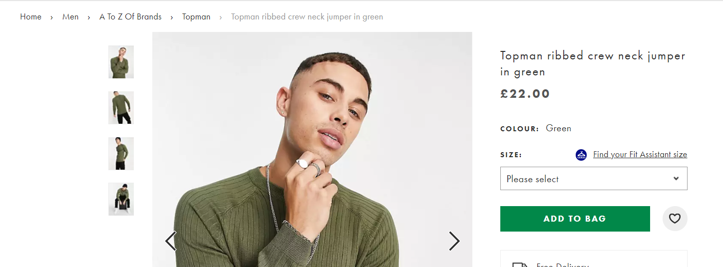
When it comes to eCommerce retailers, ASOS is one of the leaders in the industry, and their product pages do not disappoint.
What makes it great:
- Strategic keyword placement: On this product page, you’ll find a product title that is quite descriptive, such as “Neck jumper in green.” Due to the possibility that many visitors were looking for this exact item in green, this is a good technique. Consequently, since it is a keyword, it is beneficial for SEO on external sites such as Google Search, but it also assists clients in finding their search queries on your website more quickly.
A simple and affordable experiment that you may use to test your pages is described below. - Clean breadcrumb navigation: To assist visitors in navigating to various goods and parts of their website, ASOS has included breadcrumbs throughout all of its product pages. As a result, discovering the roadmap of a product for future site inquiries is much simpler. The breadcrumbs may also be used to return to a prior category if necessary. This is particularly useful if you have a large number of things in stock.
- Being open about their shipping limitations: There may be certain restrictions in place for overseas shipping. Because ASOS is aware of this, most likely due to previous experience, they inform their consumers that there may be specific constraints in delivering these goods. Because of this, there is an additional hyperlink that leads to a dropdown list of countries where the item may be sent.
The customer’s faith in your procedures is strengthened, and the whole customer experience is improved as a result.
Missguided
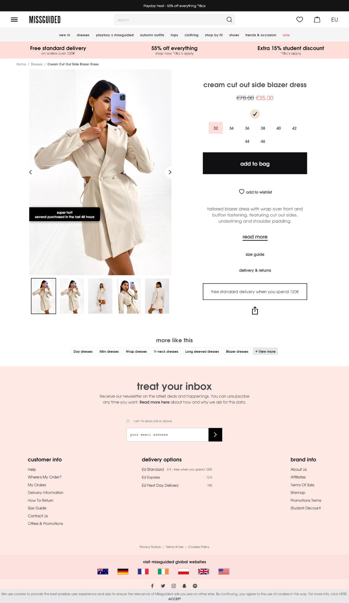
Missguided is an online clothing retailer that specializes in fashion. As a result, they put a lot of work into making sure their above-the-fold content converts as quickly as possible on their product page.
What makes it great:
- Intentional use of the above-the-fold space: First and foremost, the first thing on this website area is an obvious inducement. This generates a feeling of urgency since the bargain is fantastic and pushes shoppers to add that product to their shopping basket. Next, customers may choose from all available sizes on the sizing chart, closely followed by the checkout process itself. Then it concludes with a clear call to action (CTA) that directs you to the next step.
As a result, you’ll notice that this website area targets the most crucial roadblocks to making a purchase. That includes the cost and the sizes that are offered. It is plain, uncomplicated, and intentional. - Consumer section: Due to the many questions a customer may have regarding a product, Missguided offers specific links to every probable query. These frequently asked questions (FAQs) include links to articles explaining how to resolve the issues raised. In addition, the return policy, order tracking information, and contact us button are all included in this section. If you have a complicated product, you should consider developing a customer section.
- Transparent delivery rates: On this product detail page, you will find a clear explanation of all possible delivery choices, as well as an indication of how much each of these alternatives will cost. Customers will benefit from this since they can mentally compute their orders and checkout with a close approximation. As opposed to waiting until consumers have completed the checkout process before learning the shipping and delivery charges, this method is more convenient. It is possible to lower the number of abandoned shopping carts in your business by being open and honest about your shipping charges.
Bang & Olufsen
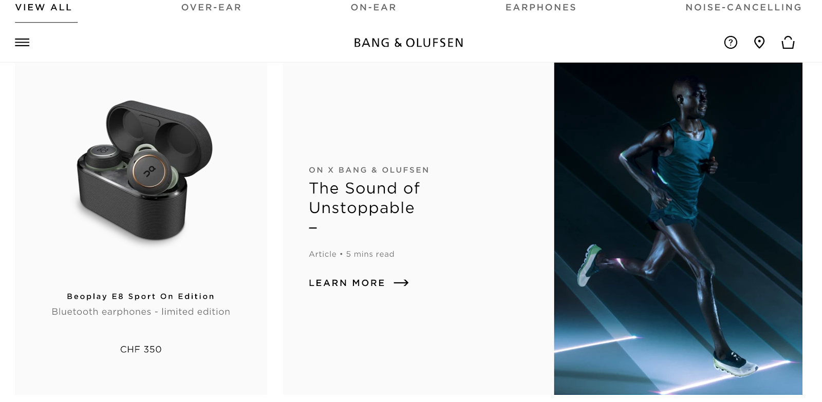
Bang & Olufsen sells its 3-in-1 sound equipment via the use of innovative components on this product page.
What makes it great:
- Horizontal formatting: This is unique and maximizes their simple design by allowing users easy access to all product information.
- Product content: Having an additional piece of material surrounding a product provides more information. This also creates internal linkages to other sections of the webshop, which improves SEO and encourages customer behavior. You may also utilize supplementary long-form material like articles, customer reviews, and, where appropriate, blog entries to give more information on the product without making the PDP overly text-heavy, such as a product demonstration video.
- Behavioral concepts are used: Make use of phrases that influence buying behavior to draw attention to the qualities of your product that influence behavior. For example, B&O uses the identifier “Limited Edition,” but you may use any relevant identification that suits your tone of voice and is appropriate.
Bellroy
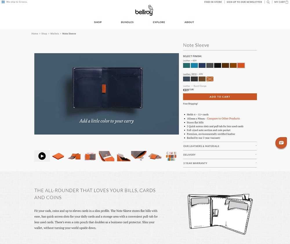
What makes it great:
- Aesthetics: There is a lot of space countered with clean photos of their goods and plain lettering on their website. According to the company, this supplier of handbags and wallets mixes video, photography, and sketch art to create a contemporary and whimsical website.
- User interface and user experience: The best-in-class product page for 2021 Once the website has been loaded, a video showcasing the product will begin to play. Exceptionally creative and highly effective. The site’s usability is straightforward, and they’ve included a lovely massive image of their product at the top of the page, along with their slogan (“Considered carry items to improve your every day”), directly above a link to their online store. It’s the first thing a consumer sees when they walk into your store.
- Innovation: Video and animations entice users to stay longer on the website. This one was a no-brainer for our list of the most significant product pages, and it also contains some of the most acceptable product detail pages we’ve seen so far in our research.
- Speed: GTmetrix gave the page a B (81%) rating for page speed, which is above the average. Page size is 1.27 megabytes.
Sun of a Beach
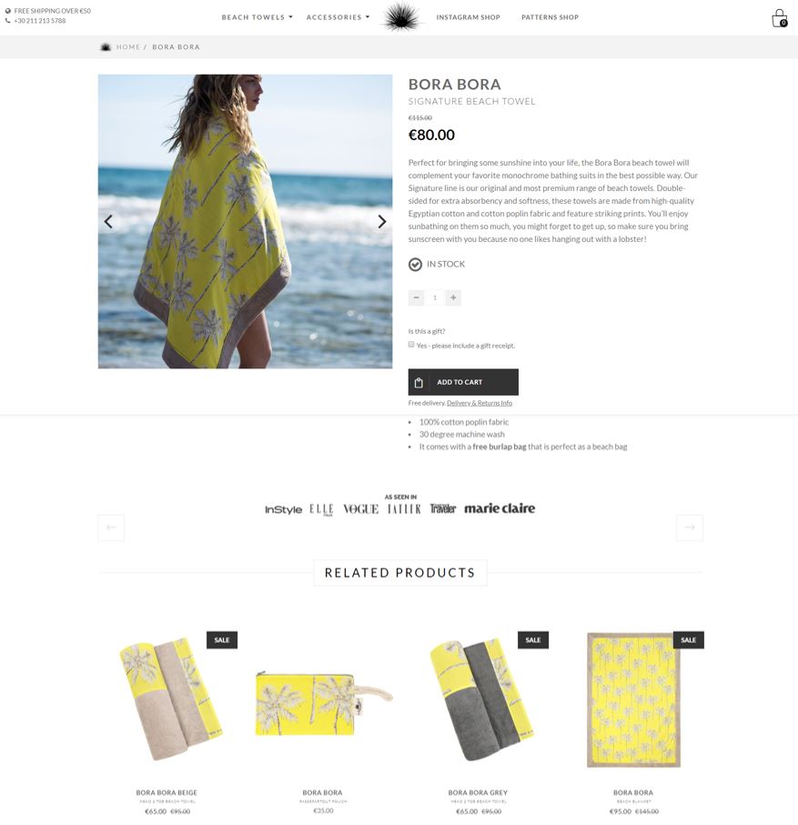
What makes it great:
- Aesthetics: A looping video of a Grecian beach with the company’s colorful towels put out in a pleasant presentation draws the viewer’s attention at the very top of the page. The ‘as seen in’ layer, which appears immediately after the fold, lends a sense of authority to the firm’s name, positioning them as a reputable eCommerce company from the potential buyer’s perspective.
- UI/UX: The website is put up in an Instagram-friendly manner, with hover text on photographs informing users of product names, pattern names, and how they can shop this look,’ among other things.
- Innovation: Sun of a beach also uses ContactPigeon’s all-in-one eCommerce marketing automation package to contact consumers. Companies may utilize the suite for various purposes, including entering and exit popups, behavior-driven product suggestions, and more.
- Speed: E (57% GTmetrix) Page size is 3.3 megabytes.
Forever 21
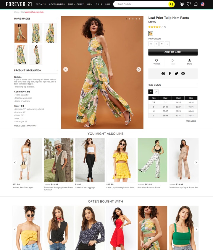
What makes it great:
- Aesthetics: Vibrant colors and typography alert customers to promotions and specials straight immediately. The eye is drawn from one item to the next by using motion graphics and more of the same dramatic colors and fonts seen above the fold and links to popular goods and discounts.
- UX: Forever 21’s interface is intended to make it easier for customers to explore and buy products. The categories are organized in a simple, linear manner according to the kind of apparel. Additional filtering options by size, color, and price range help visitors narrow down their choices from a large assortment of products, saving them valuable time. Instead of visiting the product page, shoppers may mouse over a product to examine it from various perspectives without seeing the product page. In addition, all of the critical information within the product page, from product photographs to descriptions, is presented out in a single page view, reducing the need to scroll down the page significantly.
- Speed: C (77%). Page size is 5.4 megabytes.
Buffy Sheets
What makes it great:
- Size and color selections: Provide enough alternatives for users to pick from on the PDP without causing them to feel overwhelmed by choice.
- Reviews: Include product reviews next to the product picture to capitalize on word-of-mouth Social Proof. More Individuals place more faith in their peers than they do in organizations, so you may increase the attractiveness of your product by displaying the number of people who liked it or at the very least rated it.
- Option for a “risk-free trial”: This makes use of the Endowment Effect, which explains why individuals place a higher value on something that “belongs” to them than something that does not (something that can be achieved simply by touching a product). Providing free trials will provide consumers the opportunity to touch, smell, and see the product in its natural environment, allowing them to feel more connected to it.
Manitobah
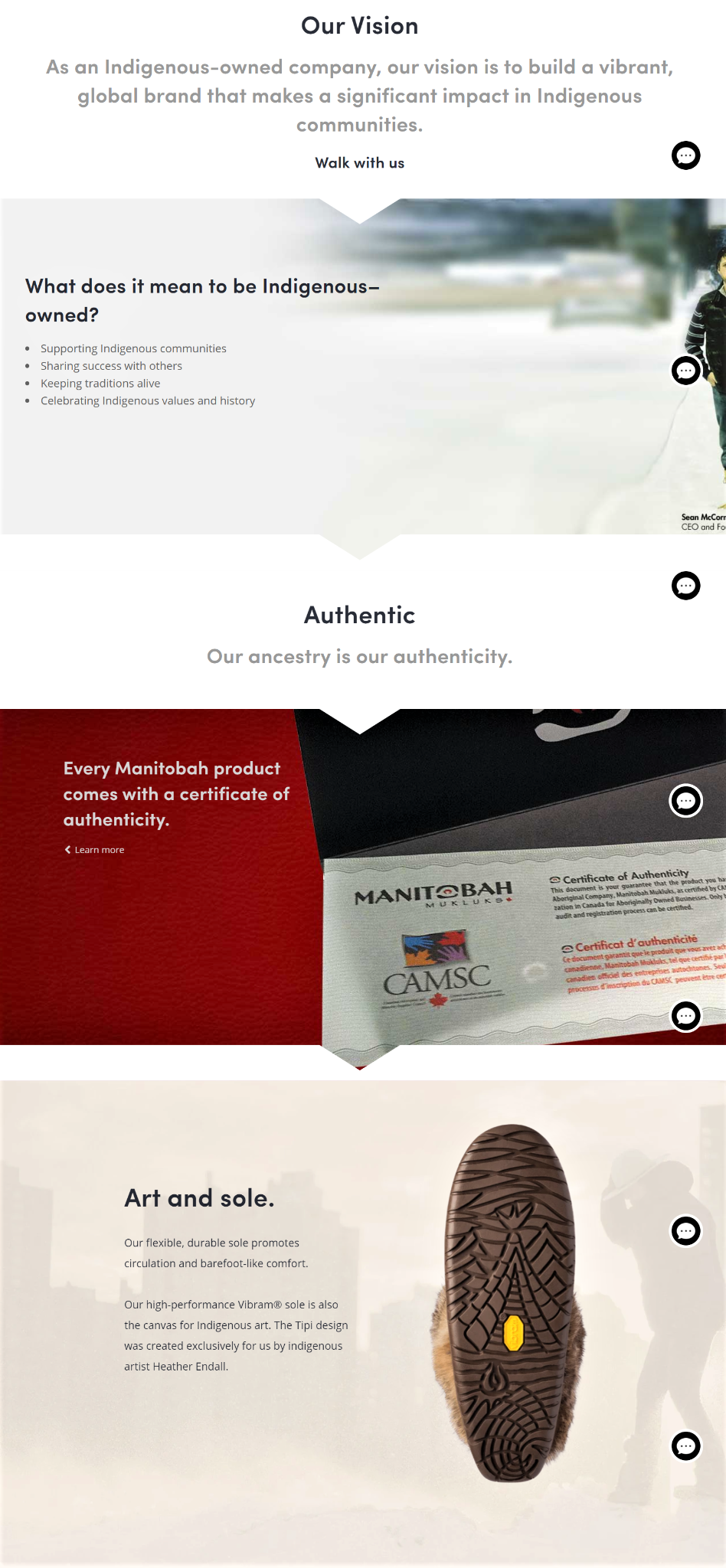
What makes it great:
- PDP recounts a story: According to Manitobah, the deeper down the product description page (PDP), the more the buyer can absorb the tale of the product, from its beginnings to the material used in its manufacture (and all in between).
- Slogans and taglines for businesses: Incorporating your company’s slogan into your PDP can help to underline your company’s ethos and how your items align with it (for example, “International Production. Local Commitment.” or “Art Meets Technology”).
- Product in close-up: Especially useful are close-up photographs of a material that isn’t explicitly specified in your product description, which may be included as an additional piece of information on your product data-sheet. In addition to setting the environment, they display all of the delicate nuances of your merchandise.
Nudie Jeans
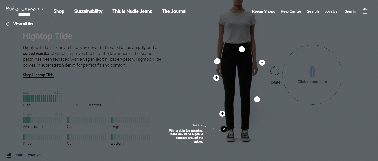
What makes it great:
- Offering a size chart or guide: If you provide a size chart or focus on your PDP, you may set the remainder of their browsing trip to their size default. Customers’ sizes may also be entered by measuring things they already possess, which will make the shopping experience seem more tactile and intimate if they do so.
- Optional defaults: Optional defaults are firm nudges that simplify and customize the customer experience by setting the PDP to a standardized choice connected to the shopper’s data. For example, default options are most typically used to pick a size. In addition, you might utilize default choices on the PDP for items with complicated setups by selecting suitable functionalities for the customer’s needs. This will increase your authority as a brand while also making it easy for your customers to do business with you.
Final Thoughts
That’s all there is to it! Twenty-six of the most impressive Personal Development Programs we’ve seen thus far. We’ve discussed why they’re so unique from the perspective of psychology, as well as some advice on how you might adapt their brilliance to your situation.
In light of this information, it is up to you to start the ball moving and develop your own top product description pages, so get to work!
Product discovery is made more accessible, and conversion rates are increased when you have powerful eCommerce landing pages. However, every merchant understands that it is no longer only about conversions.
Great product pages are the starting point for merchandising that is focused on the consumer. Vital product development programs (PDPs) create brand loyalty while maintaining consumer satisfaction at an all-time high.