You may have great blog material, give fantastic customer service, and have a sizable Instagram following. However, no amount of eCommerce marketing can assist if your product page sucks.
Your product page is what moves customers from the desire to act, and from browsers to purchasers, at the bottom of the eCommerce funnel.
So how do you construct a conversion-optimized product page? Continue reading to learn about the best practices for designing eCommerce product pages, as well as examples to enlighten and inspire you!
Best Practices For Boosting Product Page Conversions
The most significant product pages all have seven characteristics. What distinguishes the finest from the others is how they use and enhance those aspects.
The following are essential practices to follow while creating your product pages. Additionally, we’ve added extra recommendations to help you elevate your product pages to the next level!
Exceptional product photography
Each of your product pages should have a stunning main picture in addition to a gallery of supplementary images. Why? It’s straightforward: photographs sell.
The featured picture is the image that shows on the product category page and when customers share your product listing on social media. In any case, it is the picture that entices visitors to your product page. Therefore, ascertain that this photograph prominently showcases your goods, preferably against a bright backdrop with no shadows.
When surfing eCommerce websites, users like the ability to browse more photographs. It assists in simulating the experience of inspecting a product in a brick-and-mortar shop. Consider extending your picture gallery to include action shots of your product on a model, lifestyle shots, and shots of your product from unusual angles, such as the side or top.
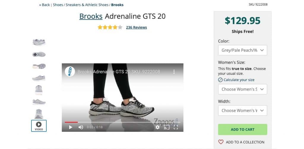
For instance, Zappos displays many images of each shoe they offer and a video of a model walking in the shoes to give consumers a sense of how they feel and look in action.
Pro-tip;
- Make the most of video and interactive media. For example, 64% of buyers purchase as a result of seeing brand videos. Increase sales (and decrease returns) by including product videos, 360° videos, or augmented reality capability that allows buyers to interact with your goods visually.
Maintain critical information above the fold
Apart from the product image, the first thing your visitors should see on the product page are crucial product characteristics such as the product name, price, size, and subscription choices, as well as the CTA button.
Yappy.com, a personalized dog boutique, achieves this very well. All critical information is shown above the fold. “Pick a Color” and “Choose a Size” are their invitations to buyers.
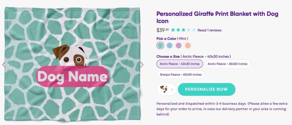
By clicking the “Personalize Now” CTA Button, they are guided through a brief interactive quiz to choose their dog’s breed and name.

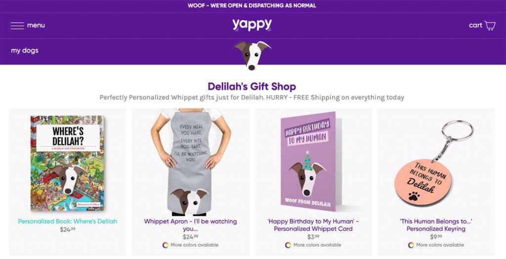
Once consumers finish the quiz, the website is updated to reflect the shopper’s personalization preferences, including product names and images.
Pro-tip;
- Personalize it. Present your size and customization possibilities to buyers as a “choose your own experience.” Invite them to choose alternatives to create the impression that you are making a product just for them.
Inspire action with a compelling call to action
Above-the-fold placement of the CTA, or call-to-action, the button is also recommended. If a customer already knows what they want to purchase, don’t complicate their lives by compelling them to browse.
Additionally, the CTA should be visually emphasized with a distinct color from the rest of the content on the page. Contrasting hues, according to research, perform better.
As for what it should say, the traditional “Add to Cart” is a safe bet. Alternatively, you might build a feeling of urgency using the phrase “Buy Now.”
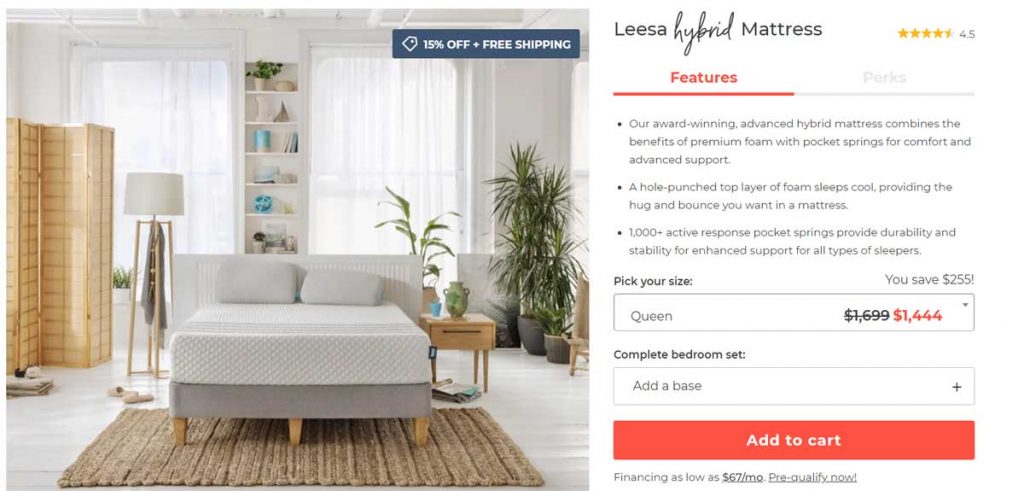
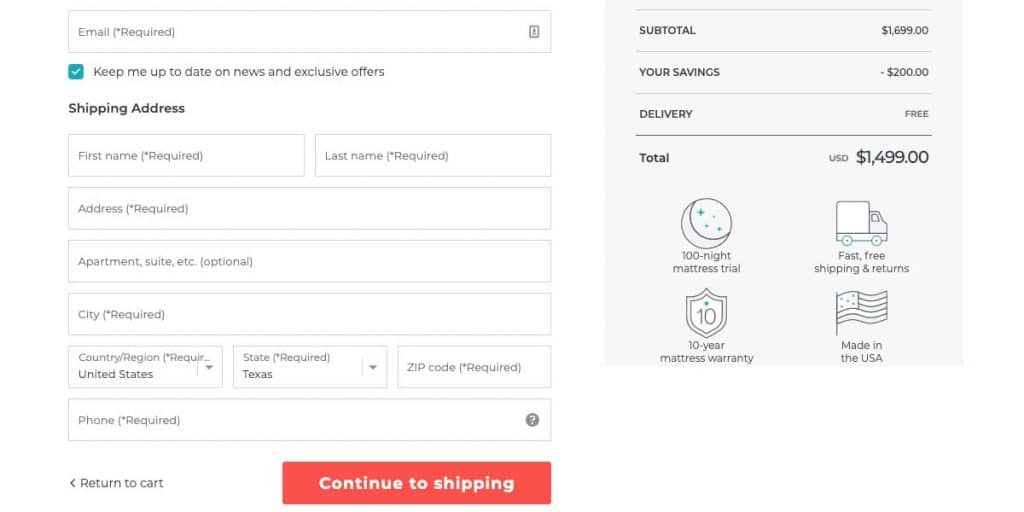
Consider the eCommerce CTA design for mattress brand Leesa. This page has a lot of information, yet the CTA to Shop sticks out owing to its vibrant salmon color:
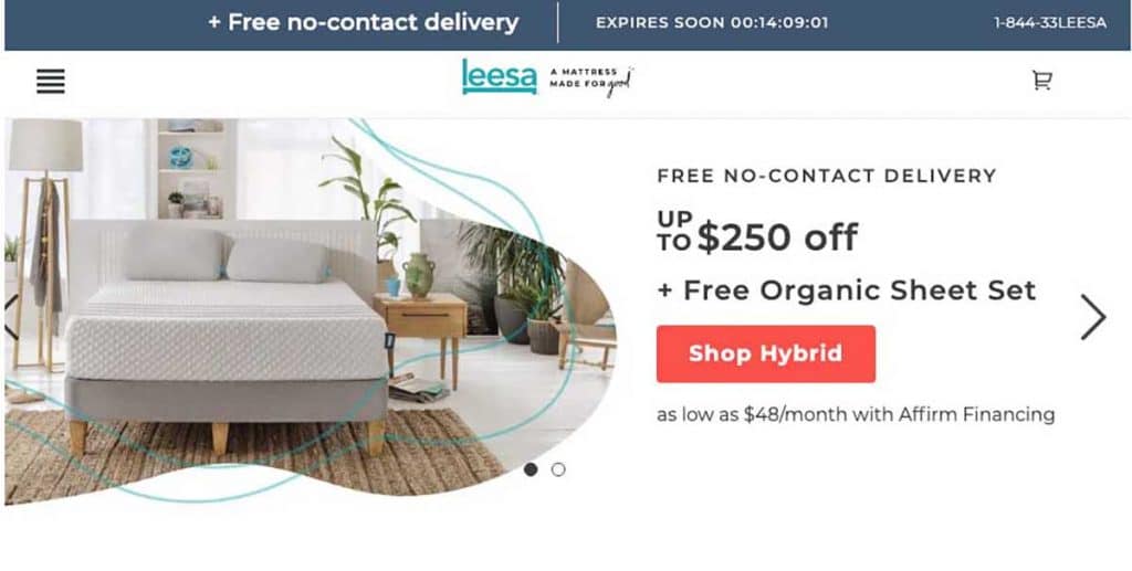
On their product page, they utilize the same color for the CTA:
Additionally, during their checkout process:
Pro-tip;
Consistently use the same design for your eCommerce site’s CTA buttons. This increases the shopper’s familiarity and reduces misunderstanding. For example, your Shop, Purchase, and Checkout buttons should all be comparable in appearance.
Include a one-of-a-kind product description
A simple snapshot with a bit of information may be all you need to convert a customer. However, some consumers may require further details. This is where your product description enters the picture.
This area of your product information page should feature an original description of your product, emphasizing the word original. Optimize your product description to include your page’s desired SEO keywords while still seeming appealing to your customer.
Please speak to your target audience’s demands and include them in the tone of your product description. For instance, the description of a hardware item should sound very different from the description of a fashion item. This is because each shopper has a unique set of requirements.
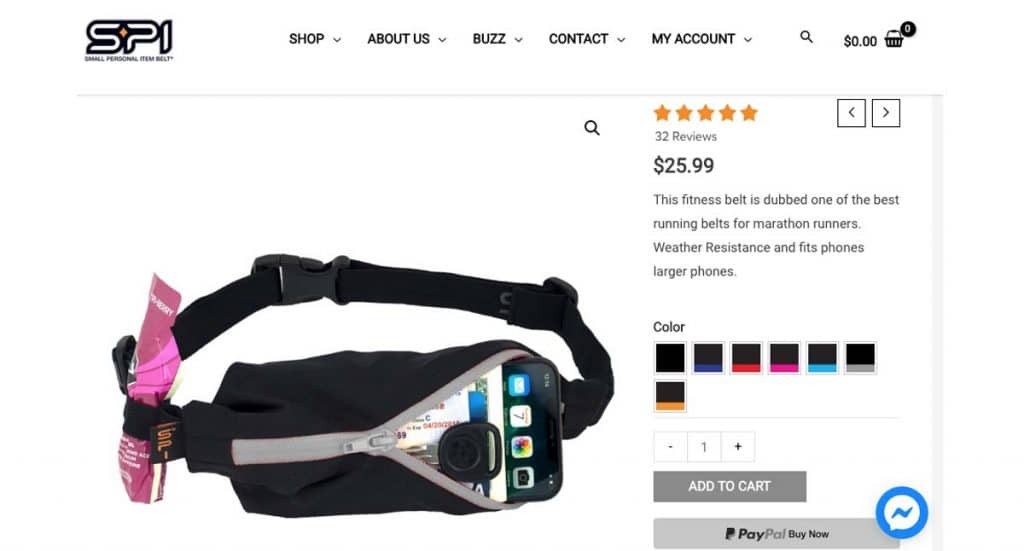
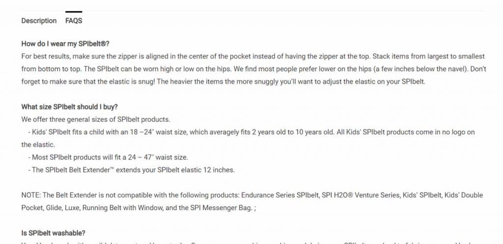
Running add-on SPIBelt’s product description has a three-pronged strategy. First, the above-the-fold material begins with a two-sentence description. This is the product’s USP.
As they scroll down, consumers may see a detailed product description that emphasizes its advantages before listing the features in a bulleted list.
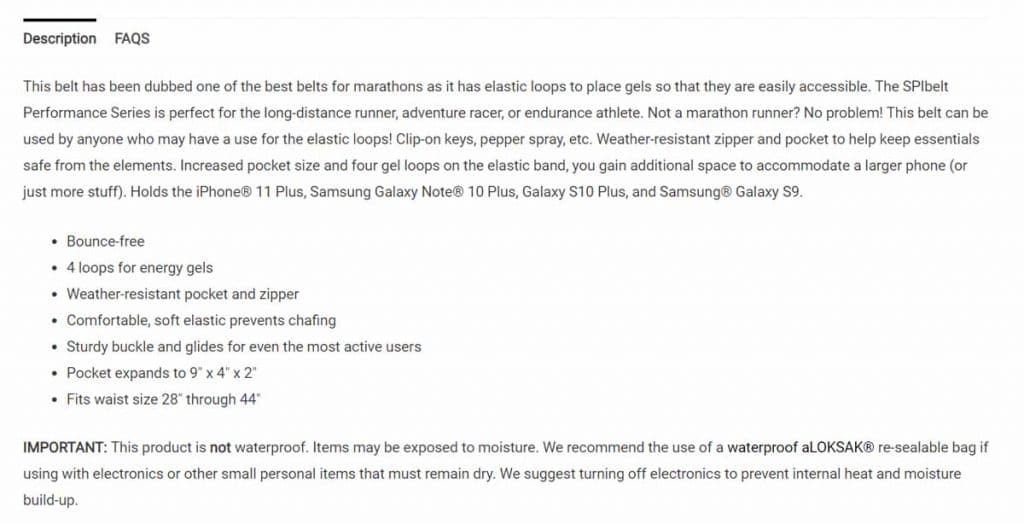
Finally, consumers with any inquiries may go to the FAQ area to get additional information.
Pro-tip;
- Utilize expanding drop-down boxes to display this information. Avoid text overloading the consumer.
- Ensure that you prioritize the benefits above features. Benefits, not features, are what entice customers to purchase. Therefore, inform shoppers of the benefits of the product.
Social proof alleviates reluctance.
Social proof consists of aspects that foster trusts, such as customer ratings, reviews, and social media postings. Ninety-five, for example, percent of customers do an internet search before making a purchase. Customers are more inclined to purchase from an eCommerce site that includes user reviews, and having 50+ reviews for your product may increase your conversion rate by almost 5%.
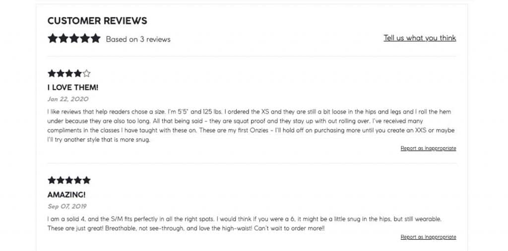
Persuade customers to buy your goods by reading reviews. Seeing photographs of genuine consumers using your product gives them a sense of belonging, further encouraging them to buy.
As yoga brand Onzie does, include feedback and social evidence into the design of your eCommerce product pages. They add a gallery of photographs from Instagram promoting the product just under their branded photo gallery:
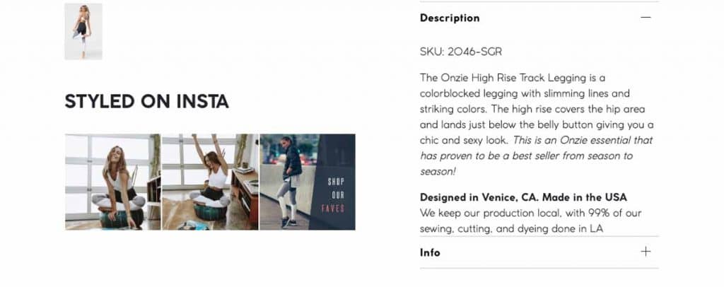
Additionally, they provide consumer reviews farther down the page:
Pro-tip;
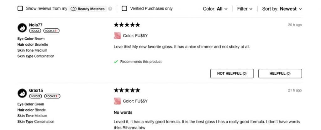
- Request critical information to present a tailored evaluation. When customers post a review on Sephora’s website, the merchant inquires about their hair, eye color, and skin type.
- On the site, shoppers may establish a Beauty profile to enter this information and filter reviews by their Beauty Match to find the most relevant ones.
Assist with FAQs and customer support
Occasionally, individuals need further assistance. Make it simple for customers to locate you by including a plethora of FAQ and customer support alternatives on your eCommerce product page.
Eighty-three percent of customers want customer help to finish their transaction, and many anticipate it immediately. Chatbots may be created to respond to frequently asked questions and free up your team’s time.
Additionally, chatbots may act as personal shoppers, directing visitors to the most appropriate purchases. For example, consider the following excerpt from a Benefit Cosmetics product page:
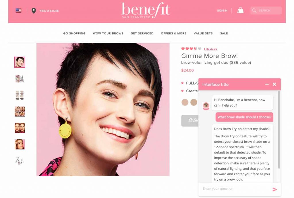
Add a FAQ section to your product description page. This might contain frequently asked questions about how to clean and utilize your product.
Make your shipping and return policies prominent and easy to find. Please include links to them at the top or bottom of your website. If you provide free shipping or returns, make a point of highlighting it with a site-wide banner. On the product page, include a concise summary of the shipping and return procedures.
Always attempt to upsell or cross-sell
Finally, if someone is interested in one product, why not attempt to get them to purchase another?
Cross-selling recommendations should be framed as a technique to boost the shopper’s value from the product that first piqued their interest and to create the impression that you’re serving as their concierge, making bespoke product choices for them to consider.
Upsell and cross-sell ideas should be placed at the bottom of your product description page to avoid detracting from the primary call to action.
For instance, GoPro enables people to discover the best GoPro for them by evaluating three comparable alternatives, starting with the one they picked. In addition, the feature icons would allow customers to compare products quickly.
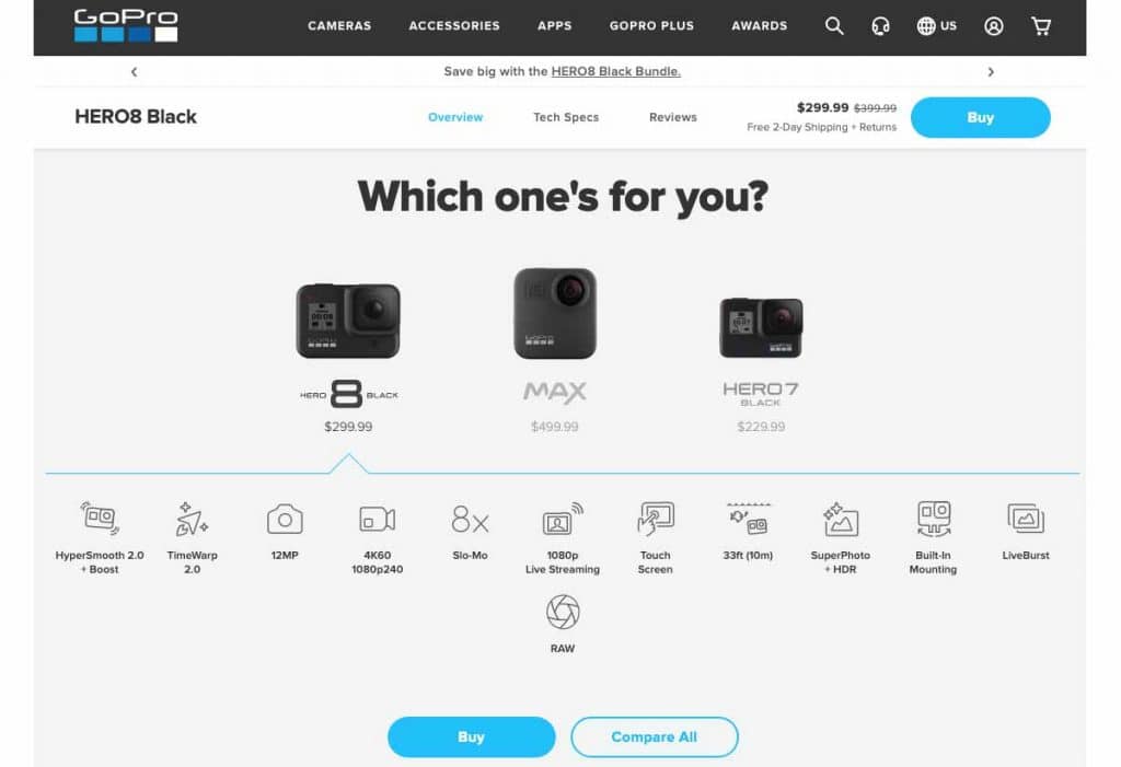
Further down the page, GoPro continues to market by offering protective gear and accessories that complement the current product picked by the shopper:
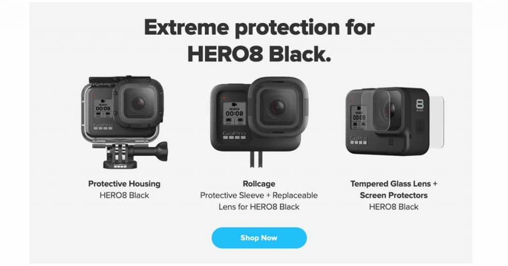
Numerous websites present this as “Customers also watched” in an attempt to capitalize on herd mentality. Others will display “Related Goods” to highlight comparable products, sometimes from the same product line. Additionally, the “You may also like” approach has the most personal feelings.
Pro-tip;
- Capture potential sales. Allow consumers to submit their email addresses to be alerted when the product returns to stock. Similarly, if customers aren’t ready to purchase, they can add items to their wish list.
Integrate trust signals
Earning your visitors’ confidence may significantly enhance conversion rates. This is because prospective clients check for indicators on your website that prove your legitimacy and reputation. These are referred to as trust signals.
Here are a few methods for incorporating trust signals into your website:
Include your business’s address, phone number, and email address
Customers want to know they can contact you with inquiries or complaints.
If you do not have a phone system or are uncomfortable displaying a personal phone number, you may route and trace incoming calls using a service like CallRail. Additionally, customers like seeing an actual address since it proves the existence of a real establishment.
You do not need to provide contact information on every page of your website if your “Contact” page is readily accessible.
Display trust badges
Consumers become fearful of submitting credit card information online after weekly stories of data breaches and stolen personal information.
Any website that requests personal information or credit card numbers from its visitors needs — and expects — to ensure their data security.
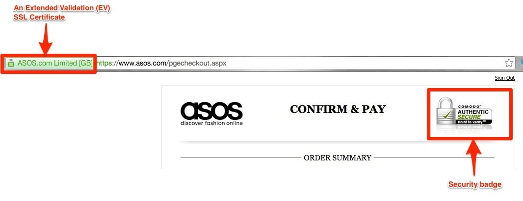
By displaying trust seals on your website, you may bolster its reputation by reassuring clients that your company is authentic and safe transactions. Several credible instances include the following:
- Norton Secure
- McAfee Secure
- PayPal Verified
- Google Trusted Store
- VeriSign
- SSL Certificate
The majority of trust seals cost a few hundred dollars every month, but they may potentially save you thousands of dollars in sales. So the investment is more than worthwhile.
Create legal pages
Ascertain that your website has legal pages, such as a “Privacy Policy” or “Terms and Conditions” page.
While these sites are unlikely to provide massive traffic to your website, they demonstrate that your organization is reputable to potential clients.
Incorporate genuine customer reviews
Customer evaluations rank third in terms of trustworthiness after editorial material, television, and internet advertising. Statista reports:
- 36% of internet users between the ages of 25 and 34 use online reviews to do brand and product research.
- 19% of internet consumers place a higher premium on online customer reviews than on personal referrals.
Social proof (in the form of reviews) is a beautiful technique to demonstrate to visitors that your product is a trustworthy solution that is also valuable to others.
Customers should be able to access both reviews and responses. For example, if a consumer posts a bad review, the following applies:
- Respond swiftly to situations like a person, not a company. This demonstrates that your business values its consumers and takes the time to react to their input.
- Admit your errors and make proper compensation.
- Maintain consistency and fairness.
Employ social media to demonstrate personality
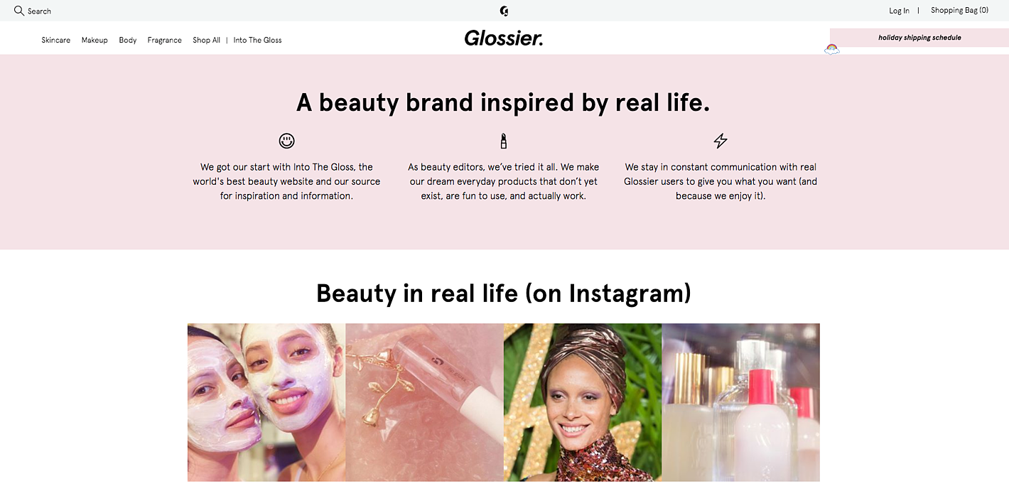
A solid social media presence demonstrates your business’s personality and builds trust with prospects and consumers. By consistently publishing and connecting with followers on your social platforms, you may convert former customers into promoters and skeptics into believers.
Connect your brand’s Instagram account to your homepage or include social sharing buttons into product pages.
Consider using user-generated content.
If you want to see a significant increase in conversion rates, use user-generated content (UGC) on your homepage and product pages.
According to research conducted by Yotpo, visitors who viewed user-generated content on an eCommerce website were 161 percent more likely to convert than those who did not. Consider the graph below to discover how UGC affects conversion rates across a variety of sectors.

Pro-tip;
- Collect and display consumer feedback on your website using eCommerce solutions such as Yotpo.
Optimizing for mobile
Surprisingly, 67% of customers are more inclined to purchase from a mobile-friendly website. Additionally, Google emphasizes mobile in its algorithm.
Both of these points are compelling reasons to improve your product pages for mobile use. They should load quickly, be simple to browse, and have set menus and appropriately positioned graphics. Additionally, you can create an exceptional shopping experience by using prominent photos, detailed product descriptions in tabbed boxes, easy-to-read typefaces, and clear call-to-action buttons.
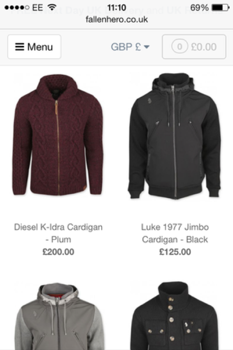
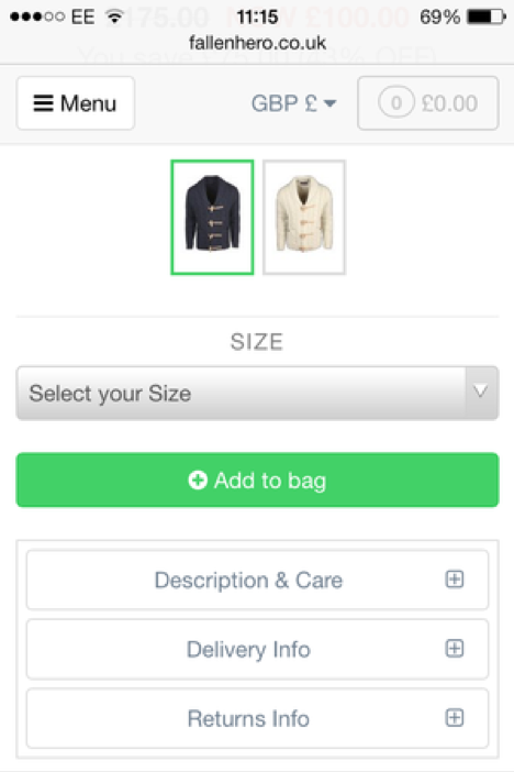
Consider Fallen Hero, a retailer with a mobile-friendly website that contains large photos and well-designed product listings:
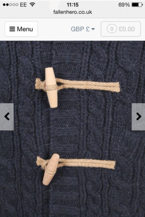
Individual product pages — such as the one below – showcase the item in more depth, with a simple swipe revealing other perspectives.
Then, by scrolling down, you’ll see clear choices for selecting the size and color.
Pro-tip;
- Because people spend less time surfing and reading on their smartphones, photos play more significant importance. Therefore, ensure that your images are accessible and load quickly to provide an enticing mobile purchasing experience.
SEO
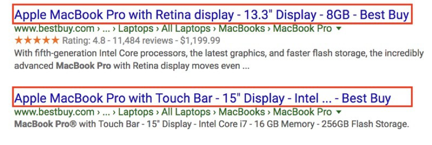
SEO has been shown to increase traffic and leads, making sense when you realize that 44 percent of online purchase begins with a search engine. Therefore, optimize the SEO of your product page by using keywords in the title and body content. Additionally, the title should include common search phrases and should define your product in minor more than 60 characters.
The title in the first example is 60 characters lengthy, which makes it simple to read. However, Google has shortened the title in the second excerpt since it exceeds the restriction.
Begin with searchable product names and attempt to include long-tail keyword words within the product page. Additionally, the URLs should be brief and straightforward, with just enough data.
Ensure that your page information and pictures are optimized – and that the image alt text contains vital descriptive words – to improve your organic ranking.
Pro-tip;
- Additionally, internal connections to similar items and sites aid in ranking. Additionally, creating backlinks to your online business from reputable websites can earn you points with search engines.
- Additionally, you should pick an uncluttered design that loads fast since sluggish page loading may hurt conversions and negatively influence your SEO.
Shipping details
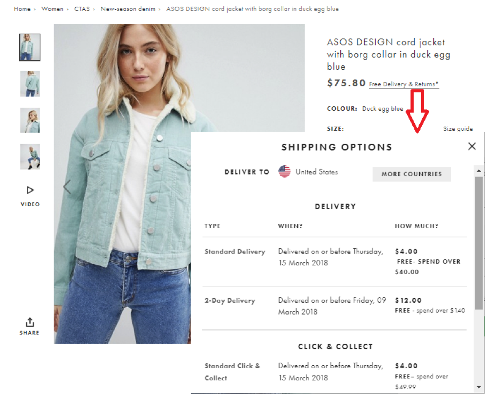
Shipping and handling charges contribute significantly to cart abandonment. Indeed, 25% of customers abandon their carts due to unexpected shopping charges. That is why it is critical to indicate shipping fees on your product page so that buyers are aware of the total cost before making an order.
Copy such as “free delivery on purchases above $50” enables users to assess prices without leaving the website quickly.
Additionally, ASOS has a ‘free delivery & returns’ link that expands to provide shopping alternatives.
Pro-tip;
- Additionally, offering free delivery might motivate shoppers to add additional things to their baskets.
Product videos
Numerous successful eCommerce firms use product videos to increase conversions. They let consumers see a live demo and encourage them to spend longer on the site, improving engagement. Videos may also help you boost your audience by gaining higher search results and indexing via metadata.
Indeed, video increases your chances of ranking on the first page of Google by 53 times. Additionally, it is readily shareable through social media.
The thumbnail is the face of your film, and as such, is critical to increasing views. Additionally, it would help to consider the video’s duration since consumers’ attention spans are limited. Finally, you do not want a high bounce rate to harm your search results.
Pro-tip;
- Consider the following demo video for the Kelty Linger Side Table, which combines a product description and a how-to instruction – all you need to know before purchasing.
Pricing should reflect the product’s worth.
The key to a landing page’s price is demonstrating that your product is worth your customer’s hard-earned money. You may do this by:
- Including former pricing, as well as any sales or markdowns
- If your product or service is less expensive than rivals, including pricing comparisons.
- Providing extra price information, such as monthly payments for consumers who qualify for installment payments.
- You may anchor your pricing by advertising an initial, higher cost that has been reduced for a particular sale or discount.
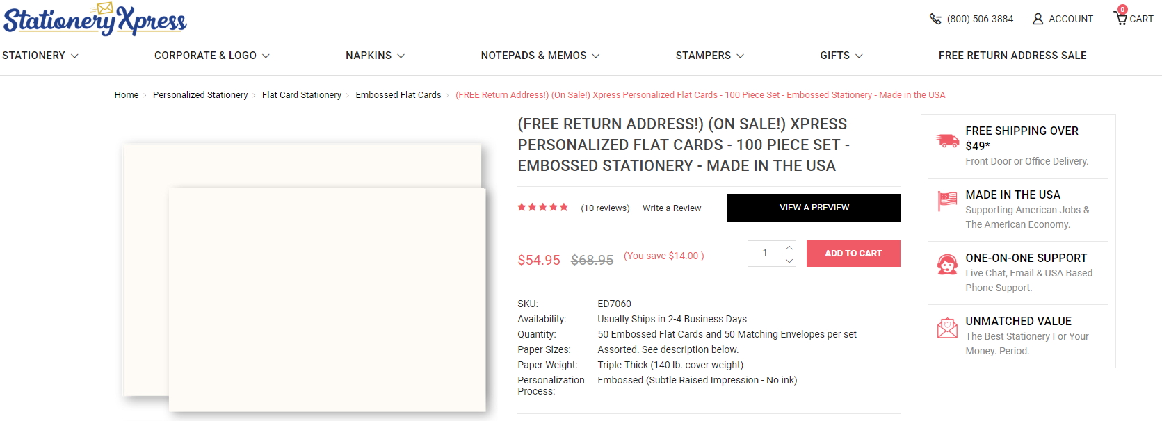
The product page on StationeryXpress uses price anchoring by displaying the manufacturer’s recommended retail price with the lower price the buyer would pay. This strategy works because buyers like having a reference point when determining the worth of an item.
Is the pricing of your product competitive? It is not always necessary to be less expensive than your competitors to differentiate yourself. If your prices are higher than rivals’, sell the following:
- Is the product more abundant in appearance?
- Is it constructed from environmentally friendly materials?
- Are you providing a broader range of services?
- A more robust guarantee?
Pro-tip;
- Be confident in your price and demonstrate to clients how much value they are receiving.
Simplify the decision-making process by comparing alternatives
Excessive choices might work against you in terms of conversions. (A seminal research showed that consumers forced to pick between six types of jam were ten times more likely to purchase than those forced to choose between twenty-four tastes.)
However, do not panic!
If you provide a few similar services, you may assist your visitors in converting by leading them toward the best appropriate selection via option comparisons or price anchoring.
This assists in dispelling confusion in the customer’s mind by outlining the primary advantages of each alternative before directing them to the most relevant item.
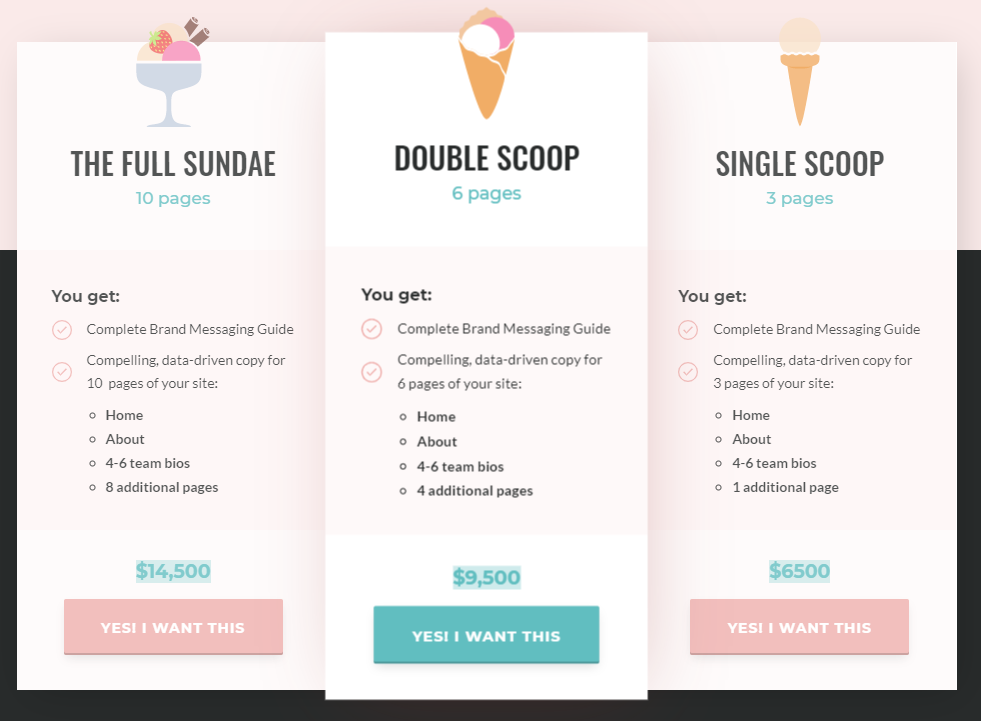
Michal Eisikowitz, for example, assists organizations seeking copywriters by providing three possibilities in this amusing (but informative) comparison. The graphic succinctly highlights her charges and services.
Pro-tip;
- Apply this to your product page by highlighting the most popular upgrades available for the item your buyer is considering.
- They’re likely to choose the one that provides them with the most value for their money, which may also increase your customer lifetime value.
Final Thoughts
By following these methods, you can develop flawless product pages to provide a memorable shopping experience for your clients and increase your sales.
Bear in mind that your product pages should address clients’ concerns and demonstrate the value of your items. By putting a premium on the user experience, you may increase conversions. Additionally, you may utilize analytics to monitor your progress.
