Table of Contents
When sales aren’t improving despite several clients visiting, something is wrong. The eCommerce industry is well aware of the dire consequences of a drop in conversion rates. So let’s first have a clear picture of what conversion rate means.
Understanding Online Store Conversion Rates
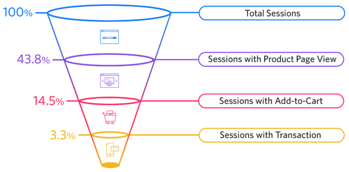
To understand enhancing your CRO, you should first understand how conversion rates are defined (CVR). In the words of Google, “the ratio of transactions to sessions, given as a percentage,” is how they describe e-commerce conversion rates. The following is a common approach to figuring out this ratio:
- [number of transactions] ÷ [number of visitors or sessions] x 100 = CVR
This would have a conversion ratio of 10% if you had one transaction for every ten sessions (or ten users, depending on the metrics you chose to use).
Even though “conversion rate” usually refers to the number of site visitors who turn into customers, you may want them to do additional activities, such as signing up for a newsletter or becoming a member of a loyalty program. After that, you may utilize CVR to see how well specific promotions or sales, UX improvements to your site, or any A/B testing are doing.
This could be a better formula to use:
- [number of goals met] ÷ [number of visitors or sessions] x 100 = CVR
Regardless of your end goal, calculating your conversion rate is more than simply a financial exercise. Examining your site, goods, and brand as a whole, as well as your marketing and customer service, is frequently the focus.
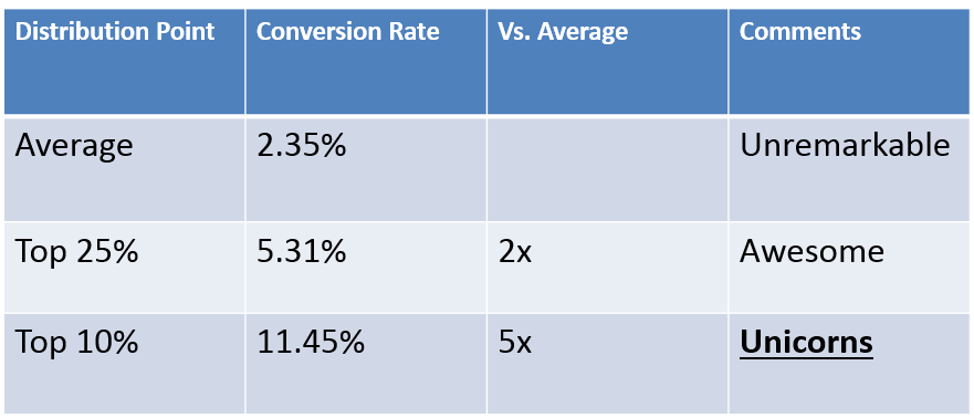
- The average landing page conversion rate was 2.35% based on current eCommerce sector sales figures.
- Ecommerce stores in the top quarter convert at a rate of at least 5.31%.
- To develop landing pages as high as 11.45%, you’ll need to maximize your conversion rate and break into the top 10%.
Why is CRO important for e-commerce?
What are the benefits of doing it? Let’s take a look at a few such scenarios fast.
Increased revenue
Implementing CRO techniques has this as its primary purpose and objective in mind. Sales will rise as a result of your efforts.
If your conversion rates go up by, say, 15%, your sales will go up by that same amount as well.
The deployment of CRO tactics, according to Venturebeat, has an ROI of 223%.
The degree to which your CRO may be enhanced chiefly relies on the technique you select.
If your form has 11 fields and you reduce it to 4, Unbounce says that you may increase your conversion rate by as much as 120%. So a minor adjustment can have a significant impact.
So, it’s safe to say that pop-ups can increase your revenue, especially if you’re using Shopify as your platform.
CRO is cost-effective
To be honest, CRO is one of the most cost-effective growth techniques you have at your disposal.
PPC advertisements, for example, may set you back anywhere from $10 to $40 for every single click. It’s easy to understand math:
If your conversion rate is 2%, you’ll need to get 100 visitors from your PPC advertising to break even.
You’ll spend $1500 to generate 100 website visitors if the average cost of a PPC ad is $15.
You will only be allowed to earn two sales if your conversion rate is 2%.
Is it possible for you to stick to this spending limit?
Hardly.
CRO optimization will help you save a lot of money, and you should be proud of that fact in your annual report.
In addition to these two primary benefits, CRO will assist you in:
- Learn more about your customers – Other things that can help you better understand your target audience and learn what they think about your items include applying various CRO tactics such as eCommerce A/B Testing, Split Testing, and user segmentation.
- CRO will improve your Google ranking — User experience is without a doubt an essential component that Google takes into account when determining website rankings. When your website is easy to use, you’ll earn more sales. Therefore, you should anticipate higher ranks if your website is more user-friendly. In addition, first-page Google rankings often have a click-through rate of above 30%.
Current CRO E-commerce Benchmarks
As previously mentioned, e-commerce websites have an average conversion rate of roughly 2 percent.
E-commerce conversion rates between 2 percent and 3 percent are considered satisfactory. However, there is always room for improvement.
If you’re interested in learning more about CRO marketing, remember that while it’s not prohibitively expensive, it still necessitates some time and effort. CRO accounts for about 5% of the budgets of top converting firms.
CRO, on the other hand, is still a more affordable option.
According to Econsultancy, barely one cent is spent on CRO initiatives for every $92 spent on acquiring consumers.
You can increase your conversion rates by up to 50% if you use digital marketing automation (which we’ll highlight as an excellent CRO technique).
According to Eyeview Digital, you may increase your conversion rate by up to 86% if you incorporate product videos on your sites.
However, no matter what the numbers say, the CRO techniques employed by the three companies listed below clearly have an impact.
A thorough dive into conversion rate optimization awaits you.
Let’s get this ball rolling, shall we?
Easy To Implement E-commerce CRO Tactics
Speed up your e-commerce Website
In terms of user experience, search engine optimization (SEO), and search engine marketing, a fast site is impressive on all counts (SEM). That being said, reducing the time it takes for a website to load is a significant undertaking.
What to do;
- See if any outlier sites get a lot of views yet have long load times by using tools like Google Analytics.
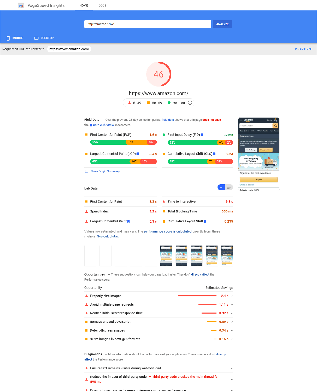
- Check for potential issues with tools like Google PageSpeed Insights.
Pagespeed insights from Google for Amazon.com are displayed on this page.
- Limit the amount of tracking scripts and plugins you use. Again, Pingdom is an excellent tool to see whether any of these variables have an outsized impact on the time it takes for your site to load.
Use a Content Delivery Network (CDN) whenever possible (CDN).
Reduce the time it takes for images to load on mobile devices by using tools like srcset. - There are a few technical procedures involved, but they’ll be well worth it in the end. The number of conversions you may do can be limited by a slow loading time.
- Think of your website’s audience as a lighted match with short attention spans. In addition, they don’t have the same level of commitment to your website as you have. It’s easy to lose a customer if you make them wait for the website to load. As a result, make confident you have a plan in place to address website performance concerns.
Establish Your Unique Selling Proposition (USP)
Talking about how you’re different from the competition might assist e-commerce buyers in making a selection. So make sure that your unique selling point has a prominent place on your web pages.
What to do;
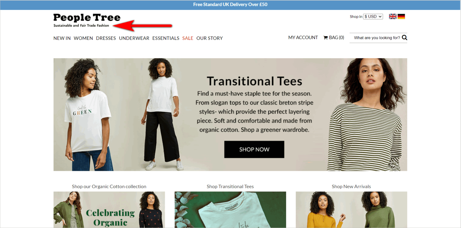
- Use the slogan underneath your logo to explain your difference and make it functional.
If you have them available to present, display certification logos that relate to your unique selling proposition prominently above the fold. - E-commerce websites that employ taglines to set themselves apart from the competition include the following:
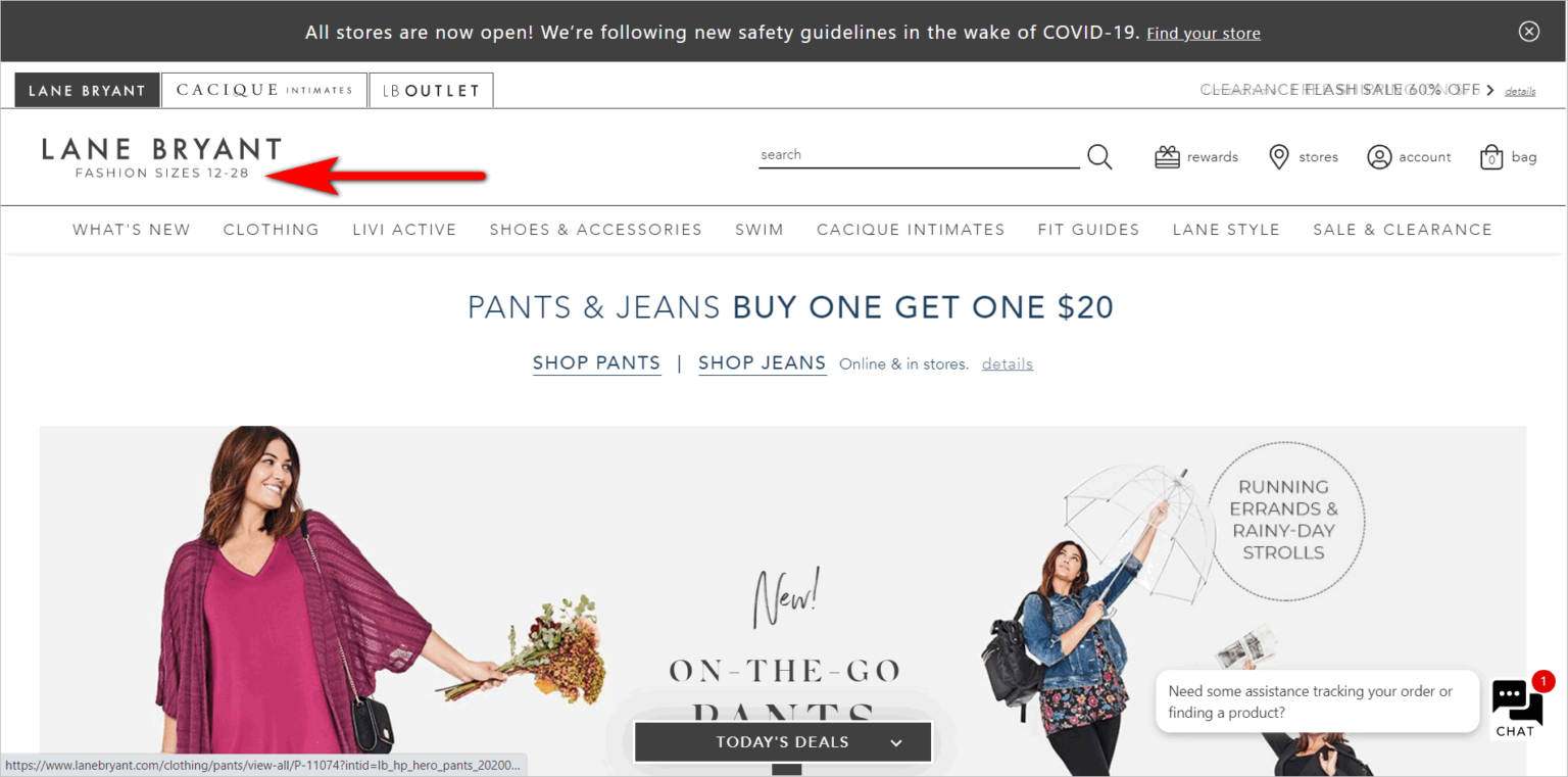
- Your e-commerce conversion rate optimization (CRO) efforts will be substantially aided if customers can easily understand your unique selling proposition (USP).
Increase Trust to Boost E-Commerce Conversions
Consumers will only engage with you if they trust you in e-commerce.
Conversion rate optimization necessitates careful consideration of how visitors will see your site.
What to do;
- Make sure your website has a clean, contemporary design. According to research, most online shoppers rely on gut feelings and immediate impressions when deciding whether or not a website is trustworthy.
- Make sure your phone number is easy to find. As far as feasible, adhere to online norms and display your phone number in the site’s top right corner.
- Display security seals such as VeriSign, Norton, or McAfee’s seals on your website. In sites where users are required to provide their information, add some extra aesthetic impact
- Take advantage of trademarks from well-known organizations that employ your products and services or media references from renowned institutions to “borrow” credibility for your brand.
- Please make sure the logos aren’t too loud to distract from the critical navigational components.
- Building trust and reputation online require time and effort. Therefore, it’s a good idea to be as explicit as possible when using trust factors.
Improve the Security of Your Online Store
Even if you gain a lot of user confidence by using logos from reputable media and well-known clients, the user may be apprehensive of doing business with you if their browser informs them that your site is unsafe. So even if you play your cards perfectly, this will lose you sales.
What to do;
- Make the switch from HTTP to HTTPS if you haven’t already. Make sure you have an excellent redirect strategy in place so that you don’t end up losing visitors and search engine rankings.
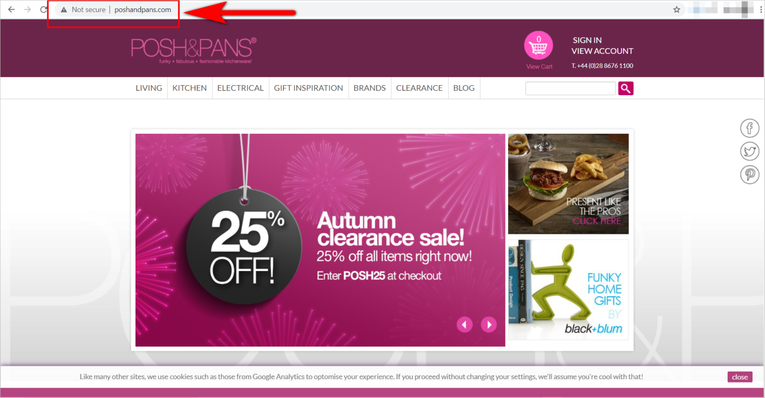
- Regularly update your content management systems and plugins to avoid being vulnerable to security threats.
- Securing the site requires effort, but it increases the likelihood that your e-commerce customers will purchase from your site when they need anything.
Meet the Needs of First-Time Visitors
There are a lot of marketers that just look at the bottom of the sales funnel when creating marketing campaigns. However, focusing just on those customers who are ready to make a purchase might be detrimental to the company’s long-term success. A successful marketing strategy attracts customers from all points along the funnel.
What to do;
- Do not restrict access to early-stage assets by putting them behind a paywall. A well-informed consumer is considerably more inclined to trust and stick with you when it comes time to make a significant purchase.
- Instead of merely presenting a path to visitors at the bottom of the funnel, show the whole customer journey upfront. It’s crucial to show the entire customer journey above the fold the more intricate the buyer’s journey is (i.e., high-ticket conversions).
- You’re more likely to succeed in the long term if your complete sales funnel is healthy rather than merely extracting value from the bottom of the funnel.
Strive for Ease of Navigation
Getting a visitor to the correct page may sound straightforward, but only the most meticulous marketers succeed in doing so successfully. Shoppers want to be able to find what they’re looking for quickly.
What to do;
- Enlarged displays should have more navigation components visible. If your user is using a laptop instead of a smartphone, avoid using the hamburger menu.
- If you can, avoid designing pages with a fake bottom or screens without scrollbars so that users are forced to glance down to see what’s below the fold.
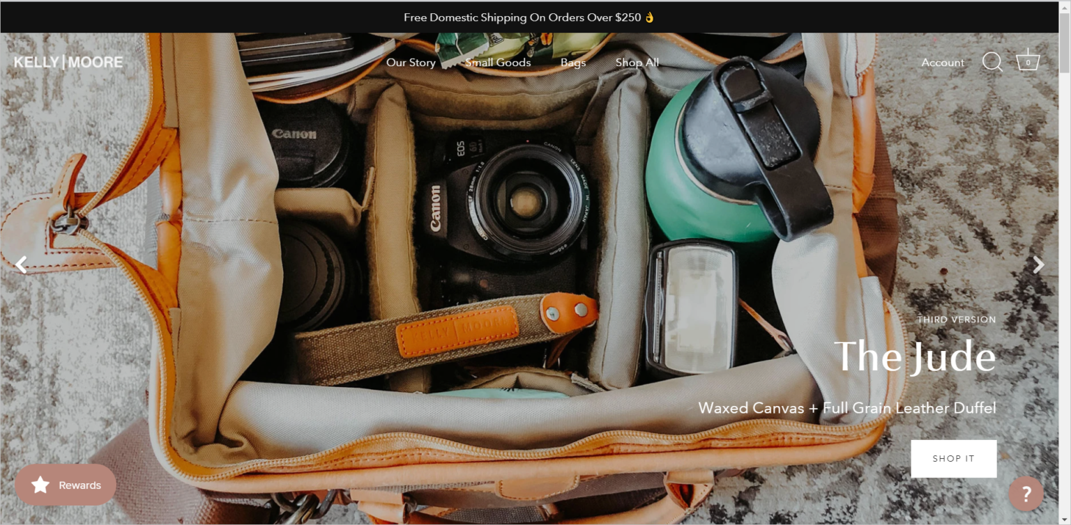
- Provide affordance signifiers to interactive components. For example, buttons and other interactive elements should appear clickable.
- Make sure your navigational labels are crystal clear. When a website visitor clicks on a navigation element, they should know precisely what will happen next.
- Follow the rules of the web. For this reason, consumers spend the majority of their time on other websites, making it easier for them to find and utilize yours.
- Don’t let aesthetics get in the way of usability. Web design trends might be alluring, but don’t let them come at the expense of usability. Your site’s aesthetics won’t matter if your online consumers can’t locate what they’re searching for.
Resolve 404 Errors for Your Customers
Invest some effort in troubleshooting your e-commerce website to see where customers are running into issues. As a result of this, mistakes will inevitably be made in internet advertising. If your site’s visitors run into problems, consider how you might help them get back on track.
What to do;
- Descriptive and unambiguous error messages should be used.
- Analyze your website’s traffic to determine where your visitors are going most often, and then include links to those pages on your 404 error page.
- If your on-site search has been optimized, include a search box on the 404 error page to assist visitors in finding what they’re looking for.
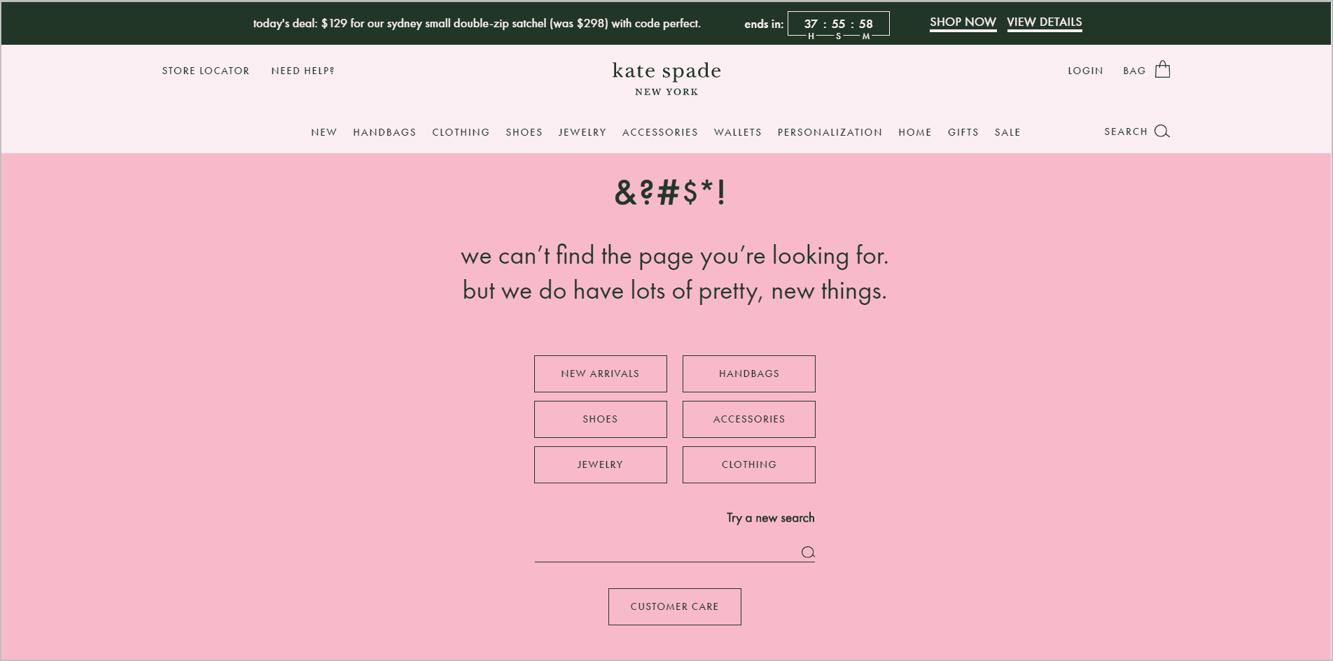
Visitors that get 404 error messages shouldn’t be abandoned. Instead, you should be able to assist some of them in recovering and finding what they want on your site with the appropriate data and minor alterations.
Make E-commerce On-site Search Helpful
Use of your on-site search engine reveals information about the purpose of the visitor. It’s the only way to learn what the site’s users want in their native tongue. On-site search data may be used to improve your entire e-commerce website, or it can be used to improve search results.
What to do;
- Put your search bar in a prominent place where customers are likely to look for it (like the upper-right corner of the page).
- Add curated or highlighted results to the search results for often used terms.
- Assist visitors in finding what they’re looking for by providing sophisticated search choices.
- Boost your search engine rankings using features like “Did you mean…?” and other relevant questions.
- Keep track of what people are searching for by regularly reviewing on-site search analytics data.
- Find out which search keywords and phrases result in problems and failed visits, and fix them.
- When it comes to the daily grind, it’s easy for marketers to forget about search. Stay away from that blunder so you can better assist the visitor in finding what they’re looking for.
Display the Breadth and Depth of your Offerings
Your webpage must answer the question “Am I in the proper place?” as well as the other two.
Showing what’s available to buy quickly and effectively on your e-commerce website will assist customers to recognize that they’ve found the appropriate location straight away. However, this does not imply that you should inundate visitors with a barrage of different items on your home page before they’ve even expressed an interest in your offerings.
What to do;
- Visual navigation features that display your top-level product categories should be used to guide customers across your site.
- Use a composite picture to immediately explain to visitors what they may expect on the category page by showing a composite image.
- Avoid ambiguity by making the categories as different as possible so that visitors know exactly how to go to the product they’re searching for.
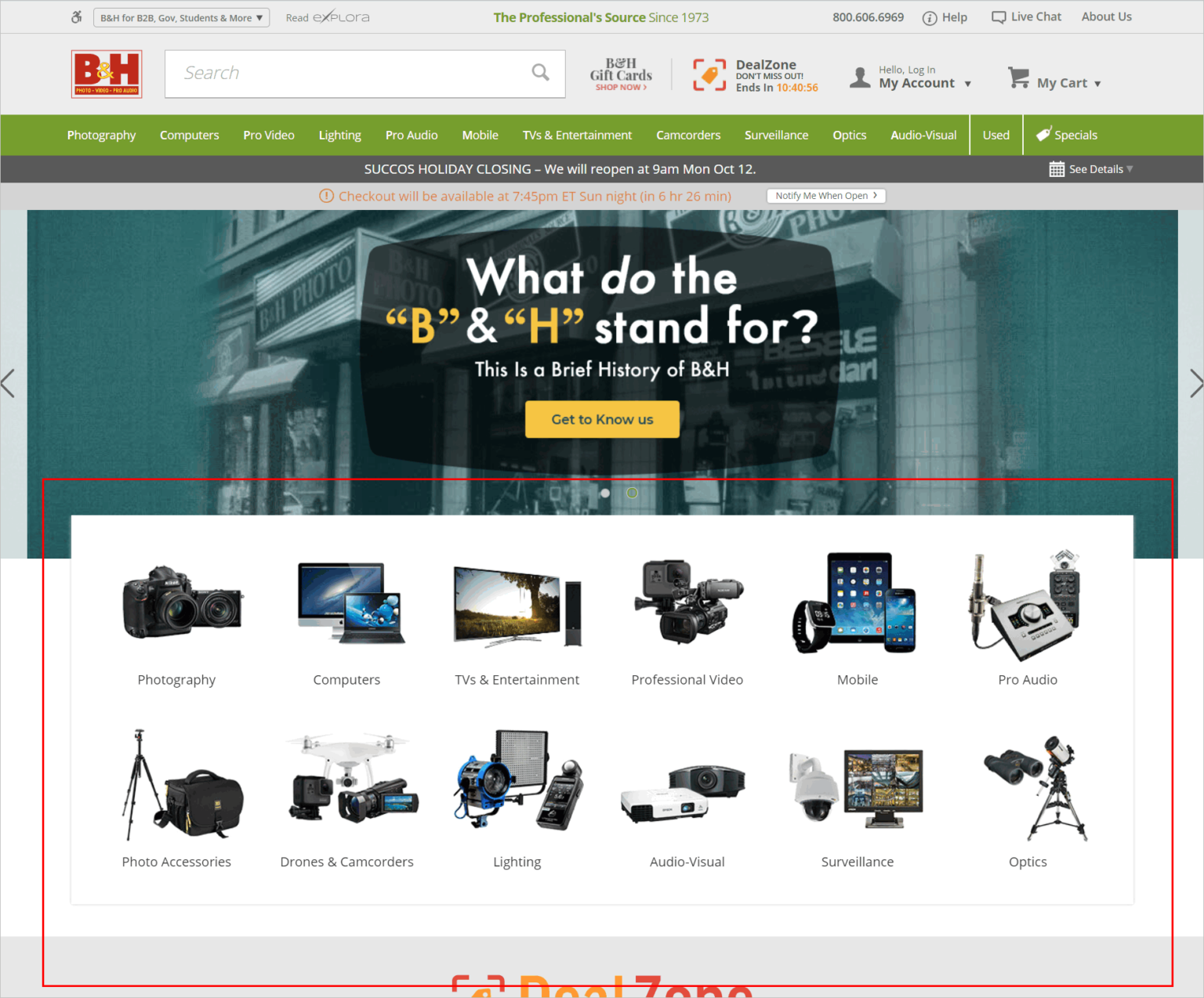
You may want to consider showing the total number of items in a specific category. As a result, the visitor will have immediate faith in your ability to provide what they require. Make sure, however, that this does not result in a user overload.
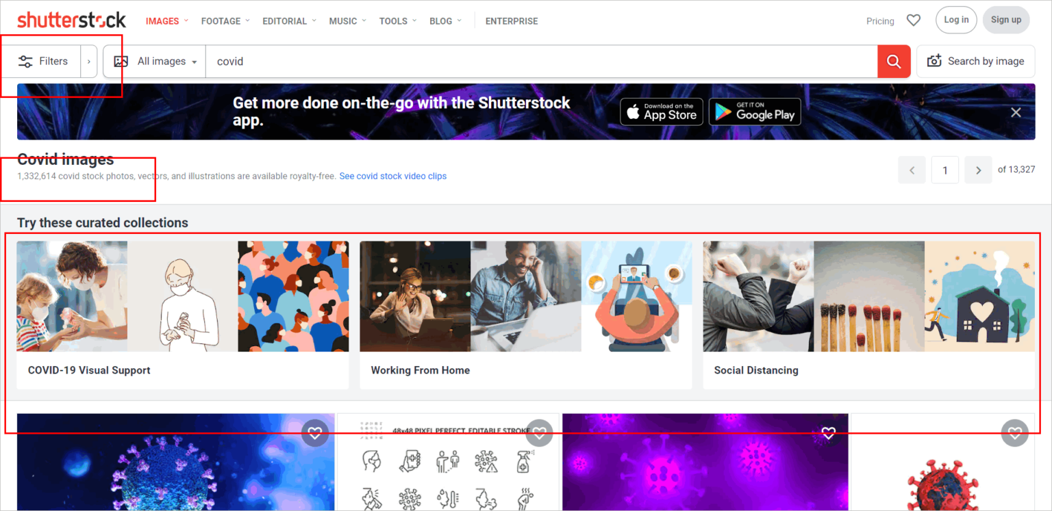
If you want to portray scope and depth, you don’t have to go out of your way. However, for e-commerce sites to immediately reveal their range and depth, the user experience must be appropriately crafted.
Limit Options to Assist Shoppers in Making Decisions
In a TED lecture, author and psychologist Barry Schwartz says that “… the choice is better than no option at all. However, this does not imply that more options are preferable to fewer options.
Too many options can produce decision paralysis in e-commerce, causing the potential buyer to put the task off until later.
There are a few things you can do to assist the visitor to choose a choice more quickly without adding to their cognitive burden.
What to do;
- List a few broad categories to get people thinking. Then, consider optimizing for ease of use rather than reducing the number of clicks needed to reach a product page. Instead of broad and shallow, go narrow and deep – five painless clicks will always defeat three unpleasant ones.
- Make sure that visitors can smell “information fragrance” before they enter. Visitors’ expectations should be met after a single click if your categories are kept to a minimum.
- Make a point of emphasizing the differences in your products so that customers know what sets you apart from the competition.
- Use visual cues to sway consumers toward your preferred selection. For example, the size, callouts, color contrast, and display order may all be used to alter the visual focus.
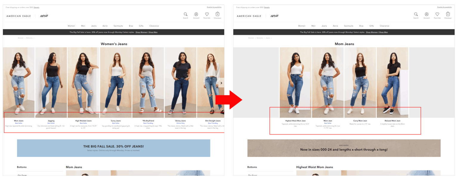
- Making choices is mentally taxing. So instead, use your information architecture and web design to display options thoughtfully.
Consciously Utilize Product Images
A physical store’s ability to give customers a tangible experience has long set it apart from online competitors. Clothes, for example, are more challenging to sell online since customers cannot try them on.
Using product photos carefully might help ease customers’ concerns that their expectations of the goods won’t match reality.
What to do;
- The imagery of the model should be complemented by customer-provided visual information. Pictures of the goods taken by genuine people are more trustworthy than those shot professionally.
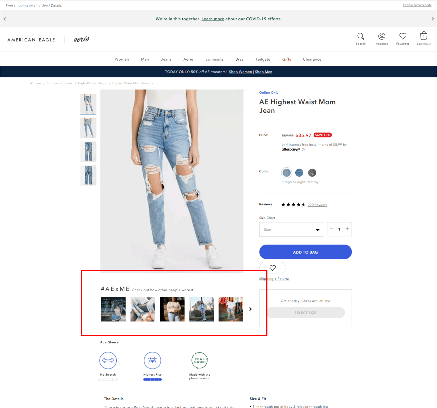
- Draw attention to the product’s unique selling point. The product picture should illustrate what makes a product stand out from others by selling comparable products.
- Display the item under various conditions. Allow customers to see how the product will seem in real life. For example, in the case of furniture, presenting the object in context helps customers visualize how it will appear in their own homes. If you’re good at it, you could use augmented reality (AR) to achieve this.
- Provide reassurance to customers who are worried that their expectations of the goods may fall short of what is delivered. When it comes to e-commerce conversion rate optimization, using product photos strategically can assist.
Persuasive Calls to Action
Make sure your visitors know what they need to accomplish on a page for them to go on. One of the most important measures is to have a prominent call-to-action (CTA) button on your website. This necessitates some research and planning.
What to do;
- Have a single, prominent call-to-action button on your page if at all possible. Create a visual hierarchy if you have more than two key buttons (e.g., using ghost buttons for secondary CTAs).
- Before conducting a split or multivariate test, follow basic principles for online usability.
- Determine if a split or multivariate testing is more effective.
- Choose a color for your CTA that stands out from the rest of the site’s design.
- Shape – Try using rounded edges to grab people’s interest.
- Test the button’s size to see how big you can make it without making the design appear amateur.
- Instead of being ambiguous and cute, make the CTA button labels clear and direct. Then, clicking on the button should result in users knowing exactly what they’re getting.
- Pay close attention to the button’s context. For example, make your call to action (CTA) more appealing by including scarcity and social proof concepts.
Use the Scarcity Principle on Your E-commerce Site
Loss has a psychological impact of around two times that of acquiring something.
The fear of suffering a setback is a powerful motivation. Or, to put it another way, scarcity improves the perceived worth of a product from customers’ viewpoint if you have it. Of course, the scarcity concept isn’t always necessary, but you should become proficient at identifying situations where it might provide you with a boost in conversion.
What to do;
- Consider using the “number of stock items left” to entice customers to buy now rather than wait.
- Show the expiration dates of the promotion together with a countdown timer to encourage potential procrastinators to act sooner rather than later.
- If you apply scarcity to the correct product lines, it can help you shift the needle. Scarcity is a situational weapon.
Make use of Social Proof/Client Testimonials.
Humans are sociable beings by nature. When we’re unsure about something, we often turn to what others have done in a similar position before us.
That’s why e-commerce customer evaluations are so effective in fostering buyer confidence in the sites that host them. In addition, reviews give potential customers valuable information that they may use to make more informed purchase choices.
What to do;
- Consider placing rating and review buttons at the top of your page.
- Negative reviews should not be ignored.
- Provide a way for reviewers to provide input (e.g., some form of “Was this review helpful?
- Enhance visual information that the consumer has supplied.
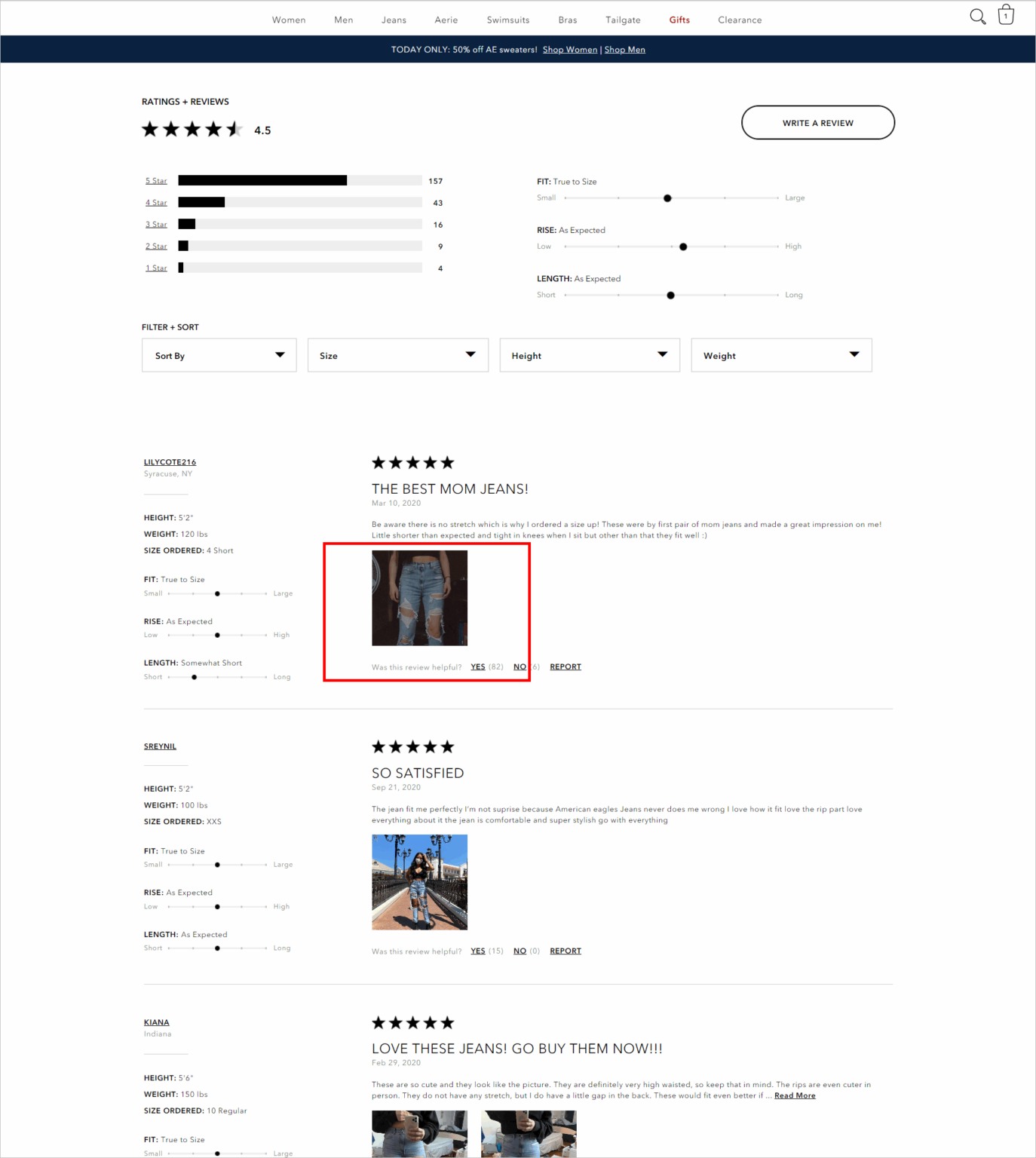
- Calculate and display pertinent averages. However, unless you have a large number of reviews, you should not show average ratings.
- Instead of displaying no reviews, use the “Be the first to review” option.
- Collect feedback by utilizing techniques such as post-purchase emails or review incentives.
- Collect feedback from your customers.
- Several hazards might occur while writing reviews. However, you’ll still want to bring your A-game and get reviews perfect if the conversion improvements are substantial.
Refine Your Price Display on Your E-Commerce Website
Specific deals can be made or broken based on how your pricing points are displayed. E-commerce conversion rate optimization may be aided by managing pricing displays.
What to do;
- Just use numbers instead of the currency sign
- Remove any unnecessary characters from the text (e.g., 100 instead of 100.00).
- Decrease the page’s price prominence.
- Put a lower price in a non-essential place.
- The first digit should be changed (e.g., 499 instead of 500).
- If you can, omit the total number (e.g., 99 instead of 100).
- If it’s a subscription, divide the cost in half (e.g., ten a month, instead of 120 a year)
- Save money by pooling your resources.
- In decreasing the order of price, display the options.
- To make alternative options more enticing, try including a less popular option first.
Strategically Provide E-commerce Discounts
Discounts may be a godsend when it comes to sales, but they should only be used sparingly. If a company relies too much on discounts, it sets off a downward spiral. On the other hand, if you teach your clients to wait for discounts, it will be more difficult for your website’s conversion rate in the long run.
On the other hand, discounts may be an effective e-commerce conversion rate optimization technique if used correctly.
What to do;
- Don’t frequently provide discounts. Be cautious of offering discounts unless you have a compelling reason to do so (such as getting new visitors into the sales funnel or building a connection with existing clients).
- Show off your offers in a way that will appeal to customers. For example, for purchases under $100, the discount should be shown as a % instead of a dollar amount.
- Make sure the coupon box isn’t overly noticeable.
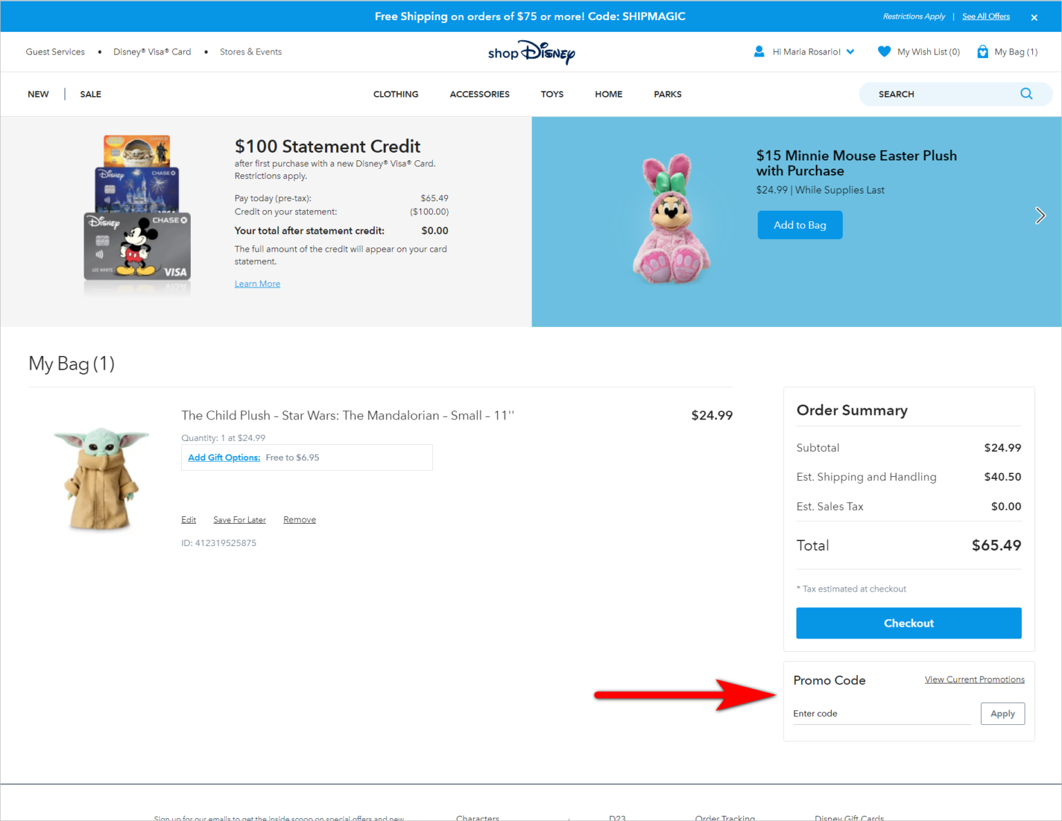
- You must be highly cautious about how you use discounts, since the rewards of doing so correctly may be enormous, but so can the hazards.
Get Shoppers to Add More to Their Cart
When it comes to conversions, it’s not simply about persuading customers to add an item to their shopping basket and then check out. You’re also aiming to maximize the average order value per client. As a result, you’ll need specific tactics for increasing the number of items and the importance of those items in your basket.
What to do;
- Product bundles are an excellent way to save money.
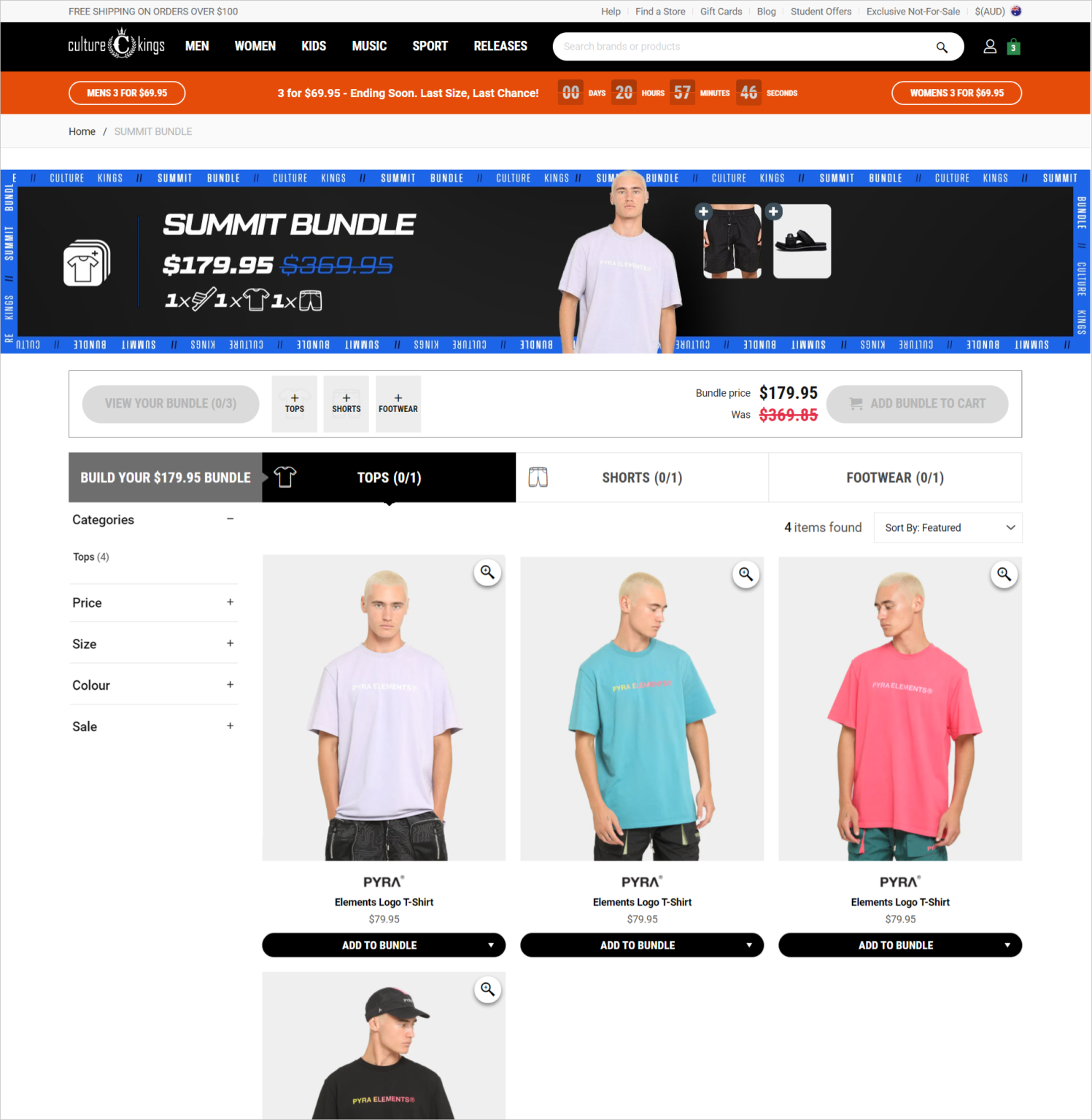
- Show similar items to increase the overall value of your order.
- Reduce the price by a certain amount.
- Increase the price to the point where you qualify for free shipping.
- Make it possible for customers to pay in installments.
- You won’t waste money if you consider the many levers available for the cart and thoroughly test your hypotheses.
Improve Your E-commerce Checkout Process
To have a good amount of customers check out, you have to put in a lot of effort. Then, once you’ve arrived, you need a strategy for getting customers to buy from you.
What to do;
- Obtain the customer’s email address as soon as possible once the purchase has been made. Using this method, you’ll be able to stay in touch with visitors even if they leave the page without filling out the form.
- Keep distractions to a minimum. Once customers get to the checkout page, it’s time to pare down the number of options they have to only the essentials.
- Set the bar for what the user expects. Clearly express what each stage entails with clear and explicit labeling and a progress meter.
- Include any additional fees as soon as you learn about them. If you catch potential clients off guard, they may become irritated and decide to go elsewhere.
- Your bottom-of-of-the-funnel chances will be maximized if you eliminate friction during checkout and prepare for customers who will leave without making a purchase.
Create Multiple Shipping Alternatives
A sale may be made or broken based on more than just the stuff you sell. Customers prefer to buy from companies that provide rapid, accessible, and sustainable delivery, according to Shopify Plus’s “The Future of Ecommerce Report 2021.”
It’s possible to give inadequate shipping alternatives yet not achieve a conversion even if you have what the visitor wants.
What to do;
- More than two-thirds of customers want their items delivered free of charge. So if you’re offering free delivery with a minimum purchase or as part of a special promotion, make sure your free shipping message is unmistakable.
- Allow for quick delivery of your product(s). Utilize the fulfillment networks of third-party logistics providers (3PLs) to meet customer demand for the speedy shipment.
- Deliver locally, BOPIS (purchase online, pickup in-store) or click and collect are all alternatives you should consider using. According to Shopify research, clients who opt for in-store pickup are 13 percent more likely to complete their online purchase. However, these customers also wind up spending 23% more money than those who choose standard delivery.
- If your rivals’ prices are close to yours, shipping costs may be the deciding factor. As a result, conversion rate optimization for e-commerce sites can benefit significantly from getting this element of the experience correctly.
Pay Close Attention to Your Thank You Page
Typically, the Thank You page is an afterthought, something sent to customers who have completed a transaction but haven’t given it any attention in the process.
Experienced web marketers, on the other hand, are aware that it goes much beyond that simple definition. You may utilize it to generate goodwill, confirm the customer’s purchase choice, and, in the right hands, sell other goods from this department.
What to do;
- Remind the consumer of the benefits from the transaction to keep them excited about the purchase.
- Recommend relevant goods to the consumer if your technology can handle them.
- You may also ask your customers to visit your website or download your app if you have one.
- As a last resort, invite the customer to join your rewards program if they haven’t already done so. Utilize the customer’s resources wherever possible.
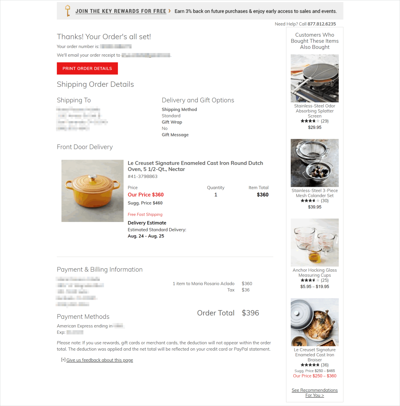
- When given enough care, a thank you page may go from a throwaway to a money source.
Post-Purchase Experience Optimization
A competent marketer focuses on transactions, but a great marketer considers the lifetime profitable making marketing decisions (CLTV). Because acquiring new consumers is more expensive than keeping the ones you already have, you should not stop worrying about the user experience when a visitor turns into a client.
What to do;
- Transaction emails may be made better by optimizing them. For example, make sure your consumers have all the information they require to purchase and strive to attract a small percentage of your customers to subscribe to your mailing list.
- After a while, follow up with a request for feedback to gather testimonials and social proof.
- Emails may be used for upsells and cross-sells, but you must be careful when sending them out. Instead, remind consumers about replenishment or a product upgrade at a time that you estimate will be convenient for them.
- Use the “unboxing phenomena” to your advantage. Think of creative ways to make the packaging appealing to consumers. As a result, customers may be more likely to recommend your items and make more purchases from you in the future. However, you’ll have to find a middle ground between branded packaging and environmentally friendly packaging.
- Instead of focusing on individual transactions when advertising and acquisition expenses rise, optimizing total lifetime value (CTLV) is vital.
Demonstrate CSR (CSR)
An Environmental, Social, and Governance (ESG) or a Corporate Social Responsibility (CSR) presence might improve your reputation among visitors.
Nearly 80% of those who took part in an IBM study in 2020 said they care about sustainability. Furthermore, most people who thought sustainability was fundamental were ready to spend an extra 35% on average for sustainable and environmentally-friendly businesses.
Without going overboard and open boasting, you must speak honestly about your care for the community. You can make a positive impression and increase your chances of converting if you walk that delicate line.
What to do;
- Instead of using stock photographs for outreach activities, use genuine photos of your personnel.
Good logos can be shown to highlight that your brand has a specific love for sustainability.
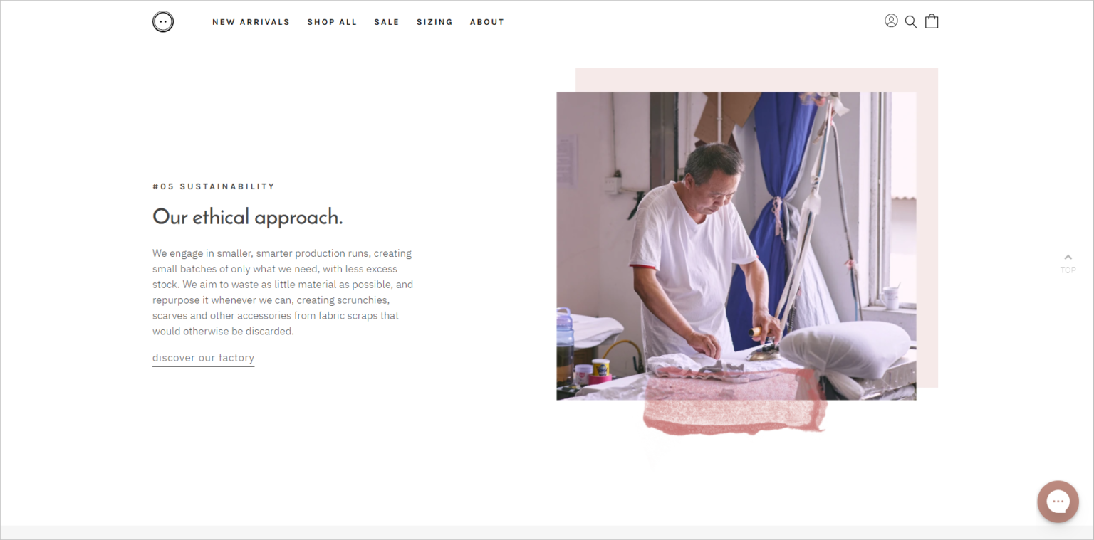
- Getting the CSR mix right may help you gain the trust of your customers while also reducing conflict.
Employ Behavior-Based Pop-ups
Your website won’t convert e-commerce buyers who aren’t sure about it, so they’ll just close the browser window or tab. You don’t have to give up on all of those visits if your marketing technology stack is advanced enough. You might be able to salvage a small portion of your losses by trying one final time.
What to do;
- Do your homework and make sure you have the tools to launch pop-ups when specific criteria are met (e.g., a visitor has viewed at least three pages).
- Display a pop-up modal to attempt to persuade a visitor to stay if they show exit intent (i.e., they look to be about to quit the browser or tab). To keep in touch with visitors after they leave your site, ask for their email addresses.
- Discover which offers to encourage people to remain by experimenting with a few different ones.
- Pop-ups based on user behavior will not transform a low-conversion website into a high-conversion digital touchpoint. Pop-ups, when used effectively, can help you achieve tiny conversion victories, though.
Final Thoughts
Success does not come by being mediocre. Standing out from the crowd can sometimes be as simple as taking an additional step. To a large extent, eCommerce now represents the concept of a society in which the winner takes everything.
There are several scenarios when you might benefit disproportionately from having a slight advantage over your rivals on the Conversion Rate.
