Table of Contents
Want some amazing landing page ideas to get you started on your next project? If so, look no further.
Converting more website traffic into subscribers and consumers is easier when you use landing pages on your small company website. It’s difficult to know where to begin when creating a landing page.
As a result, in this post, we’ll show you real-world examples of effective landing pages and discuss how they enhance lead generation and conversion rates.
What a Landing Page is and How it Works
A landing page is a web page that is displayed after a visitor clicks on an advertisement, newsletter, or search result on the web.
You build a landing page in conjunction with an advertising or marketing effort in order to gather the information of your visitors with the goal of converting them into customers. The term ‘landing page’ refers to the page that is used to capture leads. Other terms for landing pages include “destination page” and “static page.”
Examples of High-Converting Landing Pages
Now that you’ve learned how a good landing page is created and what elements should be included, it’s time to look at some real-world examples.
Netflix
This Netflix signup page serves as an excellent example of a landing page that converts effectively.
When you first get on the page, you’re greeted with a list of everything they have to offer and an invitation to get started right away. By removing the uncertainty surrounding a decision, people are more likely to respond fast.
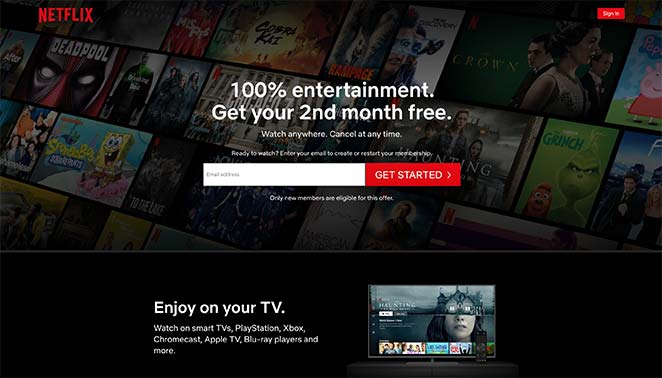
Why The Page Converts Well
- Title; The benefit drive headline grabs the reader’s attention right away.
- Trust; Knowing that you have the option to cancel at any moment eliminates any risk.
- Registration Form; It just contains one web form, making it easy for people to register.
- Easy access; The most important information is placed at the top of the webpage, making it simple to find.
- Compelling Copy; Page content that emphasizes advantages rather than features is more persuasive than copy that emphasizes features.
- Clarity; The FAQ section removes any stumbling blocks to registering.
Another sign up form is put at the bottom of this page to remind people that they should join up.
Zoom
Zoom is a widely used video conferencing program that has clients in a wide range of different sectors. As a result, it is understandable that they’d want to position themselves as a pioneer in their field of expertise to prospective clients.
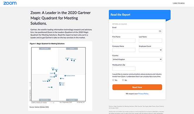
They’ve attempted to do this by providing a complimentary report that portrays the firm as a leader in the meeting solutions industry. Interested parties can register to get and review the analysis at no cost.
Why The Page Converts Well
- Free Download; Making the report available for free increases the accessibility of the material.
- Simple Form Fields; By limiting the information on the signup form to only the information that the firm requires, it is possible to decrease form abandonment.
- Copy that Persuades; The copy frames this study as a must-read, offering to illustrate why Zoom is a pioneer in its field. Curiosity is piqued, and people are invited to join and download the file as a result.
- CTA Button; The tone distinction of the CTA button helps it stand out from the rest of the page, increasing the likelihood that it will be clicked.
Brendan Burns from Mastering Instagram
Brendan makes advantage of his website to provide free online instruction on how to grow an Instagram audience. Business owners and social media influencers may learn from him how to build and monetize their Instagram pages. The opt-in rate for the landing page sample shown above is 61.88 percent, according to the data. His website has the following features:
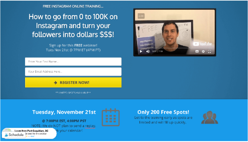
Why The Page Converts Well
- Background with a minimum amount of color; with vivid accent colors
- Scarcity as a motivator
- Pop-up window to close the page
- The presence of a visible lead capture button
- A strong emphasis on profit or gain
Marketo landing page example
Marketo, along with its sophisticated marketing automation software, was founded in 2006 with the goal of assisting advertisers all over the world in efficiently engaging consumers and prospects. Today, 10 years after its founding, the firm has assisted numerous well-known brands in achieving success with its software. Nikon, Kia, Windows, Verizon, and Panasonic are just a few of the well-known names in the industry.
Using post-click landing pages to augment their automation is something Marketo performs better than many other businesses, and this is something Marketo excels at. Marketo has been able to significantly boost conversion rates by implementing post-click landing pages in a suitable and effective manner. Look at how Marketo employs post-click landing pages to improve the number of prospects entering their sales funnel in further detail.
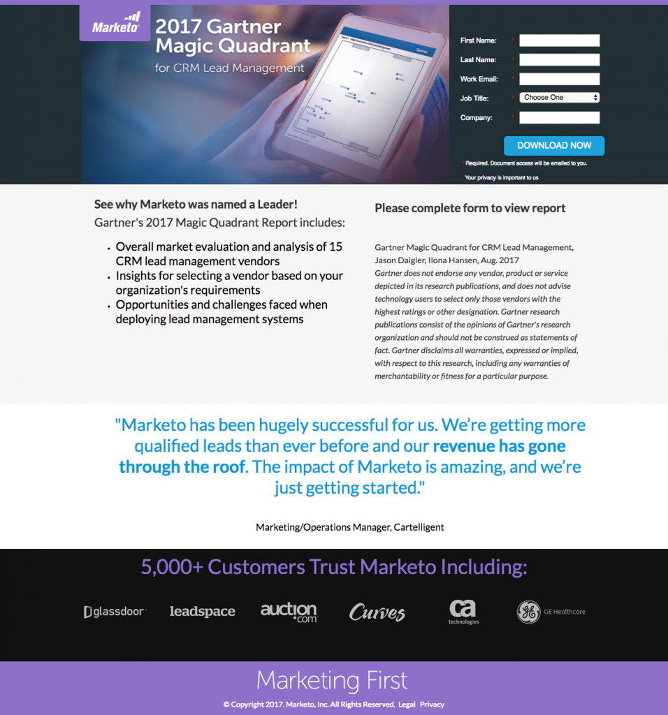
Why The Page Converts Well
- The headline immediately informs readers of the report’s subject matter.
- Visitors may see; what they can anticipate to receive if they opt to download the report by clicking on the image below.
- Bullet points; Prospects may rapidly read the page to see what information is contained inside the report by using bullet points.
- Social proof; such as a customer feedback or corporate insignia, increases the perceived trustworthiness of an offer and the firm as a whole.
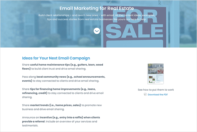
Constant Contact
Constant Contact, like Zoom, is an email marketing platform that caters to a wide range of businesses. Nevertheless, in this landing page case, they are particularly aiming their message at real estate agencies.
The landing page layout is clean, basic, and to the point, which is exactly what you want. It is a free download that contains useful advice and success stories to aid in the marketing of real estate properties. It is available for download here. Additionally, it contains a CTA that encourages readers to test Constant Contact for free.
Why The Page Converts Well
- Strong Headline; The title and description clearly convey what consumers will receive as a result of downloading the file.
- A persuasive writing; that gets straight to the point and illustrates the advantages of reading the book is essential.
- Images; Users can examine a glimpse of the PDF to have a better sense of what will be included in the final version.
- Customer testimonials; that demonstrate how email marketing has performed for other customers are included as proof.
- Call to Action (CTA); The CTA button encourages people to join up for the free trial. Because there is no financial commitment, users are more inclined to choose a trial than a purchase.
Lyft
Lyf’s driver registration landing page is a great illustration of how a registration page design doesn’t have to be difficult to understand and navigate. The headline is straightforward, informing readers of what they need to do, and the registration form just requires a cellphone number, making it extremely simple for customers to get started with the service.
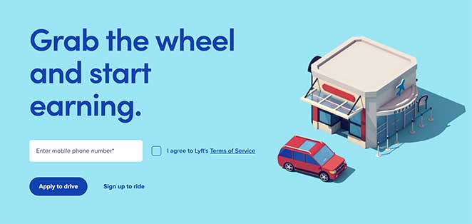
Why The Page Converts Well
- A minimalist design; eliminates any extraneous distractions that could divert your focus away from the page’s main objective.
- Form with Only One Field; Because the signup form has only one form field, the likelihood of a successful registration is increased.
- Images; A simple image elicits an emotional reaction from consumers, reinforcing the reason for their actions.
- CTA (Call to Action); The CTA button is underlined with the action that Lyft wishes you to do. The activity that is less wanted is less noticed.
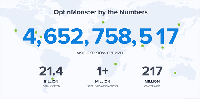
OptinMonster
If you’re searching for a landing page layout from a SaaS company, this illustration from OptinMonster is a great choice. The sales page for their agency solutions contains all of the necessary features of a high-converting landing page.
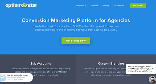
Not only are their branding colors on target, but they also employ a number of conversion-boosting strategies, which we’ll go over in more detail below.
Why The Page Converts Well
- Page Components; Different page pieces divide the page into smaller sections, making it easier to discover the information you’re searching for on each area.
- Rewards of Using the Program; The perks of using the product are discussed in detail under the features section.
- Testimonial slider; Find out what genuine customers have to say about the software in this section.
- Images; Images and gifs illustrate precisely what the software performs.
- Social Proof; This page makes use of a mix of overall sales notifications and a realtime estimate of how many individuals the program serves to demonstrate the popularity of the software.
- CTA; Call-to-action (CTA) buttons are placed across the website to provide customers with quick and easy options to purchase.
Using live chat, customers may obtain immediate answers to their queries and receive immediate feedback.
Dadz
This web page’s design is distinctive from others you may have seen. We discovered it by clicking on an advertisement in the Google search results. This is a fantastic strategy for driving particular audiences to your website since it allows you to adapt your messaging directly to the demands of that specific group.
In this instance, the intended audience is a modern family man, and the landing page is well suited to their needs.
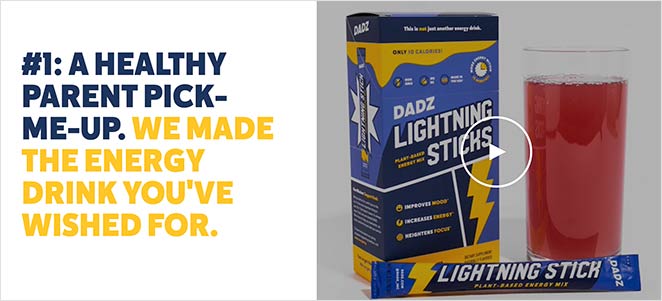
Why The Page Converts Well
- Audience Match; This landing page is tailored to the specific sort of audience it is intended for, and it provides solutions that are appropriate to their needs.
- Case Studies; Before making a purchase, you are encouraged to study case studies, which is a type of social evidence.
- Dadz landing page offers an engrossing film; that demonstrates how you will feel after you have used their products.
- Reviews; Positive feedback from genuine consumers demonstrates that this is a product worth a try.
- Social Media; The big Instagram gallery illustrates the businesses’ active and growing community of followers..
- A number of call-to-action (CTA) buttons; are utilized across the landing page, providing many possibilities to purchase.
Codecademy
This landing page by Codecademy demonstrates how including white space across your layout may assist to bring attention to important page components such as navigation buttons.
As opposed to cluttering the website with distracting graphics, gradients, and full-screen backdrops, Codecademy has maintained things simple by incorporating bright flashes of color to capture the viewer’s attention.
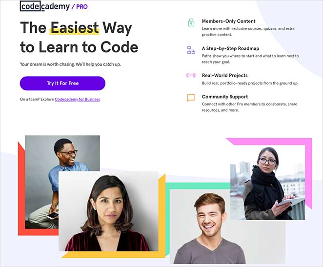
Why The Page Converts Well
- Using color strategically; in important page sections generates interest and draws the reader’s attention to the location you want it to go.
- Animated GIFs; The graphics on the page depicts experts who are joyful and smiling, which elicits an emotional and positive reaction from visitors.
- Testimonials; Comments from real consumers demonstrate that they had a genuine experience with the product and that it is worth trying.
- With the pricing comparison; it is simple to evaluate which plan is the most cost-effective for you at a glimpse.
Action – The CTA section has a different backdrop than the rest of the page, which makes it stand out more from other parts of the page.
Airbnb
Airbnb’s mission is to make it simple for people to discover someplace to stay while also providing customers with a means to earn a living from their homes. They have another fantastic example of how to make your page content communicate on its own without the use of any superfluous bells and whistles on their host sign-up landing page as well.
It is basic and plain, and it leads users through the decision-making process.
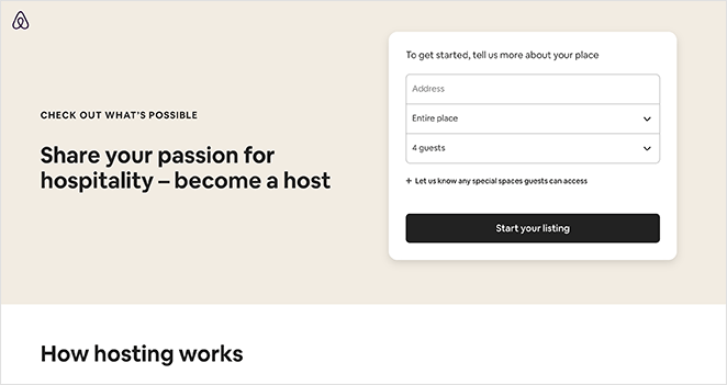
Why The Page Converts Well
- Signup Form; There are only three required fields on the signup form, with optional fields concealed behind a tab. While still enabling them to acquire critical information, this renders it less overwhelming.
- Resources; The resources section contains all of the information that users require to understand how Airbnb operates in terms of hosting.
- Community; Potential consumers may see how other users are using the service, which might aid them in making a decision about it.
- Support; It’s simple to see what kind of help is offered, which removes one of the barriers to signing up.
- CTA; CTA buttons are utilized across the site, allowing for many opportunities to join.
Asana
Asana targets product managers with this landing page design, which promotes the company’s product management software platform. The website is entirely customized to this specific demographic, and it explains why their service is the greatest option available to them.
While the website appears to be quite straightforward at first look, it is clear to see why it’s effective. Using the different page parts, you can break down the content into digestible bits, guiding your interest at each level up to the final call to action (CTA).
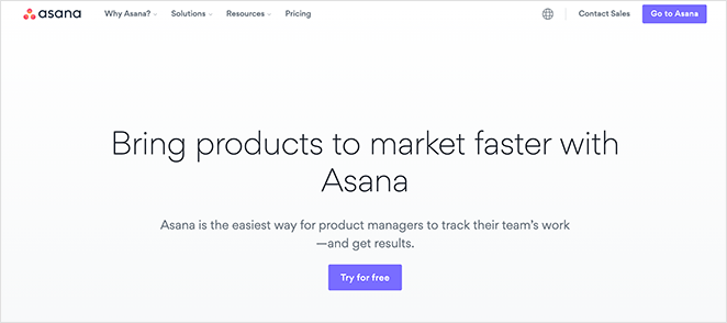
Why The Page Converts Well
- Headings; At a glance, the headlines summarize all of the benefits of Asana.
- Use Cases; A variety of use cases demonstrate to customers all of the many ways they can put the product to work for them.
- Video Case Study; The clip demonstrates how a well-known company is utilizing Asana to achieve commercial success, which is far more effective than relying on copy.
- Free Trial; The last call-to-action (CTA) provides a free trial, which is less intimidating than jumping in and purchasing the product immediately.
SEMRush
Whenever it comes to content promotion, webinars are a fantastic method to get the word out there quickly. Aside from the fact that they keep users interested in your website for longer periods of time, they’re also a wonderful method to establish relationships with potential consumers.
For this reason, the SEO company SEMRush organizes frequent webinars for its users, and their webinar application form serves as a shining example of how to effectively advertise these events.
Why The Page Converts Well
- Featured Content; The featured content on this webinar landing page describes exactly what visitors will learn by participating in the webinar, as well as who will be conducting the event.
- The webinar specifications; make it clear who the presenters are and what you will study in further depth throughout the session. This generates enough interest to persuade people to sign up for the event.
- Registration form; Users just need to submit a little amount of information while completing the registration form.
- Content that is recommended; Previous and upcoming episode listings urge consumers to interact with more of their material in the future.
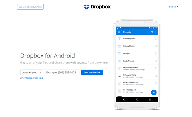
Dropbox
If you want consumers to utilize your product, the ideal approach is to make it as simple as possible for them to obtain it. That’s exactly what Dropbox accomplished with the landing page for their Dropbox for Android application.
The website, which is designed specifically for Android users, is simple to navigate and to the point. As a result, there is minimal doubt about what it is for, resulting in leads that are well-targeted.
Why The Page Converts Well
- Description; The headline and description includes no superfluous information, providing only what visitors need to get started.
- Image; A sneak peak of the app is displayed, giving consumers a sense of how it will appear on their device if they download it.
- Form; Obtaining the software is a simple process. Simply provide your mobile number, and they will send you the link to your account. There are no more actions necessary.
Smash Balloon
When it comes to business, Black Friday is a major event on the calendar, and creating a landing page just for the occasion is an excellent method to collect all of that focused traffic in one spot.
This is exactly what Smash Balloon has accomplished for its Black Friday promotional campaign this year. The page is visually appealing and provides several opportunities to interact with the business during the special time, attracting attention to their item discounts.
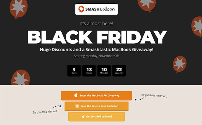
Why The Page Converts Well
- Branding; The landing page layout is prominently branded, informing visitors that they are dealing with a legitimate company.
- With the usage of a countdown clock; users are forced to take action before the timer expires and a sense of urgency is created.
- The use of an incentive offer; on your landing page might assist to raise awareness of your offer. As more individuals enter the contest, more people will become aware of the offer, increasing their likelihood of taking advantage of it.
- The use of email reminders; and the addition of the deal to users’ calendars by SmashBalloon enhances the likelihood that users will return while a bargain is active.
Dreamforce
With so many live events being postponed or canceled, it’s critical for every firm that depends on in-person events to take measures to bring the experience online. They risk losing out on important business if they don’t.
Dreamforce is a great example of how to do this. This year, instead of the traditional yearly four-day event, they’re presenting it online so that anybody may participate from anywhere in the world. In addition, the event application form serves as a spectacular example of a landing page layout that successfully promotes the upcoming event.
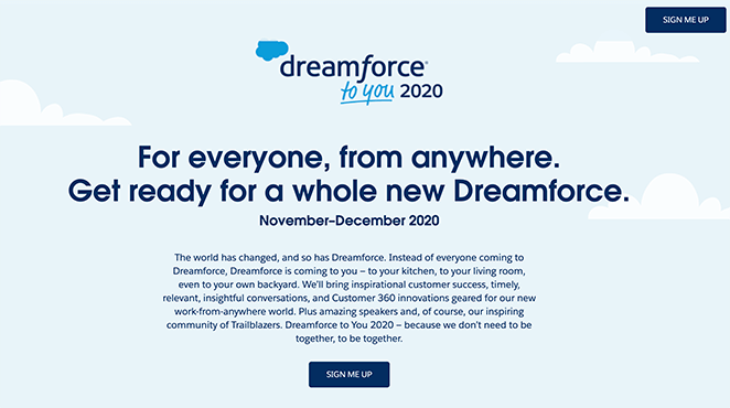
Why The Page Converts Well
- Inspiring Imagery; The pictures used within the landing page emphasize the idea that a digital event can be just as entertaining and educational as an in-person one. All of the content is made more enjoyable and lighthearted by the addition of a full-width animated gif near the bottom of the page.
- Four distinct page blocks; describe what you’ll benefit from attending the event, allowing you to make an educated decision about whether or not to go.
- CTA; A large number of CTA buttons in vivid colours directs you to the appropriate sign-up page.
Digital Marketer
It has already been noted that landing pages that incorporate videos are an excellent method to present difficult information in a clear manner.
This technique is used on the landing page for Digital Marketer’s Elite Growth Accelerator program. Following a presentation from the Founder and CEO, you will be guided through the process of how it works.
Each component of the website serves as a new stage in the decision-making journey, guiding you through each step until you make the ultimate choice to sign up for the service or product.
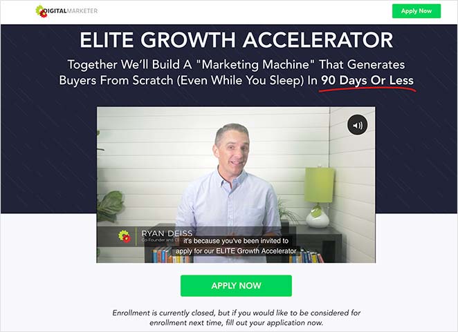
Why The Page Converts Well
- Video; The introduction video condenses all of the material into a few minutes, making it simple to comprehend.
- Step-by-Step; Step-by-step instructions will walk you through the process of how coaching will operate.
- Clever Copy; Rather than describing characteristics, the copy concentrates on the advantages. It also informs you of what the course is not, allowing you to dispel any concerns that may have prevented you from enrolling.
- Bonuses; Instead of just training, you’ll receive a slew of benefits, making the experience more valuable.
- Social Proof; Screenshots of testimonies from other users lend credibility to the page, increasing the likelihood that you’ll engage in the activity.
- A discount; The reduced price tag emphasizes that this is an excellent bargain that saves money.
Taboola
Offering a free ebook in exchange for your contact information is a common method of generating leads. In order to target advertisers with its case study ebook, Taboola uses this method of distribution.
In this simple landing page example, the benefits of reading the book are demonstrated in a straightforward manner. Since the ebook content is relevant to the brands’ sector, people will be more inclined to check them out and subscribe to their email list as a result of the promotion.
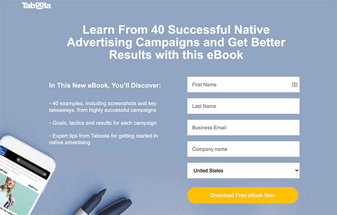
Why The Page Converts Well
- Numeric headlines; increase the credibility and persuasiveness of your text by using numerical headlines.
- Bullet list; Bullet lists make it simple to scan through and rapidly absorb the material.
- A simple signup form; with only the essential form fields is provided for your convenience.
- Demo; Taboola offers information on how businesses have boosted conversions using native advertising, which is a major focus of the booklet. This lends credibility to the book and encourages readers to discover more about how they attained their goals.
- CTA; Call-to-action (CTA) buttons are used at the top, middle, and bottom of a page to encourage viewers to click on the link provided.
Slack
With Slack being used by over three-quarters of Fortune 100 organizations, there’s no denying that the brand is experiencing tremendous success. The growth pace of Slack is “unprecedented,” according to the website TechCrunch. In only one year, the firm saw a 3.5x increase in the number of daily users (currently 5 million), as well as the number of premium customers (now 1.5 million).
While new technology and capabilities – such as open communication channels, instant message, voice calls, video chats, and so on – have undoubtedly played a role in this astonishing expansion, they are by no means the only factors to consider. Slack’s usage of post-click landing pages to boost conversions and nurture leads into paying customers is another aspect that has played a significant part in the company’s explosive development.
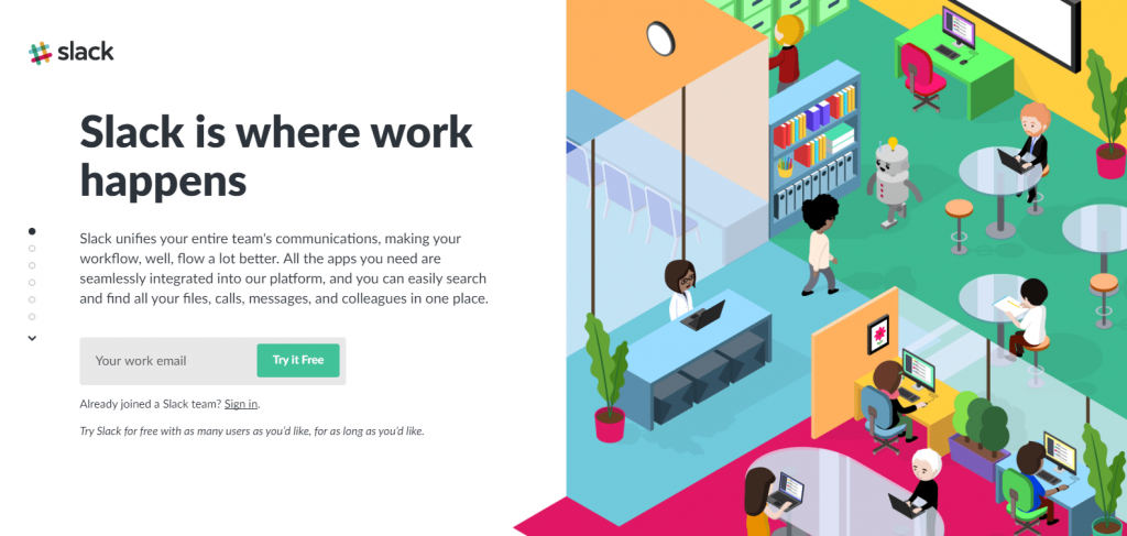
Why The Page Converts Well
- The use of a distinct scrolling style; allows all required information to be presented, allowing visitors to get information without having to navigate up and down the page.
- The lead generation form; is continuously visible as consumers navigate through the material.
- The copy for the CTA button is powerful; since it is brief, straightforward, and includes the term “for free.”
- The presence of one form field; increases the likelihood that visitors will finish the form.
- The pictures are vibrant and interesting; they use branded colour scheme, and they are relevant to each part in which they appear.
- Slack’s usage of social proof; may lead visitors to feel pressured into signing up for the service.
Oracle
Oracle, which ranks third on the list of the world’s most valuable brands, behind only Amazon and HP, has an estimated brand worth of $26 billion! In terms of market capitalization, the firm is among the world’s top 30 most valuable corporations.
It is understood by the software giant that in order to remain top of mind, build brand recognition, and generate leads, they have to make an excellent first impression and connect with their audience at all phases of the sales funnel. This is made possible by Oracle’s usage of post-click landing pages, which offer a range of content from various traffic sources whilst nurturing those leads through the sales funnel.
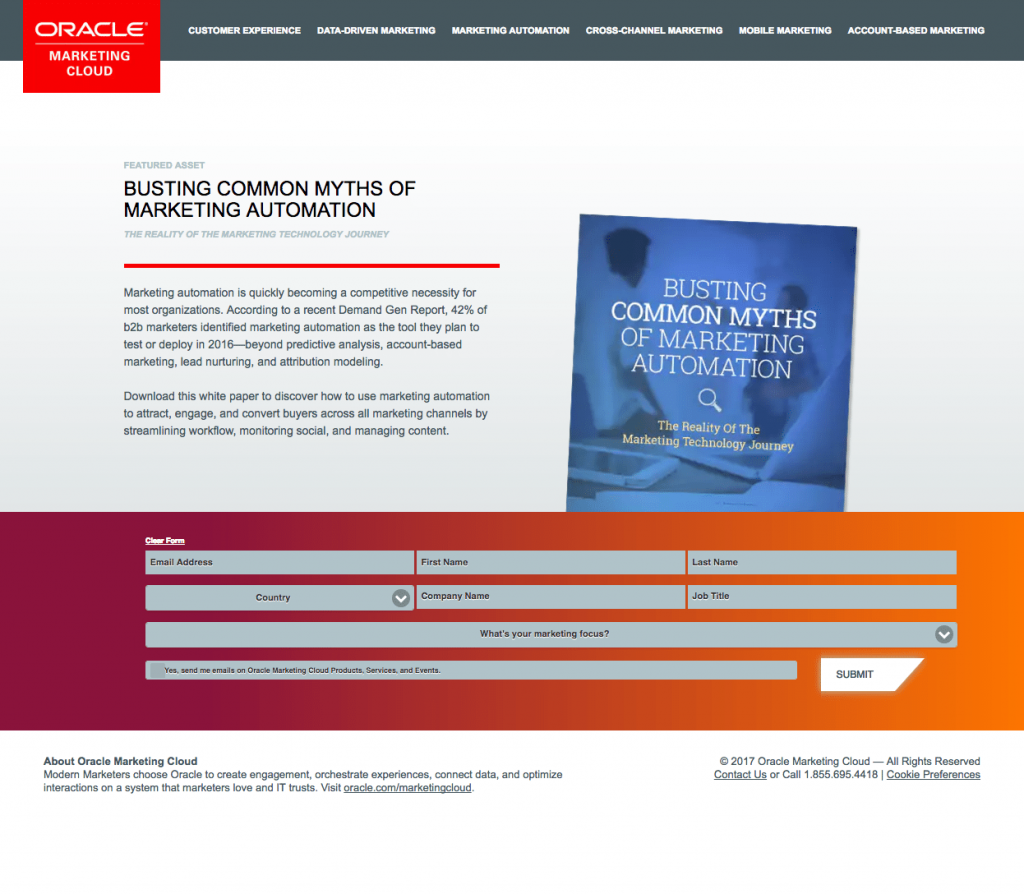
Why The Page Converts Well
- The Demand Gen Report analytics; in the text isn’t “current,” as it claims to be – it’s from before 2016, but the copyright date on this page is 2017 (and not 2016).
- The picture of the white paper; offers visitors with a sneak peek at what they may anticipate to receive if they choose to download the white paper in its entirety.
- The form’s contrasting hue; stands out and attracts attention, prompting visitors to fill it out completely.
- The unmarked opt-in box; guarantees that consumers who opt-in do so because they want to receive Oracle emails.
Google Hire
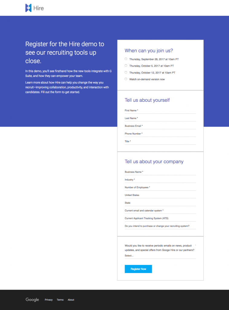
Finding the appropriate personnel for your company can be a time-consuming and expensive process that requires a lot of effort. According to research conducted by the University of California, Berkeley, the estimated cost of recruiting new staff is $4,000. Professional and management staff had an average salary of $7,000, which is higher than the national average.
The staffing market size is forecast to reach $146.6 billion in 2018, and most managers and senior-level workers are well aware of the high costs and annoying inefficiencies associated with hiring and replacing people in their organizations. The majority of managers desire that the hiring process could be made more efficient and less of a burden on their time and resources, and they are right.
Google is now revealing its answer to this problem to the public. The debut of Google Hire, a recruiting tool for handling job applications, will take place in July this year. Because they are counting on altering the way firms hire new personnel, rivals should be extremely cautious given Google’s track record of success in entering new industries in the past.
Why The Page Converts Well
- The Hire logo; within upper left corner directs users to the correct page. The fact that it is not hyperlinked will help prevent users from leaving the page, making it an excellent post-click landing page.
- The clear title; informs prospects that the demo will contain information regarding recruitment tools.
- The concise, to-the-point content; enables visitors to rapidly scan and decide if they would like to convert on the deal.
- Encapsulating the form; makes it more visible on the page, which is likely to result in higher conversion rates.
- The link to the privacy policy; in the footer builds trust, which encourages customers to provide their personal information.
Uber
The moment we decide what we want for dinner, what we watch on TV, what we read in the newspaper, and pretty much everything else we can buy with our money.
Because of our society’s reliance on “on-demand,” Uber has become a household name when it comes to getting what you want when you want it.
For the first time, a taxi cab could be requested with a straightforward series of taps instead of the old-fashioned hunt-and-hail method.
It didn’t take long for the Uber genius to be acknowledged when it became widely popular. On-demand service applications have a huge market opportunity.
Fast-forward to when Uber delivered everything from groceries to booze to massages and even weed.
On-demand services are already bigger than Uber, although the firm is still growing at an alarming rate right now.
Over the past year, the on-demand, cab-alternative service has served over 8 million customers in 400 cities and provided over 1 billion trips. It’s fair to say that Lyft’s the David to Uber’s Goliath, with even narrower odds of winning than the mythical underdog.
In comparison, Lyft only has 100,000 customers in 60 cities, which is well behind the competition.
How does Uber keep things so secretive?
Is it their equipment that’s the problem? Is it because of the way they drive? It’s both, and their marketing is just as critical.
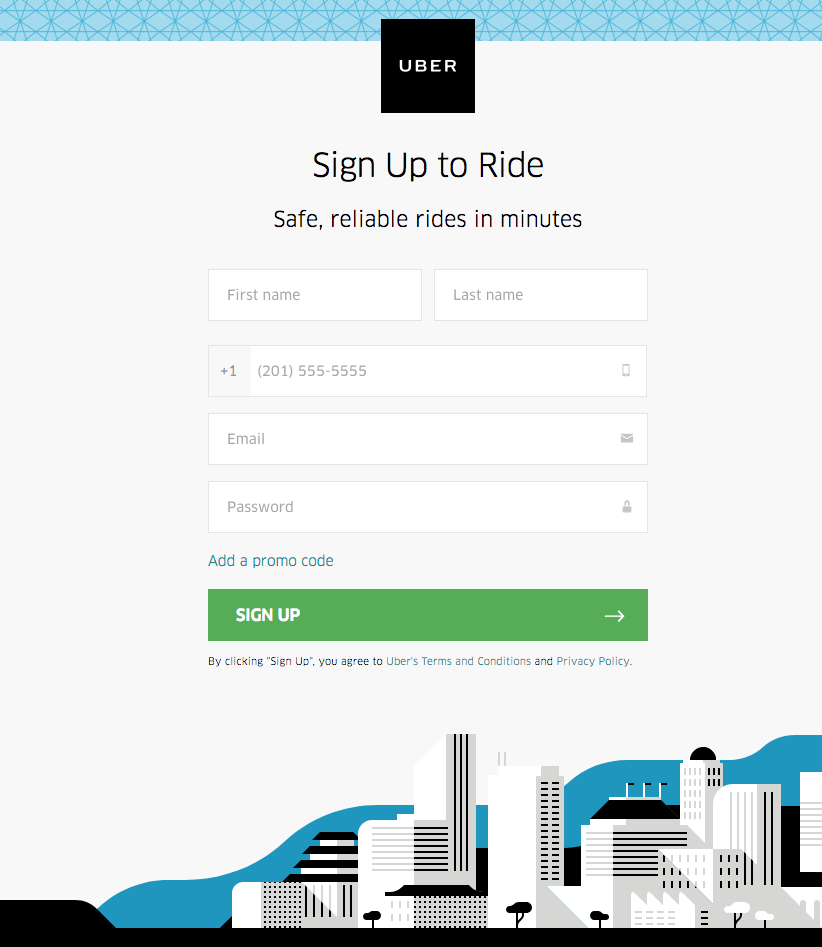
Why The Page Converts Well
- The Uber logo; at the top of the website informs users of their current location. Because it’s not affiliated to the homepage, it doesn’t serve as an exit link.
- A registration page; with five form fields is suitable because they don’t ask for any personally identifiable information.
- The optional promo code section; is ingenious since it does not display unless prospects click on it, limiting the form to five fields constrained.
- The green CTA icon; sticks out on the page since there is no other green.
- As a directional signal; the arrow on the CTA button directs visitors to click to discover what is on the other side of the post-click landing page.
IBM
Ten years ago, it would have been unthinkable to use IBM’s predictive technology to help you complete up your NCAA tournament bracket. IBM Watson is now a practical tool that people may utilize in their everyday lives. However, even though IBM is a global giant, they are always inventing and seeking new ways to influence the people and businesses that utilize its products. IBM
The amount of money IBM has put into creating new technologies has had a significant impact on its success. However, advancements in technology aren’t enough to account for the company’s expansion. Post-click landing pages are an important element of IBM’s lead generation strategy, which is handled by skilled digital marketing staff.
Landing pages created after a user clicks on a link are stand-alone pages with a single goal: conversion. These landing pages employ persuasive features like eye-catching visual cues, and testimonials to persuade visitors to take action once they have clicked through to the site. Prospects are prompted to take action on offerings including e-books, freebies, newsletters, and white papers on IBM’s post-click landing sites.
Here are a few methods that IBM’s marketing team enhances lead generation by optimizing post-click landing sites.
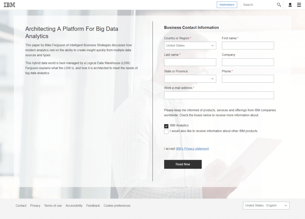
Why The Page Converts Well
- The title grabs attention; and entices readers to go on to discover more about the deal.
- A quick summary of the white paper; is provided in little text, so that prospects are not overloaded with superfluous details.
- Giving users the choice of language; is a brilliant concept. Instead of translating this post-click webpage, visitors who pick a different language are taken to the homepage.
LendingClub
It’s little wonder that online lending has grown so rapidly in the last few years since clients can now refinance car loans, merge college debt, repay off credit card debt, or even request private loans with just a few mouse clicks.
There was a 9-fold increase in the loan volume of US internet lenders in the span of just two years, from a market capitalization of $4.5b to $36.5b in 2015.
As you might expect, the rise of internet lending has disrupted traditional financial institutions. Partly the reason banks have grown riskier and more indebted is the erosion in their franchise value, according to former Treasury Secretary Lawrence Summers and Harvard Ph.D. candidate Natasha Sarin. In reality, financial services have had revenue declines of almost $100 billion since 2009.
LendingClub, a brand that has assisted over 1.5 million clients with their finances and loaned out over $28 billion in total, is one of the key firms challenging banks with online loan options.
In order to reach as many individuals as possible and significantly grow their client base, LendingClub has used a well-tuned marketing approach. Post-click landing pages are included in this, of course.
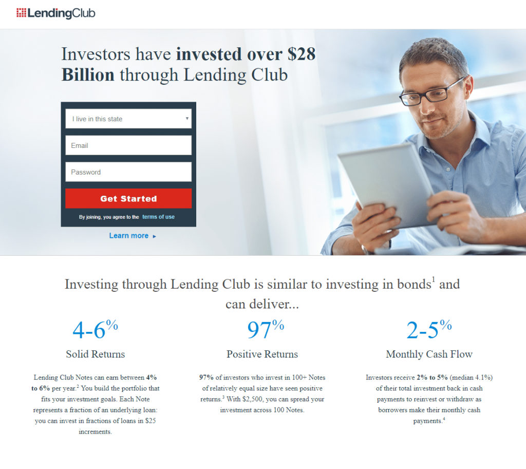
Why The Page Converts Well
- Bold typeface; is used in the headline to draw attention to the headline’s value proposition.
- Incorporating a contrast of colors; to encompass the shape draws attention to it.
- The scarlet CTA buttons; will increase conversions because they stick out on the page.
- “Investing through LendingClub”; offers the primary advantages of working with LendingClub without clogging up the website with a lot of unnecessary text. As an added bonus, the particular investment percentages act as social evidence.
- The corporate logos; also serve as social proof, letting visitors know that LendingClub is well-known and trusted by numerous well-known companies.
- Multiple call-to-action buttons; provide potential customers multiple ways to respond to the offer.
Intercom
A unique customer experience, according to B2B executives surveyed by Accenture in 2015, has a direct influence on company performance, according to the survey. Since its inception in 2011, Intercom, a messaging and interaction platform for customers, has experienced rapid growth due to the rising importance businesses place on customer experience.
The link between consumer engagement and growth is more understood by businesses, but Intercom’s success is not only due to this. Using post-click landing pages, Intercom also has a solid digital marketing strategy.
To persuade visitors to take action on an offer, post-click landing pages employ features like enticing headlines, hero images, testimonials, and contrasting CTAs. An ebook download, a product demo registration, a free trial sign-up, etc. are all examples of actions that qualify as “actions.”
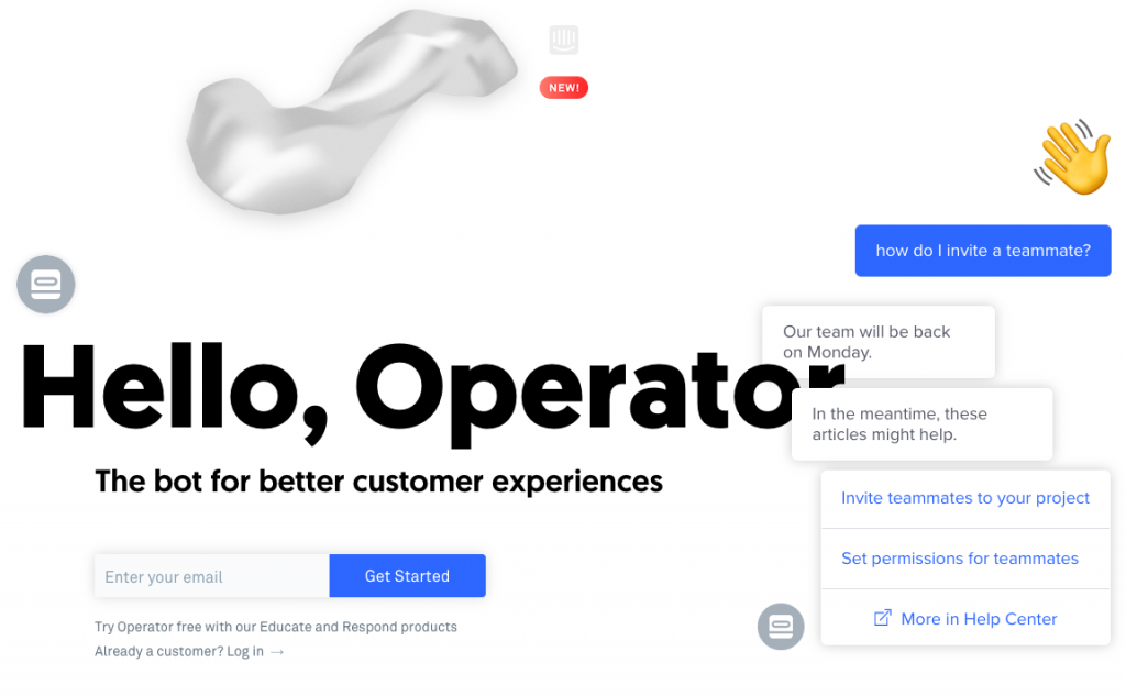
Why The Page Converts Well
- Humor; particularly in the section titled “Bots nowadays are extremely unpleasant,” aids in the development of a deep, empathic, and human relationship with visitors.
- Section headers; with a minimum amount of material inform prospects about what Operator comprises (and how it can help them) without overcrowding the page.
- Enough white space; on the website improves readability and navigation.
Microsoft
The Windows 10 application is installed on over 400 million devices, making Microsoft a global leader in technology. Since its inception in 1975, Microsoft’s ascent has been fuelled by superior technology and creativity. However, the company’s rise to the status of a tech behemoth can’t be attributed just to technological advances. Using the newest digital marketing techniques, such as post-click landing pages, they promote their products and services extremely well.
Post-click webpages are self-contained web pages created only with the goal of increasing conversions after a user has clicked over from another page. Prospects are more likely to take action when you employ persuasive features like captivating headlines, social evidence, and visual signals. This may be anything from registering for a free trial to downloading an ebook to signing up for a free demonstration.
This week, we’ll take a look at how Microsoft’s marketing uses post-click landing pages to convert prospects into customers.
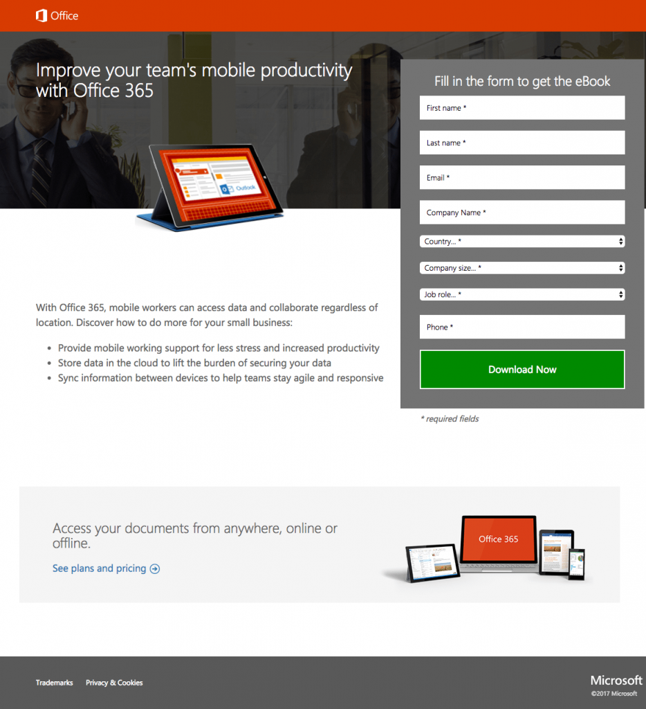
Why The Page Converts Well
- A benefit-focused title; informs readers that Office 365 may help their team members be more productive on the go, and it entices them to download the ebook to discover more.
- The picture of the product; conveys to customers what they may expect if they decide to download the ebook from the website.
- Increasing the size and realism of the image; may boost conversion rates even further.
- Prospects can skim pages with bullet points; and minimal writing to find the information they need.
- The enclosed form; stands out, grabbing the attention of anybody who sees it and encouraging them to finish it.
- The contrast between the green CTA button and the rest of the website; makes it stand out.
Zoho
While Zoho’s best-selling CRM product may be well-known, its platform offers a wide range of cloud-based applications. As a result, the firm recognizes that in order to maintain and develop, they should continue to give value at every level of the sales funnel. Creating a strong first impression is essential to converting prospects into customers and nurturing those customers into sales.
To achieve this, Zoho provides a wide range of material that is only accessible once a user clicks through to a post-click landing page.
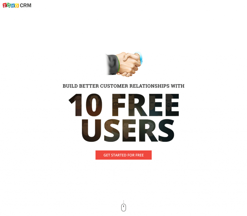
Why The Page Converts Well
- The headline instantly highlights; two advantages of registering for a free Zoho CRM plan: improved client connection development and the provision of 10 free users.
- The word “free”; appears multiple times on the website, including in the title, on the call-to-action buttons, and in the body content.
- The red color of the CTA buttons; stands out against the white background of the website, grabbing the viewer’s attention. Prospects will be sent to a form at the bottom of the landing page if they click on an anchor tag in the first button.
- Indicated by a mouse icon; site visitors are encouraged to continue scrolling down the page for further information. In addition, because it’s an anchor tag, clicking on it quickly moves them downwards to the next section.
- The extensive feature list; explains all that Zoho CRM has to offer.
- Due to the 2-step opt-in design; this page has reduced friction because the form is not displayed until the bottom CTA button is clicked by prospects.
- The use of yellow; around the form’s edges aids in drawing attention to it, which, in turn, enhances the likelihood of people completing it.
- The 3-field form; which just asks for name, email, and password, lowers the amount of work.
- The unchecked Zoho email checkbox; indicates that only those who are really interested and have high potential will access the content.
AWeber
Email marketing tool AWeber is used by small company owners and entrepreneurs with more than 100,000 clients. Because the platform knows how to streamline the email marketing program while helping its clients generate emails that are aesthetically appealing and engaging, this specific audience prefers AWeber.
AWeber has witnessed considerable growth in the email marketing business and increased competition since its inception in 1998. AWeber depends on landing pages to develop their email list to assist build brand recognition, generate prospects, and nurture them through the sales process. Since landing pages are the strongest marketing asset for making a good first impression, this is the case.
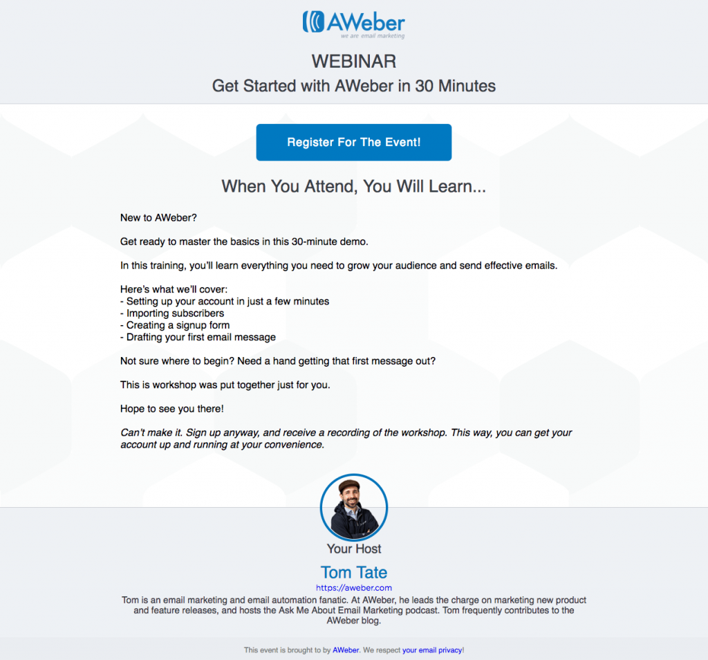
Why The Page Converts Well
- The title instantly; informs prospects that the webinar will only last 30 minutes and is free of charge.
- The call-to-action button is prominently displayed; ensuring that visitors will notice it as soon as they arrive on the website. Additionally, the text is detailed and enticing, making it more probable that prospects would click through to the website.
- As a result of the 2-step opt-in design; the lead capture form has been removed from this page and can only be viewed by prospects once they click on the CTA. As a result, there will be less friction, which might lead to more conversions.
- Only three form fields; inquiring for the day and time of the event, as well as the participant’s name and email address — make it quick and simple to complete.
- The italicized text; informs potential customers that if they are unable to attend any of the events scheduled, they could still sign up to get a recording of it.
- Tom Tate’s photo; and bio are welcome additions since they allow potential customers to have a better sense of who will be speaking. However, increasing the size of the image’s impact would be a better option.
- The link to the privacy policy; at the bottom of the website should reassure customers that they are giving their personal information to a reputable organization.
Squarespace
A website-building platform that includes everything you need to establish an impressive and beautiful online presence while also sharing your unique story with the world is known as Squarespace. Squarespace is the most popular website building platform in the world.
Since its debut in 2004, Squarespace has been the web platform of preference for over 1,000,000 paying clients, ranging from individuals as diverse as the handyman on Main Street to the frantic entrepreneur creating the next life-altering software and Fortune 500 corporations.
Despite the fact that Squarespace is a website builder rather than a post-click landing page solution, the brand acknowledges the value of post-click webpages and the necessity of having a clear, focused page in order to convert prospects into paying customers.
A compelling title such as “Claim your domain” is successful because it communicates a sense of impending doom. Prospects must act quickly in order to secure their chosen domain name before anybody else does.
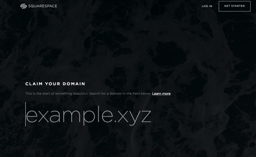
Why The Page Converts Well
- The “Learn more” hyperlink; in the subhead is an anchor tag that directs visitors farther down the page in order to receive further information about the promotion.
- Simple, consistent font; used across the entire page lends it a professional appearance in and of itself.
- Small pieces of material; make it easier to read and assimilate the content.
- Using the comparison; between Squarespace and its rivals shows potential customers that selecting Squarespace over the competition has many advantages.
- The woman’s gaze; below the landing page is directed squarely towards the section heading, which is likely to trigger visitors to do the same.
Mixpanel
Who are your most loyal customers, and what aspects of your business do they value the most? What strategies can you use to attract new consumers while also engaging with those you already have? How can you keep your present clients while increasing your revenue from them?
No matter what your job title is, Mixpanel analytics can assist you in answering these and other issues.
Mixpanel is widely regarded as among the best channels for developing mobile and online applications, as well as other types of software. In contrast to other analytics tools that only track page visits, Mixpanel tracks all of the actions that users perform within your application, including uploading images, viewing videos, sharing articles, and more. By thoroughly examining each activity, you may gain a thorough understanding of your consumers.
As a result of its use of a range of post-click landing pages to build brand recognition, generate leads, and close sales, Mixpanel has become a dominant force in the digital advertising business. Prior to discussing how they are employed, however, it is necessary to remind ourselves of some fundamentals.
Why The Page Converts Well
- Using a customized and benefit-oriented headline; the website asks users if they are prepared to expand their business.
- The picture; demonstrates to potential customers that the ebook may be viewed on a variety of devices.
- The brief description; of the ebook offers visitors with a high-level overview of the ebook that is being offered for purchase.
- The 4-field form; is fast and easy to fill, increasing the likelihood that visitors will finish it.
- First-person language; is used in the CTA button wording, which helps consumers feel more connected to the product.
- The section under “What’s Inside Your eBook”; expands on the brief summary provided above, covering the most significant arguments presented in the ebook as well as the perspectives of product leaders on those issues. It’s also a good touch to include headshots with your resume.
- Due to the absence of exit links; it is virtually difficult to leave the website without converting. You can only exit the page by clicking the “X” in the browser window or by completing the form on the right.
Infusionsoft
According to Forbes, Infusionsoft is the “gold standard” when it comes to marketing and sales solutions for small businesses. With its customer relationship management (CRM) and email marketing software, the firm assists marketers in tracking clients and sales at every stage of the buyer’s journey, allowing them to better nurture them to purchase.
Using methods such as email marketing and customer relationship management, Infusionsoft is able to convert visitors into paying clients. Infusionsoft also uses customized post-click landing sites to convert visitors into paying customers.
Why The Page Converts Well
- Social proof; such as business logos at the head of the webpage and testimonials at the bottom, gives prospects confidence and trust.
- The headline; does a fantastic job of identifying a visitor’s difficulty, empathizing with them, and afterwards providing a solution.
- The subhead complements; the title effectively, highlighting some of the most significant advantages of working with Infusionsoft.
- The concise, four-field form; requests only the most basic information, increasing the likelihood that prospects will complete it.
- The CTA button copy; informs prospects of exactly what they will receive as a result of completing the form and hitting the button.
- The list of services; provided by Infusionsoft informs prospects of the benefits they will enjoy if they opt to engage with Infusionsoft.
- Use of iconography and a large font; helps to bring the reader’s attention to this area.
HubSpot
HubSpot. You’ve probably heard of them, read their blog, purchased an ebook, and maybe even attended their annual convention. But who are they?
When you search for HubSpot, you’ll see that they don’t define themselves as a content development firm, despite the fact that they provide a large amount of material. Instead, they describe themselves as a provider of inbound marketing software solutions.
Which, of course, is precisely what they are: they are
This HubSpot landing page demonstrates to marketers how HubSpot looks in search engine results when searching for an inbound marketing software provider.
HubSpot, like the majority of businesses today, recognizes that the most effective method to grow their lead generation software firm is through the usage of post-click landing pages. Their marketing portfolio of tools includes a landing page tool, but it’s safe to argue that HubSpot is not a specialist in post-click landing page technology.
In spite of the fact that HubSpot is not the most feature-rich post-click landing page builder available, the company clearly “gets it” when it comes to incorporating effective lead generation techniques such as regularly posting to social networks, newsletter campaign, and writing blog posts, among other things, that include a call-to-action that directs visitors to a post-click landing page
This is something that HubSpot does really well. That’s why we decided to look at some of HubSpot’s landing pages to discover how they generate prospects from a range of gated content.
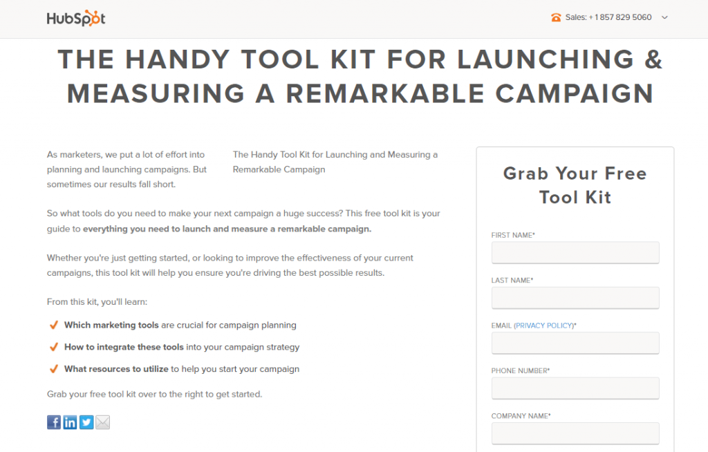
Why The Page Converts Well
- The click-to-call mobile number; enhances the user’s experience.
- The page header; clearly describes the offer and informs visitors of the benefits they will receive as a result of participating.
- Short sentences, bullet points, and a strong font; make it simple and comfortable to browse this page quickly and easily.
- Encapsulating the form; makes it more visible on the website, which is likely to result in more people completing it as a result.
- The title of the form; informs prospects that the toolkit is completely free to use. The efficacy of the page would be increased if this was also included in the page headline.
- Prospects may easily reach the privacy policy; by clicking on the link adjacent to the email form instead than going to the bottom of the page.
- The blue CTA icon; stands out on the website due to the scarcity of other colors.
Conclusion
Make your own high-converting landing page using the knowledge gained in this guide.
Moreover, you shouldn’t limit yourself to just one option. The more you choose, the greater your testing arsenal will be.
The design of landing pages changes throughout time. Keep a lookout for landing pages you enjoy and make use of their unique selling proposition.
What type of landing page are you going to develop now that you’ve read this post?