Table of Contents
What methods do you use to compel your consumers to take action? This tutorial will clarify what a call to action is and offer examples of calls to action that have been utilized successfully in marketing campaigns.
What is a Call to Action?
The volume of advertising and promotion that is available on tv, online, and billboards can be overwhelming to customers. Fortunately, there are ways to combat this.
How do businesses make their marketing stand out and compel consumers to take action by purchasing or using their goods or services? When a consumer sees a call to action, they are more likely to try out the product or service. When it comes to advertising, this is what all businesses strive for.
For example, Mary offers women’s face cosmetics, and she is attempting to increase the number of individuals who test her merchandise. She decided to advertise her product through the usage of a billboard in the town.
‘Try Mary’s Moisturizer now for free,’ the sign proclaims. If you purchase online right now, you’ll receive your first item for free.’ In this case, the call to action is clear and urges the buyer to experiment with the product.
How to Write and Optimize Your CTA
There are a few fundamental principles to follow regardless of where you decide to include your appealing call to action (CTA).
- Make use of action phrases. Make it crystal clear what you want the reader to do to complete the task. However, while being charming and catchy may be appealing, it will not result in any conversions because the reader will be unsure as to what to do. Whether you’re not certain how to incorporate action phrases, look to see if your call to action contains any action verbs.
- Make use of the first person. To persuade a user to do anything, it is best to make the communication more personal, as if you were chatting to a friend. The simplest method to accomplish this is to use the first person singular tense.
- Create a feeling of urgency. Without a feeling of urgency, it is simple for your consumers to hold off taking action until a more convenient time. That does not imply, however, that you should create a sense of terror. Create a pleasant feeling of urgency to push potential consumers to act instead by bringing awareness to the time-sensitive aspect of what you’re giving. This might be a referral reward such as a significant discount on an item or valuable content that could benefit them right now.
- Eliminate any obstacles or friction that may exist. Make it as simple as possible for the user to complete the action. Any obstacles that stand in the way of performing that activity should be removed as soon as possible. To increase social proof for your brand or product, for example, put a clear social share link immediately next to your call to action (CTA) on your website.
- Make them noticeable and easy to locate. Whether you choose a brightly colored interactive button or a well-designed form, ensure that your CTA is easy to discover and understand. When you load a website with clear content that urges a certain action, the call to action is often the first thing your attention is pulled to.
If you follow these simple but effective guidelines, you will see an increase in the number of people who respond to your call to action. Allow me to share some compelling examples of a call to action with you!
Call To Action Examples
Writing a compelling call to action is a critical part of conversion rate optimization. A call to action (CTA) may be seen all across a company’s website. The call to action is the linchpin of good lead generation, dictating everything from button color to sign-up form design.
Here are a few examples of strong calls to action that can be seen all over the internet right now.
Crazy Egg
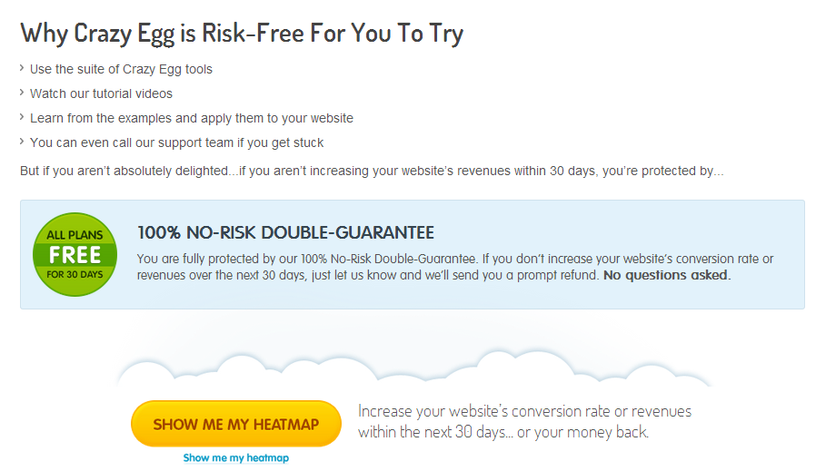
This company, Crazy Egg, is one of our favorites for several reasons. Crazy Egg’s message is also spot on, as seen by the following appealing call to action (CTA):
Why it Works
- Several important points are made in this call to action. To begin, it explains why utilizing Crazy Egg is risk-free, employing simple language to reaffirm the security of using their service.
- It uses simple verbs to describe numerous reasons why you should do something. To top it all off, the CTA button (“Show Me My Heatmap”) leverages the persuasive power of client feedback.
Manpacks
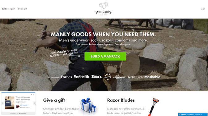
It’s easy to obtain what you want by speaking the language of your potential consumers. Consider this example of a call to action from the website Manpacks, which sells men’s grooming products.
Why it Works
- You may make a lot of money by selling products that are boring on their own, but if you appeal to the urge of males to construct something, you’ll be on to something big and successful very quickly.
- Combining stereotyped imagery (a guy chopping wood in a plaid shirt) with powerful language (“Build a Manpack”), one firm makes putting together an all-male grooming gift set sound fun and exhilarating.
GiftRocket
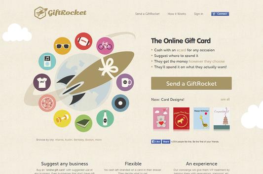
We may all agree that gift vouchers and store-bought greeting cards are the laziest methods to convey our feelings. In contrast, GiftRocket successfully combines the two into an appealing package that may really result in a nice present for the people you care about.
Why it Works
- Rather than asking you to sign up now or “get yours free,” this CTA lets you “Send A GiftRocket,” a lot more fascinating and thrilling method to send a gift. This makes the CTA considerably more persuasive.
- A lot is going on on this landing page, yet it all comes together to provide an engaging experience. GiftRocket is a better alternative to sending a gift card.
Contently
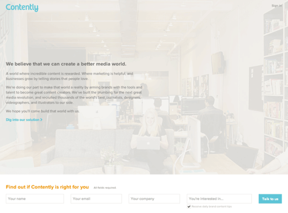
We all know that Contently publishes outstanding work, but did you know that their landing pages often feature some outstanding calls to action?
Why it Works
- To say this landing page’s design is unconventional would be an understatement. The “You’re interested in…” area is unnecessary in my opinion, but the call to action itself – “Talk to us” – is spot on.
- It might have simply said “Submit,” but it would have been ineffective. Instead, Contently utilizes warm, approachable language to emphasize the value of connections. You can see from this that Contently wants to have a discussion with customers instead of just selling.
Less accounting
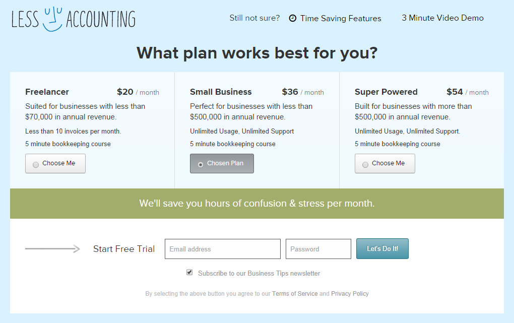
You have a tough time convincing customers to take a hazardous step that, in the long run, benefits your company. For SaaS companies, this is particularly true, and for financial software companies, this is much more so than usual. To illustrate, we used Less Accounting’s “Call to Action” as an example.
Why it Works
- The color scheme on this landing page is meant to convey a sense of tranquility, but it’s the CTA that really makes it stand out.
- To be sure, their sales pitch includes an invitation to take part in a trial version of their accounting system, but the tone of the invitation itself is compelling: “Let’s Do It!”. One, the CTA suggests a collaboration; they’re not only after the prospect’s personal info. Exclamation marks also express excitement for the goods, which is quite a success in this case considering the product’s characteristics. This is an excellent example of a motivational call to action.
Square
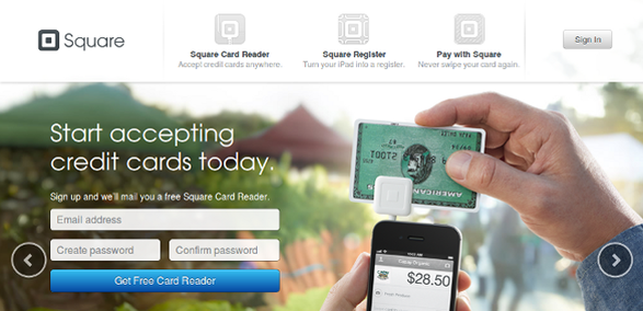
It’s a wonderful strategy to boost conversions to provide your customers with something they actually desire. If you’re successful, your call-to-action (CTA) will not need to be very unique or interesting, as shown on this Square landing page.
Why it Works
- From the start, this landing page targets small-business owners by emphasizing the advantages of adopting Square’s solution: the ability to take credit cards for transactions, something many merchants had been unable to do before its introduction.
- As long as the word “get” is included in the CTA, it’s likely to be effective across a wide range of industries. Because Square doesn’t charge for its product, many potential customers will be truly surprised, which strengthens the perceived value of the offering and makes it more enticing.
- When it comes to landing pages and CTAs, this one wins because of the simple form (just three fields), a strong indication of possible value (“Start accepting credit cards now”), and a fantastic offer (a free Square card reader).
Basecamp
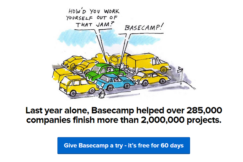
Basecamp, the project management software platform, is all about making things simple for the user. Basecamp is designed to make project management easier for everyone, from the people who use it to those who create it.
Free trials are still a successful CTA, but there are several minor variations in Basecamp’s CTA that make it stand out:
Why it Works
- In Basecamp’s CTA, the risk-free element of the free trial is reinforced while persuasive language is used informally. A less frightening alternative to “Start Free Trial Now” is “Give Basecamp a try.”
- It’s as though the CTA has a casual attitude as if to say, “What’s the worst that can happen?” Because they are sure that consumers would use (and love) the software, Basecamp does not need to make an aggressive offer with a somewhat confrontational CTA, which is precisely what they are attempting to achieve. That was really astute of you.
My Perfect Resume
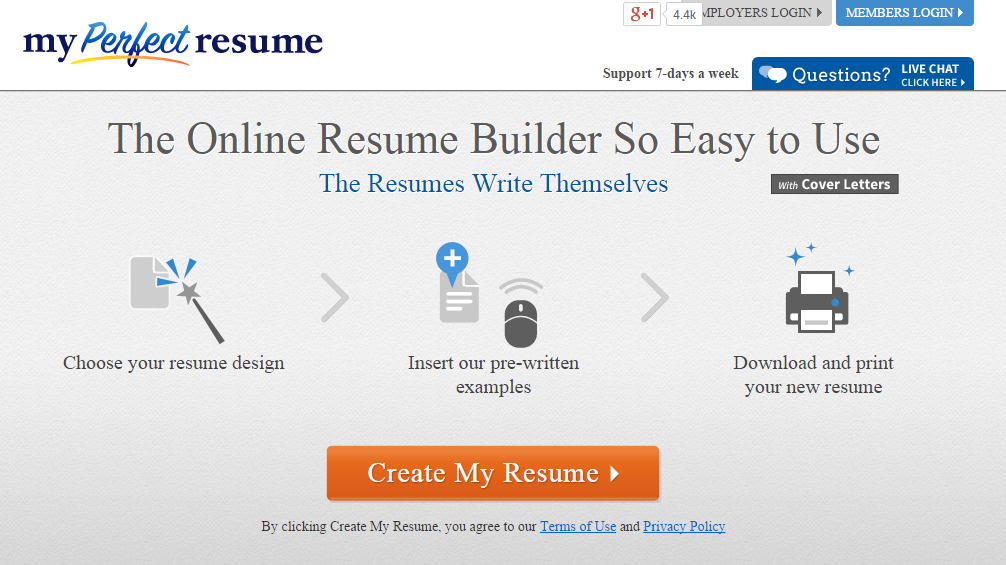
Crafting a resume from the ground up may be a real pain in the rear, and My Perfect Resume takes full advantage of this by offering a great service.
Why it Works
- It doesn’t get much simpler than this when it comes to a straightforward call to action. The step-by-step pictures above it, though, make it exceptionally clickable.
- There’s a strong likelihood that My Perfect Resume performs most of the job for you, which makes clicking “Create My Resume” an especially alluring option for those who don’t have the time or interest to construct their own resume. Simple CTA paired with graphical components creates a powerful combination.
Point Blank SEO
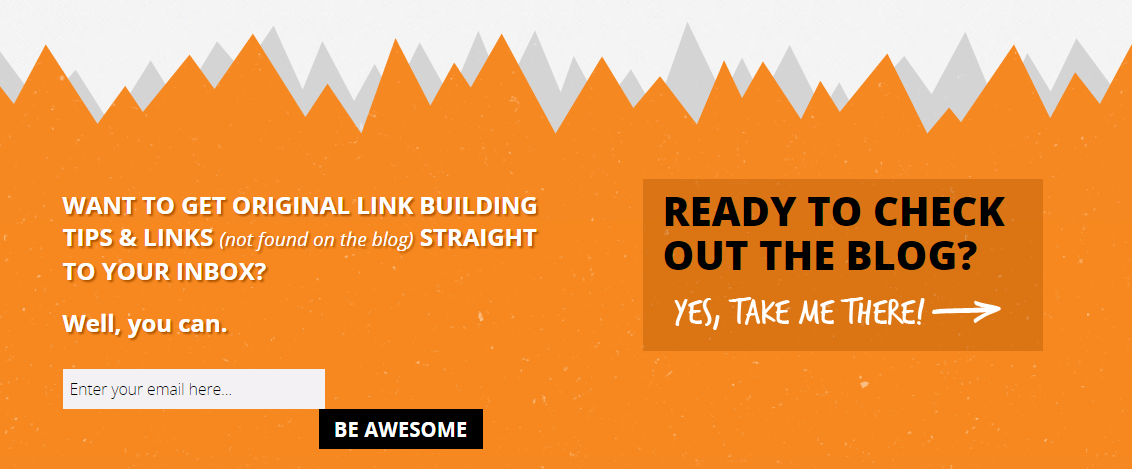
CTAs for newsletter signup might be challenging. Yes, you want consumers to “Sign Up,” but urging them to do so is, well, dull. If you’re having trouble increasing the number of people who read your newsletter, take a cue from Point Blank SEO.
Why it Works
- Several factors contribute to the effectiveness of this CTA. It’s refreshing to see a “Sign Up” or worse, “Submit” button replaced by something more enjoyable and entertaining. After all, who doesn’t want to “Be Awesome?”
- To begin with, it establishes a sense of urgency and timeliness by utilizing an innovative method to ask for action. Additionally, the link to Point Blank SEO’s blog is highlighted with an exclamation point, creating excitement about a straightforward navigational feature. Last but not least, using a striking color combination of orange and black helps to draw attention to the CTA and provides a clear navigational indication to the blog.
KISSmetrics
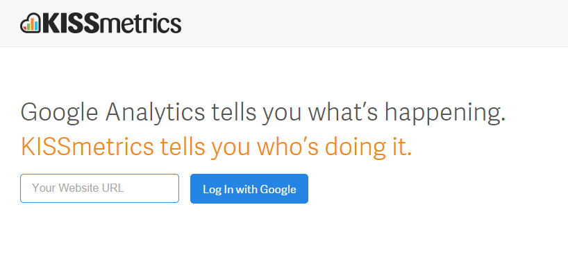
It would be impossible to write about calls to action without discussing KISSmetrics. Another simple yet effective call to action comes from the KISSmetrics homepage: “Sign up for our newsletter now!”
Why it Works
- To keep things simple, KISSmetrics’ homepage doesn’t go into great depth about all of the platform’s features.
- This CTA is very effective because it asks the user for little more than a URL to work. When a user clicks the “Log in with Google” button, it immediately tells them what to anticipate and makes it incredibly simple for them to begin. The explanation text’s wording also works to stimulate users’ interest, and the mention of Google underlines the prospects’ need for security.
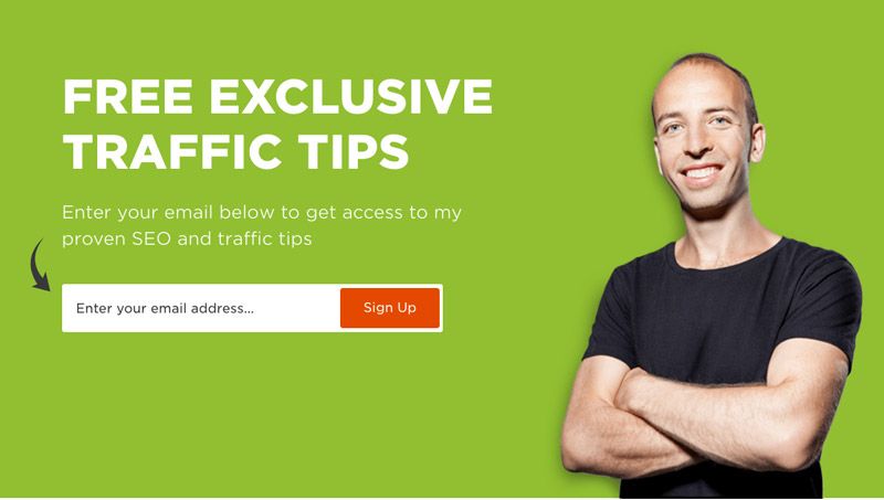
Quick Sprout
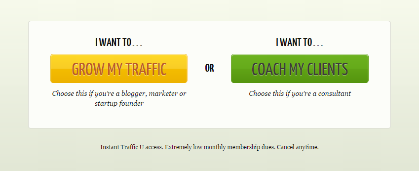
Neil Patel’s Quick Sprout is another motivational call-to-action example.
Encouraging visitors to interact with instructional material, like newsletter sign-ups, may be difficult, especially when this traffic isn’t always a qualified lead right out of the beginning. While this does not devalue them, it does necessitate a different attitude.
Why it Works
- Rather than relying on complicated CTAs, Quick Sprout makes use of two basic CTAs that are incredibly effective in driving traffic.
- It appeals to a potential customer’s desire to drive more “selfish” traffic to his website. When you click on this CTA button, a suggestion appears based on the sort of user you are.
- Through emphasizing the benefits that agencies and consultants may derive from learning, the second CTA highlights the value of Quick Sprout’s educational material. Because it indicates that users may make themselves more helpful (and necessary) to their clients by reading, Quick Sprout’s content they are more motivated to improve their work performance and earn a higher salary. This is a win-win situation for both parties. It’s all really well thought out.
Klientboost’s Newsletter
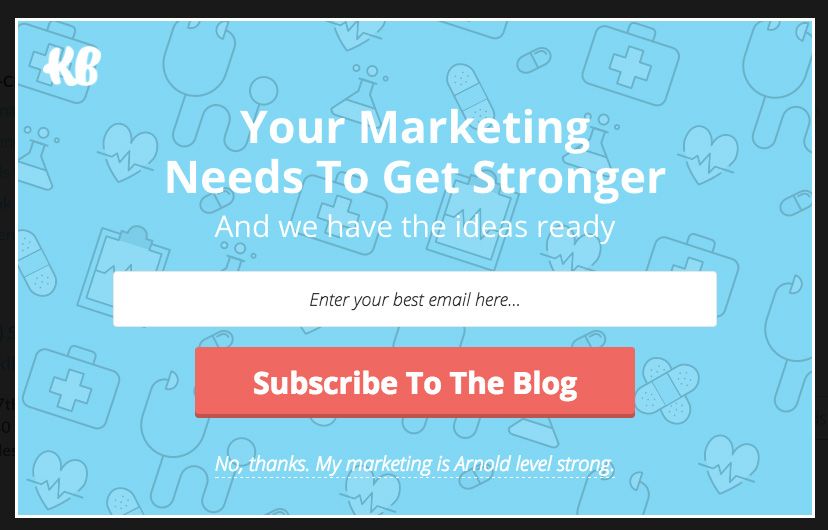
As you can see, Klientboost’s newsletter page has the most effective call to action, as the copy on that page states clearly what the visitor should do next.
Every single one of these is dependent on what happens when the user clicks on the CTA.
Why it Works
- A pop-up that has been thoughtfully created.
- CTA that is both crystal clear and conspicuously bold.
- The statements made by CTA are succinct and to the point.
- WCAG requires a minimum contrast ratio of approximately 3:1 for visuals and user interface components, which is why the CTA button is red. This contrast ratio improves the aesthetics of your website while also persuading the reader to go through with the call to action as well.
Backlinko
The absence of contrast between the CTA and the webpage backdrop is one of the most common beginner’s blunders that marketers make when creating their CTAs. Conversion rate optimization dictates that the color of your call to action (CTA) should stand out against the backdrop and everything else on the page.
Why it Works
- In addition, the CTA is easy to spot thanks to the bright red hue. Red is the only color that isn’t used anywhere else on the page.
- Although it lacks directional indicators, the stark contrast ensures that the crimson sign-up button will capture your attention almost immediately.
ConversionXL
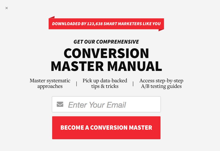
This newsletter subscription example from ConversionXl’s call to action is unique due to the following reasons:
Why it Works
- The page’s bright red call to action (CTA) stands out against the rest of the design.
- It’s preferable to use benefit-oriented phrases like “become a conversion master” instead of generic CTAs like subscribe.
- Because it already includes a benefit-oriented phrase, consumers will be more likely to convert because they’ll be anticipating the value they’ll receive.
- With the aid of facts and praise, the CTA encourages visitors to sign up for the newsletter so that they may join the 123,638 other clever entrepreneurs who have already signed up. The numbers help build trust with your visitors, and the inclusion of the term “praise” encourages them to do the same.
Blog Growth

The language you choose and the way you position your content will have a big impact on how many people click on your CTAs. In this example of a call to action,
When it comes to content upgrades, the word “free access” has been replaced by “free lifelong access.” You should use this for your CTAs since it will do better in A/B testing.
Why it Works
- It boosts your product’s perceived worth.
- Increases the conversion rate by making the upgrade’s content more interesting.
Stripe
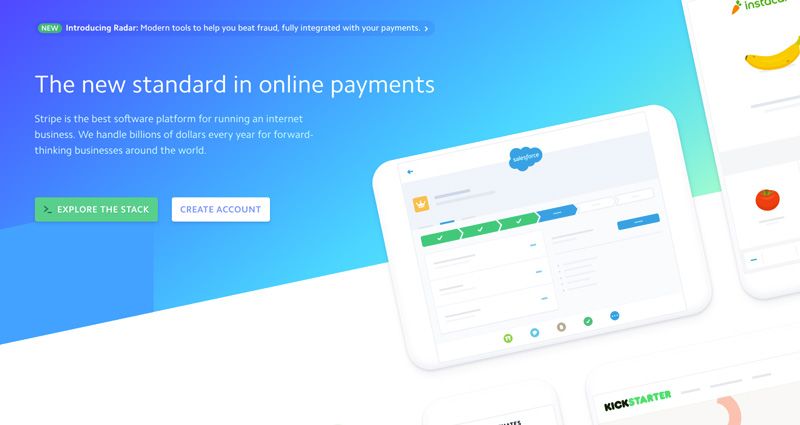
There should only be one CTA for each group of your audience on the finest landing pages that include CTAs to prevent the paradox of choice and ensure that numerous CTAs per page do not have a negative influence on your conversion rate and consequently your net sales. You may, however, have two CTAs on a single page to cater to a variety of your target demographics. This example of a call to action contains just that.
As you can see, there are two CTAs on the homepage of Stripe: one that encourages visitors to navigate the app if they are unfamiliar with it, and another that encourages them to sign up and get started right away.
Why it Works
- You can both discover more about the product and get started using it.
- Both CTAs use a variety of colors to emphasize their respective roles.
- The call-to-actions (CTAs) use straightforward language that is differentiated based on their purpose.
- Curiosity is piqued by the wording used in the CTAs, and the placement of two CTAs side by side further encourages it.
Ancestry
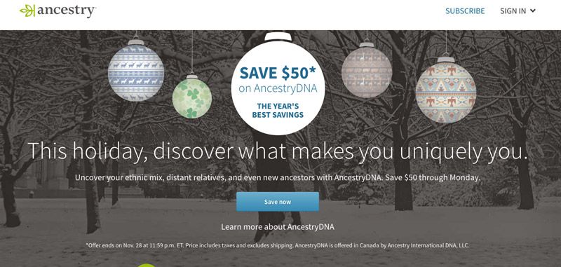
Having your text header and CTA content together is another way to improve your conversion rates. Special deals, product launches, and many other situations call for this to be extremely helpful.
On the offer landing page of Ancestry, this call to action example is a good illustration of the same because:
Why it Works
- Their use of the “save now” CTA served to reinforce the discounts they were giving. These CTAs might alternatively be called “notify me” or “remind me,” for example.
- Just above the call to action (CTA), the value being given is underlined to ensure conversions.
- The CTA instills a feeling of urgency by emphasizing the offer’s expiration date.
- Because of this, the users will be more interested in what they have to give.
Feedly
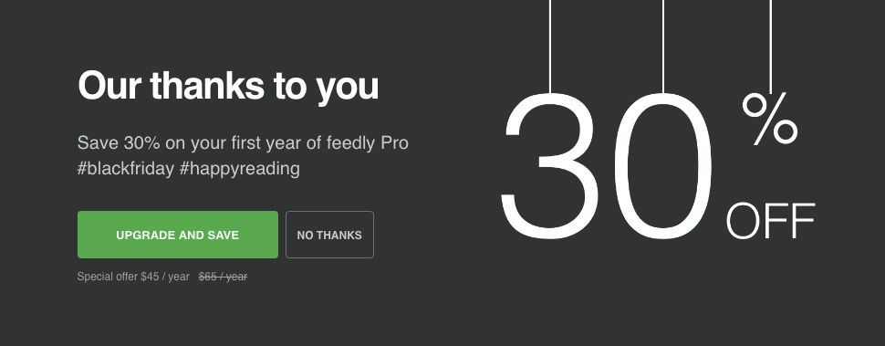
While landing pages funnels and overly complex calls-to-action might work, they’re not always the best option. As basic as this Feedly example of a call to action, but still quite specific.
Why it Works
- It combines the two advantages it has to offer: an upgrade activity that also saves money.
- As a result of this two-fold incentive, consumers are more likely to convert.
- The call-to-action is highly relevant to the page’s offer, so your viewers won’t be turned off by unnecessary content.
- The CTA button adheres to WCAG’s color contrast guidelines of a 3:1 contrast ratio, grabbing the attention of visitors as soon as they arrive on the website.
- Below the CTA button, you’ll see the original price as well as the offer price, which emphasizes the advantages your potential consumers will be able to take advantage of.
BMO
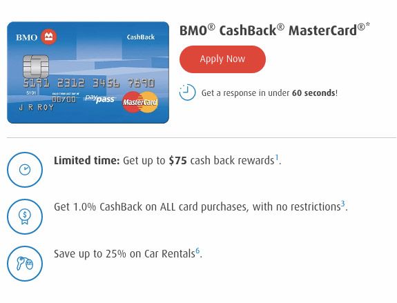
The surrounding regions are a crucial consideration when creating CTAs. They will have a significant influence on your CTAs’ performance, therefore they should be optimized and supported in the same way this call to action template has been.
Why it Works
- With the phrase “apply immediately,” the CTA is direct and action-oriented.
- The CTA button matches the contrast ratio of the homepage, with a white backdrop and blue components, except it is red.
- It focuses on a single product and emphasizes the most important features that will entice potential clients and enhance the likelihood of a sale.
- There is a disclaimer in the CTA that reads, “receive an answer in under 60 seconds,” which removes any concerns consumers may have about the length of the application process.
- Your users will feel compelled to act immediately if you utilize the phrase “limited time.”
- The feature of “no limits” on cashback adds value for your customers.
Neil Patel

Neil Patel’s site, where he encourages his readers to learn more about his training and consulting services, is another excellent example of a product CTA.
Why it Works
- Sign up and subscribe now are high CTAs, but “learn more” is an easy ask from any user. In fact, this CTA has a higher conversion rate than the others since it encourages the customer to proceed through your sales funnel.
- The call to action is in striking color contrast to the rest of the design.
- This CTA has been repurposed as a way for consumers to learn more about him and his offerings, thereby decreasing friction and increasing traffic to his following landing pages.
- In the form of “….. helped me expand my business by 300 percent,” the testimonial of Alana Mitchell- a business wonder- is something that can once again earn the confidence of your audience, improve brand recognition, and increase your conversion rates.
Qualaroo
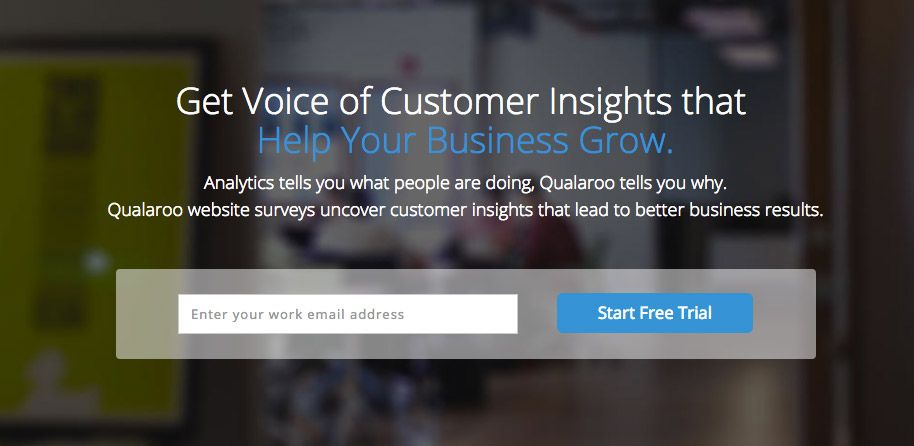
A call-to-action (CTA) should aim for the best possible conversion rates to boost sales and, ultimately, profit. This example of a call to action was created with that in mind.
Why it Works
- Users may join up for a free trial right from the site, where the CTA is prominently displayed.
- Because they are more likely to click on email marketing links if they use their work email address, it asks for it. As a result, your business email address is more likely to be compromised than your personal email account.
- A good combination of colors and the size of the button help make the call to action stand out.
- For this reason, users are less likely to misunderstand and leave the page when it is presented prominently on the homepage with a clear indication of what will happen when they click on it.
- With two lines of justification for why the company’s product is superior and how it would benefit you, the CTA calls attention to itself. The words chosen have both authority and persuasiveness working for them.
Pipedrive
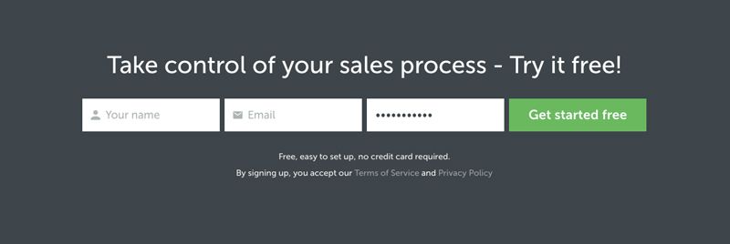
There is an easy-to-use form at the bottom of Pipedrive’s product pages that encourages customers to join up for a free trial.
Why it Works
- The shape is perfectly situated in the desired location. It’s the last thing potential consumers see after they’ve read through all the product details. Thus, they’re more likely to convert if you make it easier for them to do so. In addition to good lead management, the location of the form followed by a free trial has a greater likelihood of moving them through the sales funnel more quickly.
- The form’s password field comes with a pre-typed default password that may be changed by the user. As a result, they spend less time filling out the form and are more likely to convert.
- CTA is “get started free,” which not only gets people to take action but also takes away any hesitation about joining up because it is free.
- Because the CTA button’s color stands out from the rest of the page’s design, people are less likely to overlook it.
AWeber
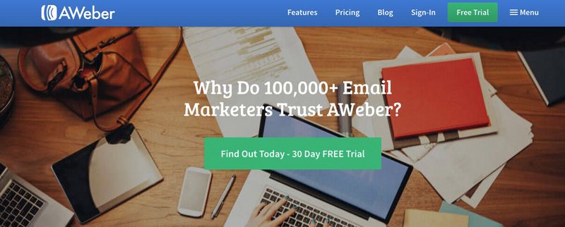
Any website or blog post should follow the guideline of answering a question as soon as it is posed. When you ask a question, you capture your visitors’ attention and pique their curiosity, which increases the time they spend on your page.
Why it Works
- Besides including data, its title also poses the question, “why do 100,000 email marketers trust AWeber?” This grabs the attention of the audience, earns their trust, and piques their curiosity.
- CTA “find out today- 30-day free trial” provides the solution to the inquiry asked before.
- The headline and call-to-action (CTA) are combined in such a way that they demonstrate the value they have to give their consumers.
- The call to action (CTA) button is large and stands out against the background.
Razorsocial
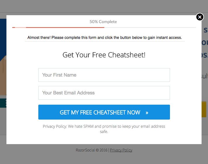
CTAs are all about the small details that increase conversion rates since it is these details that optimize your CTA. All of these aspects can be seen in this RazorSocial content upgrading call to action.
Why it Works
- Their form is small, but it contains everything required for further conversions and marketing.
- It has a contrasting blue CTA pop-up that is clear and action-oriented.
- The CTA text reads, “Get my free cheatsheet immediately,” with the word “now” successfully conveying a sense of urgency that will boost conversion rates.
- The tiny arrow on the right of the CTA boosts your conversion rate significantly as well.
Marie Forleo
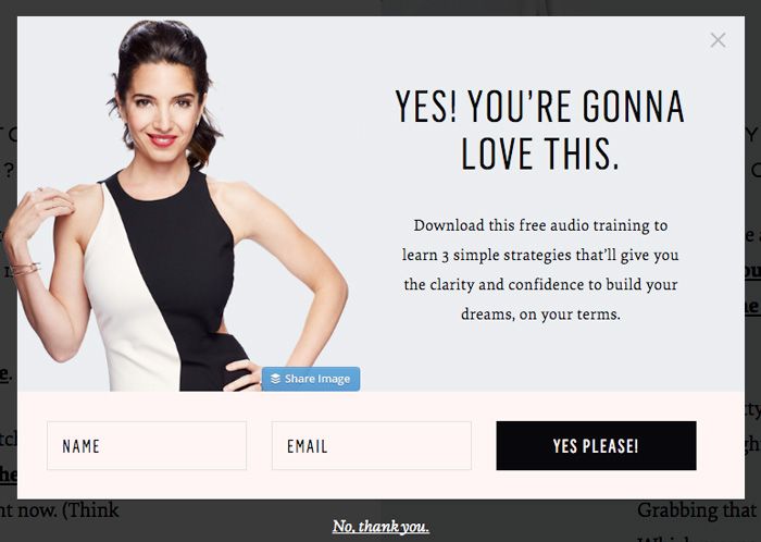
You’ll learn what works and what doesn’t by doing CTA A/B tests. The benefits of using these insights include increased conversion rates, lower operating expenses, and improved cash flow. Marie Forleo’s example of a call to action utilizes this knowledge into its overall CTA design.
Why it Works
- The text “yes please” on a black CTA button resonates with her target audience.
- In accordance with your brand style and positioning statement, the CTA text and copy are consistent.
- To make things even easier for users, the tactics presented are referred to be “simple,” which gives them further confidence after signing up for the audio training program that they would get value from it.
- Because the headline opens with “yeah, you’re going to adore this!” your conversion rates will rise as a result.
- In keeping with their target audience, the CTA pop-up has a friendly, conversational tone.
When I Work
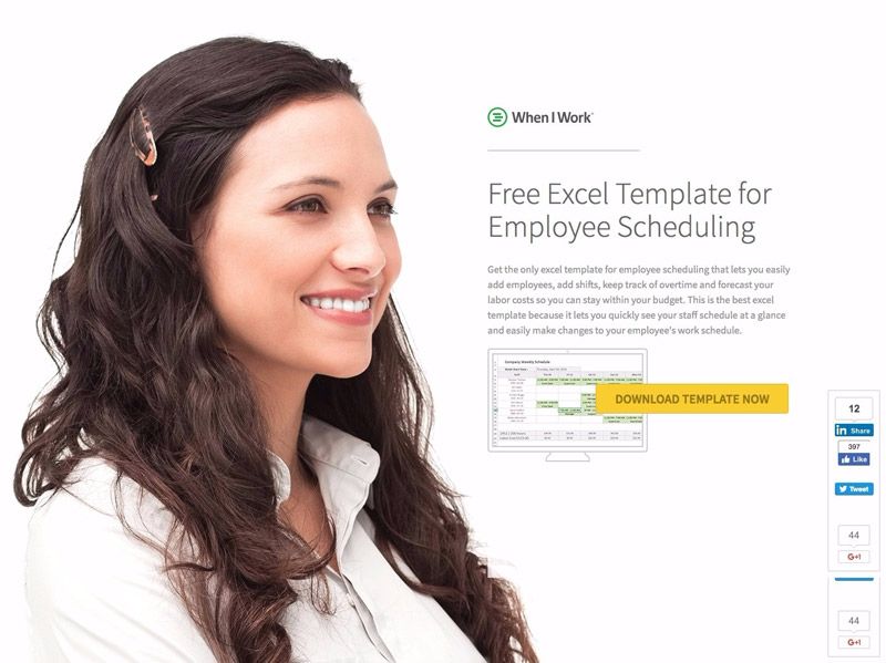
Your call to action (CTA) will most likely be found on a specific landing page. More conversions and better quality leads have been obtained using this method. In this example of a call to action, a free excel framework is being offered as a content improvement in exchange for a full landing page.
Why it Works
- The female model in the lead image is staring directly at the landing page’s headline, ensuring that it will be the first thing you read.
- The title instantly directs the user’s attention to the yellow CTA button, which reads, “Download template now.”
- When the CTA button’s wording is specific to a page, it lets the user know what to expect when they download it and how much value they’ll get out of it as a result. By doing this, you’ll reach a more targeted audience, which will result in more sales and, thus, a higher operational income-to-expense ratio.
- A short statement on numerous characteristics of the template is written directly above the CTA button and can be used to your advantage. A similar advantage is provided by this as stated in the preceding section.
- Linkedin, Facebook, and Google+ all include social media sharing panels that indicate how many people have shared the template on each platform. It’s possible to tweet it as well. A testimonial next to a call-to-action button will have the same impact as a social panel on your visitors’ trust in you.
Salesforce
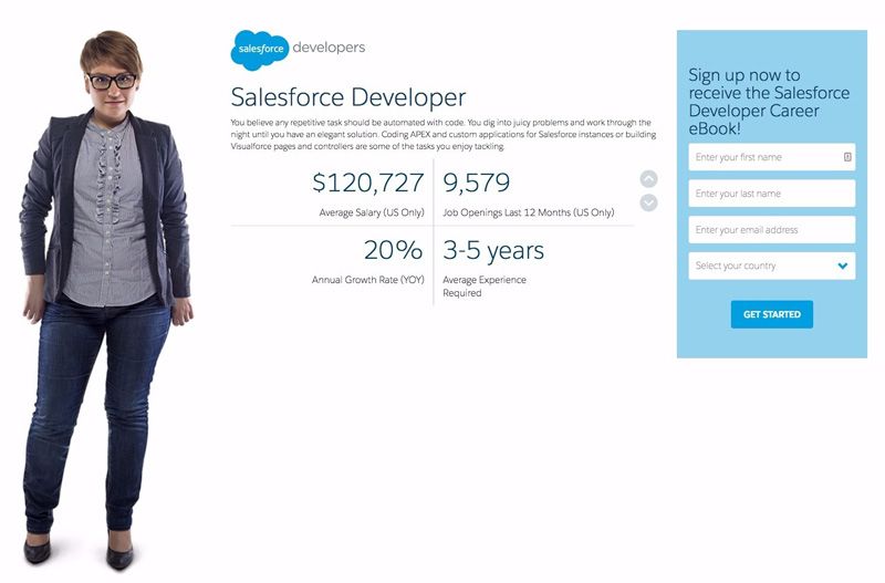
An eBook landing page that targets a specific persona is a terrific example of a call to action.
Why it Works
- As a result of what you’ve demonstrated about the book’s substance, readers are even more enthused about reading it. More people will fill out the form as a result, which will increase the number of conversions.
- It has been found that the CTA text “get started” is one of the most effective call-to-action in all industries. Since this is the case, begin by testing a “get started” call to action on your landing page if you’re still unsure.
- As a result, the CTA form is laid up in such a way that it provides clear instructions on the next steps and what to expect once you have “get started.”
- The only blue block on the website is the CTA form and button color, which immediately catches the attention of visitors.
- The data, which is given in clear language below the CTA form and button, help to back up the call to action. All of this is done to keep visitors on the website and increase conversion rates by preventing them from leaving.
Lemonstand
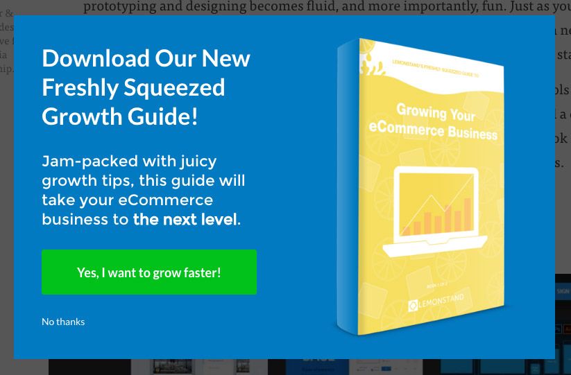
As we’ll see in a moment, the example of a call to action contains casual writing, pleasing colors, and a general CTA format and layout that engages its target audience.
Why it Works
- CTA text “yes, I want to grow faster” explains the user’s main pain problem and how this guide can help solve it.
- In order to make your font stand out from the blue background, we’ve used a blue background for the CTA button as well as a yellow book to attract attention.
- The color scheme is soft, peaceful, and upbeat, all of which will compel your site visitors to download the eBook when they see it.
- For this reason, the call-to-action button is extremely large.
- It has a conversational feel to it because of the informal and playful tone, which keeps visitors interested and even persuaded.
Masterclass Webinar

There’s a nice contrast between the call to action (CTA) and the remainder of the page on the webinar page.
Why it Works
- The call-to-action (CTA) text is emphasized to indicate it is a worthwhile link to click on.
- The call-to-action text used is “reserve my seat,” which is a typical call-to-action text for webinars because they tend to do well.
- Because of the urgency created by the CTA text, your visitors will be more likely to sign up right away, resulting in increased conversion rates. There’s a good chance they’ll put off signing up until later if they don’t get that immediate gratification.
- Visitors will have a positive initial impression of the webinar if they see a picture of a smiling, kind, and open-minded female model in it.
- “Free live masterclass” is a popular headline for webinars since it emphasizes the free nature of the event. These are the types of webinars that will have a greater chance of drawing a large audience. As a result, the header keeps your readers interested and encourages them to make a purchase.
- There is a CTA button after the title and before the value that attendees will receive from the webinar. As a result, the number of conversions rises once more. Another advantage of this is that even if their readers hold off signing up for the webinar until later, the advantages will keep them interested.
Final Thoughts
When your call-to-action button is clicked, quality leads and customers will be generated for your business via your landing page, contact us page, promotional banners, sales text, and PPC ad campaigns.
If all other aspects are well-optimized for your consumer base, a greater click-through rate will almost certainly lead to a higher conversion rate.
Keep in mind that your blog’s traffic isn’t an issue. Getting the appropriate individuals to click on the “Order” or “Add To Cart” button is a key issue when creating a lucrative blog, sales funnel, or product.
Even if you only persuade a few individuals each day to do this, you will notice a steady increase in sales.
Remember to test your call-to-action messaging, content, and button design whether you’re generating search engine traffic or social media referrals.
When it comes to crafting an effective call to action, there are no hard and fast rules. You can only be certain of what works by experimenting with many versions.