Table of Contents
Instead, you provide valuable information to win people’s confidence until they are ready to make a purchase. This method is effective, as shown by 71% of business-to-business marketers who believe they gain from lead nurturing.
As an illustration of what this looks like in reality, we’ve compiled lead nurturing email examples. Let’s get started.
Inspiring Lead Nurturing Email Examples
Zapier
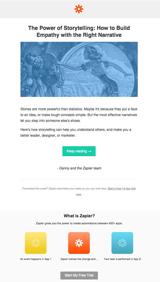
Zapier facilitates the connection of your favorite applications with one another. Like Simple Green Smoothies, you may automate tasks such as adding new customers from Shopify to Autopilot to nurture them towards their next purchase.
Zapier does an excellent job of catching the reader’s attention with attention-grabbing text in this lead nurturing email sample.
Zapier’s approach seems similar to the ideal lead nurturing email, with a section containing a call to action urging the lead to sign up for a free trial with the company. However, have you ever noticed how the blurb for the article takes up the bulk of the email? In this way, the “What is Zapier?” section at the end of the page becomes a non-intrusive commercial that has earned the right to be there.
Consider what would happen if the firm sent out an email every five days that was just about Zapier and had no helpful information. It wouldn’t be a delightful experience. So instead, every value-adding lead nurturing email Zapier sends is an additional opportunity to develop trust and raise the number of free trial signups on the site.
Shopify
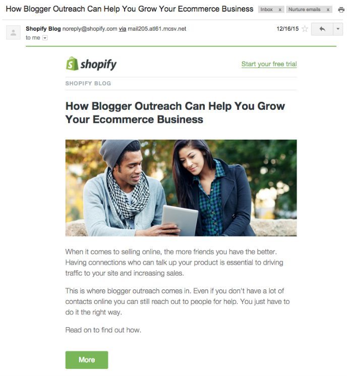
Shopify makes it simple to start up an online shop, and the firm also regularly publishes top-notch marketing and small business suggestions on its blog. In addition, its blog is a treasure mine of information that may be used for lead nurturing.
The email is similar to Zapier in that it concentrates on pitching a single article. That’s all there is to it. However, rather than include a separate section regarding signing up for a free trial, Shopify provides a text link that says “Start your free trial” in the upper right-hand corner of the page. It’s a subtly worded call to action, enticing readers to join up for anything.
Quick Sprout
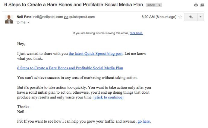
Neil Patel of Quick Sprout came up with the idea for our first text-based lead nurturing email sample.
It’s written as though it were a personal communication from Neil to the reader. There’s no sizeable main picture, and there’s no business branding. His call to action is comprised of four items, three of which are hyperlinks to the article. Neil’s client acquisition webinar is linked in the postscript, the next phase in the buyer’s journey for this particular customer. What is the takeaway? You don’t need a flashy design to keep your leads at the forefront of your thoughts.
Vidyard
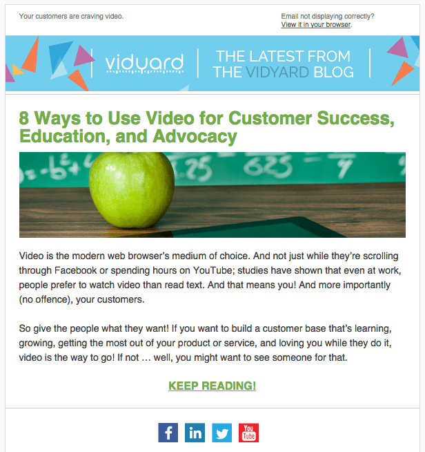
Vidyard is a video marketing platform that assists companies in converting viewers into paying customers via video marketing. People may sign up for a free trial on the Vidyard website, but there are also a lot of call-to-actions that direct them to request a demonstration. In addition, there is no indication of cost on the website. Even while this may be irritating to some, it eventually encourages customers to call the sales staff. According to the company, the firm is an excellent B2B example of using nurturing to check in with leads who haven’t indicated that they’re ready to purchase yet.
Because there is no call-to-action to sign up for a free trial or interact with sales, I’m curious as to what occurs once readers click through to continue reading. Are they retargeted in the same way that they were throughout the digital marketing journey? Is a behavior-triggered message sent to them to schedule a meeting with sales? If so, do they go to the next level in the lead nurturing content funnel? Aside from that, have you begun to see a pattern in these lead nurturing email examples? Companies often concentrate on a single primary content and add a call-to-action to encourage visitors to return to their website. It’s a straightforward formula that is effective.
Lincoln Murphy
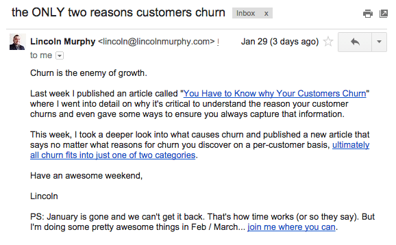
Due to Lincoln Murphy’s extensive experience working with over 300 SaaS organizations to improve the customer lifecycle. He has a wealth of relevant information to share with prospective customers via nurturing emails.
Lincoln includes two links to the article and one call-to-action in the postscript, which is a nice touch. Unfortunately, he does not address the recipient by name or provide a greeting – there is no “Hi Brian” or “Hey” in his email, as there is in Neil Patel’s. This de-personalization vs. personalization comparison would make for a fascinating conversion optimization experiment to do.
Canva
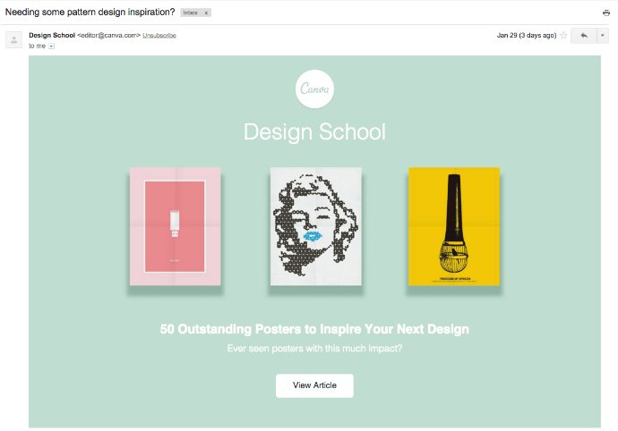
Canva is a tool that allows individuals to create visually appealing graphics and documents. The firm offers a web application, an iPad application, and the “Canva button,” allowing consumers to create designs. I enrolled in their Design School to keep in contact with them.
Canva’s email has less content than the previous samples and instead focuses on attracting the reader’s attention with a visually appealing design. The posters serve as an attractive teaser to encourage you to read the whole article.
The “Ready to create with Canva?” call-to-action at the bottom of the email is not visible in the screenshot, which encourages you to do so. Instead, in the same way, that Zapier and Shopify do, the firm utilizes this as a chance to welcome leads into the platform who haven’t already done so.
EMyth
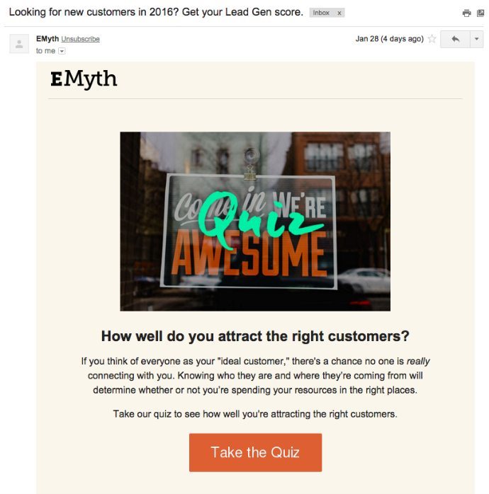
EMyth advises small company owners on systematizing their operations (you may be interested in reading their founder’s book). Since hiring a coach to walk with you on your entrepreneurial path is a significant choice, it makes sense for the organization to provide excellent material over time to win leads’ confidence.
Instead of an essay, the email addresses a subject that many small company owners deal with: “Am I attracting the proper customers?” The question is answered with an interactive quiz.
So I went ahead and took the quiz (if you’re searching for a program that allows you to build quizzes, check out Kuia). However, to access my findings, I had to provide my name and email address. As a result, EMyth has devised a creative method of identifying and engaging with sales-ready prospects.
Neville Medhora
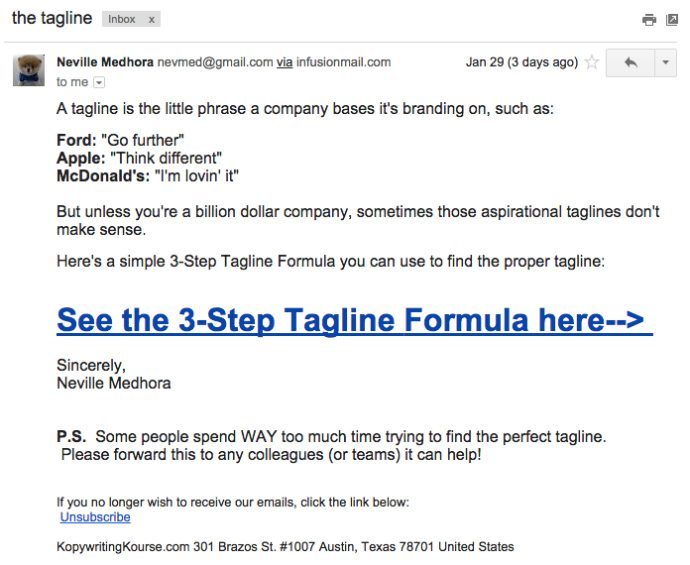
I couldn’t help but add Neville Medhora to this list because he deserves it. The Kopywriting Kourse is his main product, and he sends out the most humorous, frank, and intelligent articles possible.
The subject line reminds me of an email I’d write to a buddy since it’s essential and has no marketing fluff to distract from the message. As with Lincoln’s last email, there is no personalization here. Furthermore, the call-to-action to see the content is challenging to overlook. It’s a fast and straightforward text-based lead nurturing email that anybody can send.
Framebridge

You don’t have to make all of your lead nurturing emails commercial in nature. However, engaging receivers will result in purchases, so giving them something they’ll want to open and read is critical. Framebridge does something in their nurturing emails that are pretty effective: they educate their subscribers. By imparting a valuable skill to the reader, they are delivering value in return for a request from their intended receiver (reading the guide).
It’s also worth noting that they only have one clear call to action – “Educate Me.” This is also worth noting. The use of one call-to-action (CTA) in an email, according to WordStream, may boost clicks by 371 percent and purchases by 1617 percent, respectively.
Casper
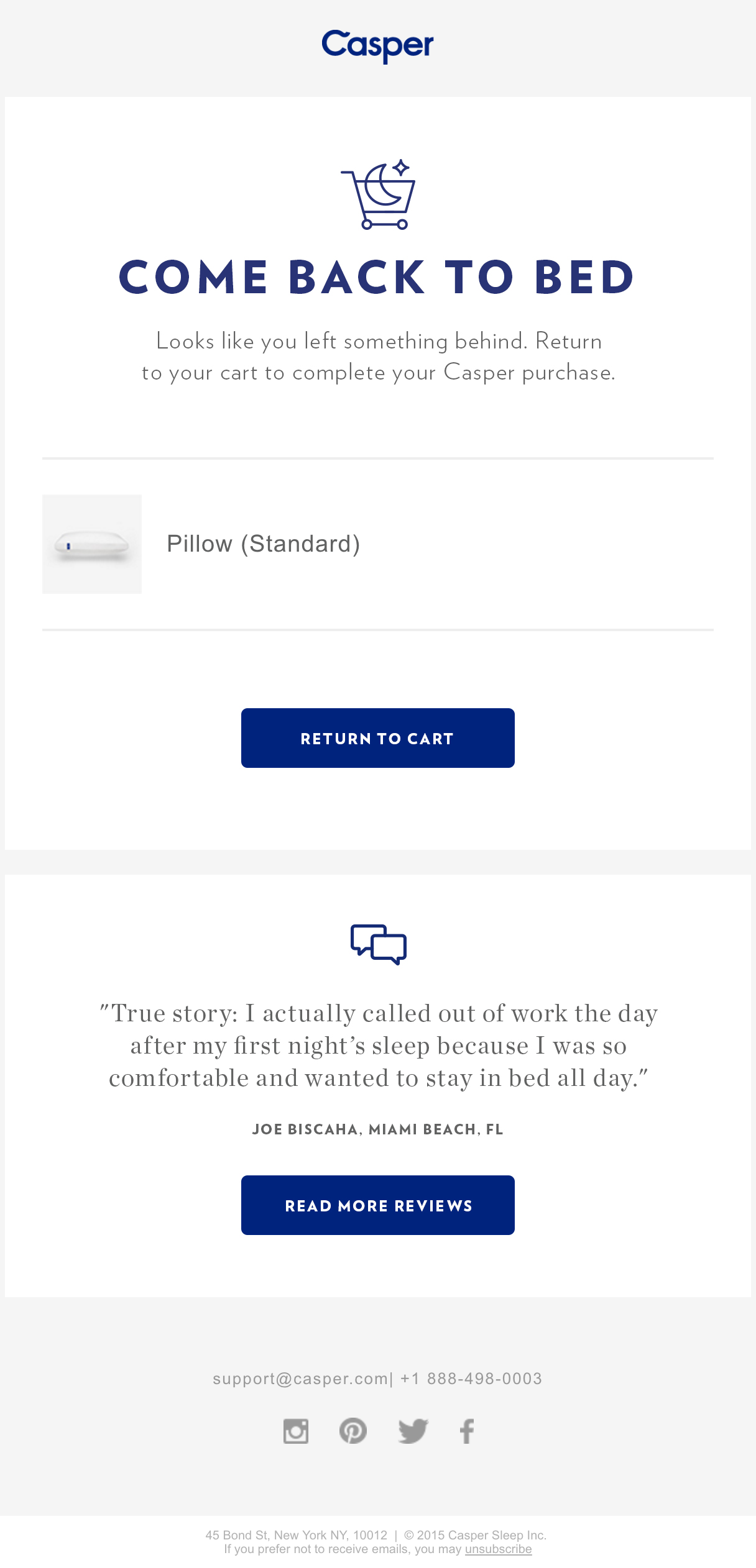
Your product is just as good as the reviews it receives; in fact, the majority of buyers read reviews or testimonials before making a purchasing decision. So in this standard abandoned cart email, Casper includes a humorous customer testimonial to lend a little social proof to the message.
Ingenious and to-the-point, Casper’s abandoned cart email captures the attention of the recipient. It asks the reader if they’d want to revisit a cart they’ve previously put items to, displays what they were shopping for, and gives two straightforward call-to-action.
Sephora
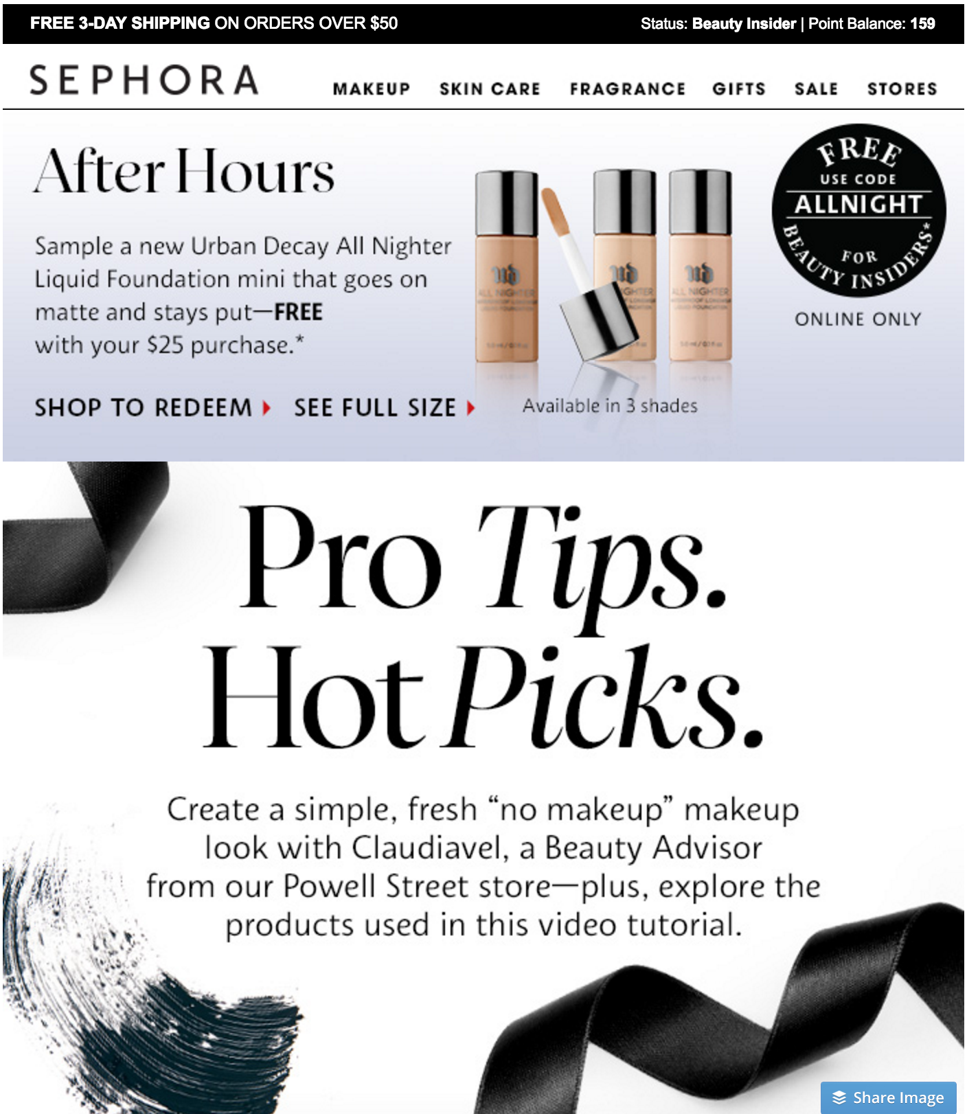
When it comes to visual goods, video is a fantastic tool for expressing and explaining. With each product offering, Sephora also offers a humorous video from an employee that incorporates instructional material. They have many calls to action, but the primary emphasis is on the reader watching the instructional, which is beneficial. A visually appealing email for a visually appealing company captures your attention while also showcasing the items freshly and intriguingly.
Litmus

According to Epsilon, triggered email communications generate a 67.9 percent higher open rate and a 241.3 percent higher click rate than conventional email messages. In addition, as a result of using a person’s behavior, such as downloading information about email processes and then sending them a relevant email, the system will operate effectively in most situations.
Take a look at this excellent example from Litmus, which explains how to utilize intelligent, straightforward language to offer readers a relevant email that also adds value.
Uncommon Goods

Uncommon Goods places its items in a natural setting and organizes its website into sections inspired by Pinterest for each distinct look. In addition, each collection includes a prominent call-to-action (CTA), and the email is designed to seem more like a curated pinboard than a sales email.
It’s worth mentioning that this email is also very mobile-friendly, which may play a significant role in the success of an eCommerce lead nurturing email: According to Litmus, mobile devices are used to open 56 percent of all emailed messages.
Chubbies
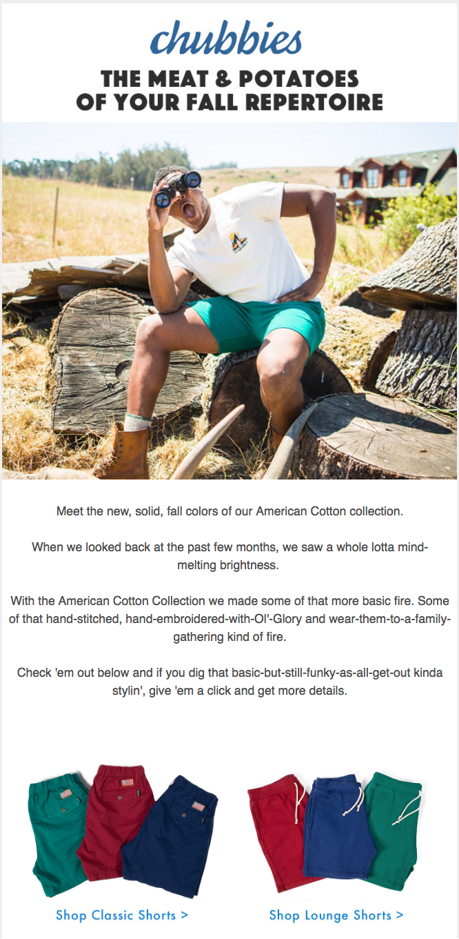
Chubbies is well-known for their sly marketing, and their emails do not fail to live up to their reputation. With over 1.68 million Facebook Likes, they prioritize the social and entertaining aspects of their material. Users’ submitted material, promotions, and general hilarity are all included in their email newsletter, which is sent out regularly.
This email, which is both information and half entertainment, encourages its recipient to enjoy reading it even if they do not intend to purchase anything at the time. The language is relevant to its target demographic, the images are consistent with the brand, and there are many call-to-actions (buy clothing & follow on Snapchat).
JetBlue

JetBlue’s email copy is among the finest in the business. Although this email is humorous, informative, and full of excellent puns, it demonstrates JetBlue’s dedication to engaging and keeping consumers via email. A primary goal of JetBlue’s email marketing is to convert existing or former consumers into TrueBlue members, as seen in the example below.
Airbnb
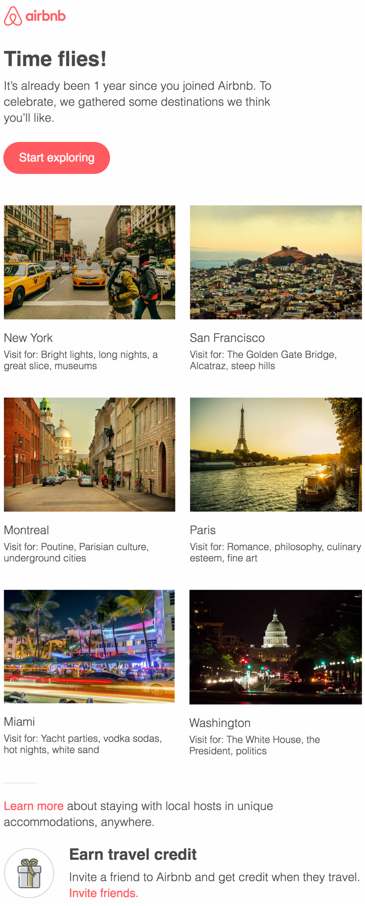
Airbnb’s emails are written with one objective in mind: to instill a sense of wanderlust in its recipients.
This email has a clear call to action (CTA), which showcases gorgeous holiday places and does not require much of the receiver. Not to add that business anniversaries are usually an excellent time to reach out to subscribers without coming off as pushy or intrusive. Instead, it has a personal and selected vibe to it.
Handy
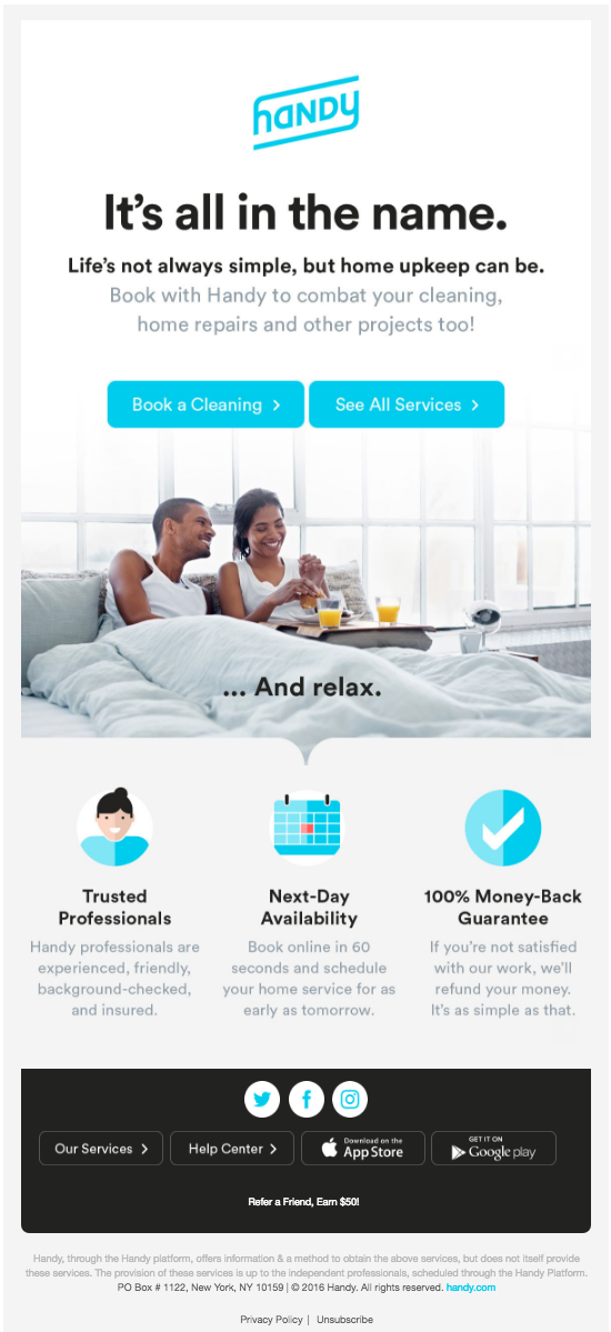
Its simple and effective appearance is due to the use of apparent buttons and information about the service, as well as a great picture. More precisely, the use of a photograph of happy customers is a wise decision for two reasons:
- It contributes to bringing attention to their product’s impact on individuals who purchase it: happiness, for example.
- According to VWO, human images convert at a rate that is 95 percent greater than that with object photos.
Freelancer

As a sucker for a good illustration, Freelancer’s design quickly drew my attention. I was impressed. They demonstrate the worth of the service with a graphic and then make a straightforward request in the CTA: “Get Started Today.” Suppose you can align graphics in your email while also teaching your readers. In that case, the message will linger with them for a more extended period and significantly influence their behavior.
Skillshare

This email from Skillshare begins with a kind reminder to its readers that their trial period is about to expire – a thoughtful step that will ideally result in a renewal or purchase from the company.
An inconspicuous, proper CTA for different educational courses is shown beside the reminder. It’s important to note how the essential, attractive boxes stand out as an alternative to the typical button design.
Thrive

According to research, an individual who hears anything will recall 10% of the material three days later. However, when the information is presented with a related visual, individuals retain 65 percent of the knowledge three days later. Thus, the image superiority effect is the term used to describe this notion.
Thrive makes use of this notion to its advantage via the usage of product photos on its website. Additionally, there is a strong emphasis on appealingly highlighting their items, including substantial material, and encouraging the reader to purchase.
Dunkin’ Donuts
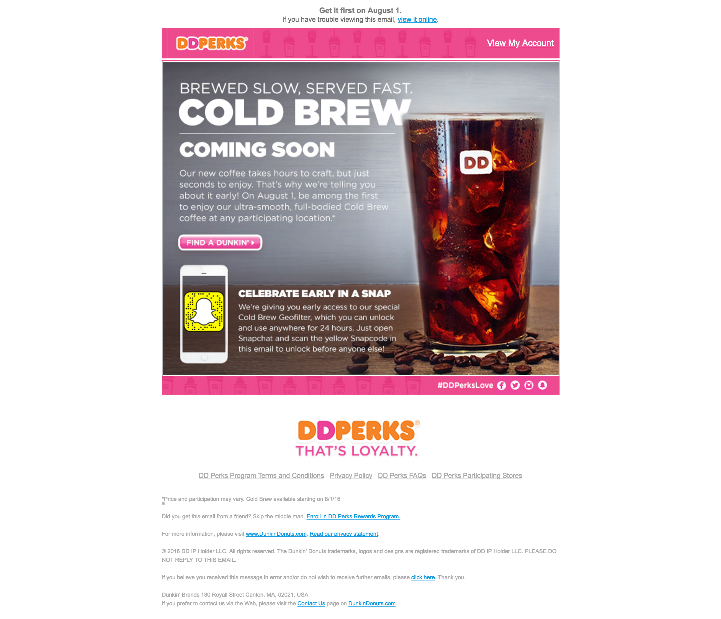
Dunkin Donuts utilized an announcement for a new item as a means of reaching out to its target demographic. This straightforward email directs readers to the location closest to them, highlights the new drink, and includes a secondary call to action to follow them on Snapchat. (While we’re on the subject of Snapchat, have a look at this guide on using Snapchat for business.)
InVision
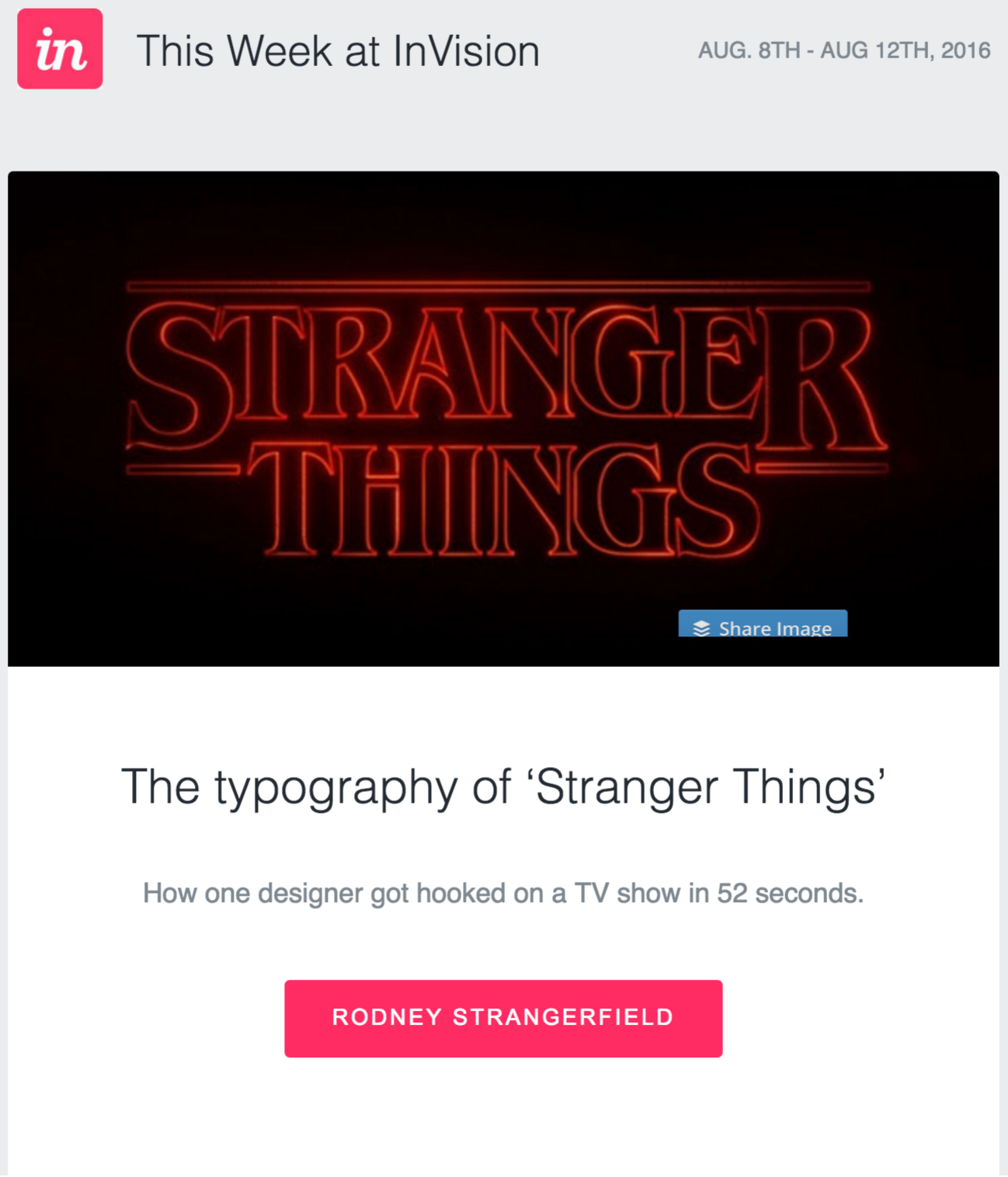
According to HubSpot, newsjacking is “the technique of capitalizing on the popularity of a news item to increase your sales and marketing success.” For example, incorporating a current, hot issue into your marketing may attract a new audience while also engaging with your existing customers and users.
This email from InVision capitalized on the “Stranger Things” craze by emphasizing its typography and connecting it to the design business. They also utilized it as an excuse to educate the receivers of their newsletters via seminars and training sessions.
Sprout Social

Sprout Social offers a new function as a justification for reaching out to potential customers. They educate the audience on this new feature, notify them that their trial period is coming to an end, and give helpful feature descriptions to assist them in making an informed choice.
By providing a taste of your new goods and services, your readers will be motivated to discover more, so be sure to add pertinent links and information that will allow them to continue their investigation.
Typeform
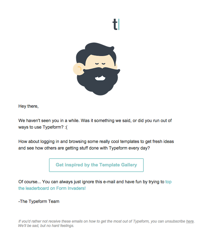
Writing email copy is a challenging task. Therefore, it’s critical to be approachable, helpful, and direct with others.
As a result, Typeform’s email struck the nail on the head in terms of effectiveness. They are not only being approachable and honest, but they are also tactically taking use of their user’s inactive situation to position the outreach. Take a look at the sample below. In addition, the challenge to check out their scoreboard is a great secondary call-to-action that doesn’t ask too much.
Square
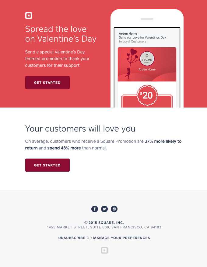
Lead nurturing is the form of holiday marketing that is rather prevalent. Running holiday-themed advertising throughout the year is very beneficial to both B2B and B2C businesses.
When it comes to Valentine’s Day, Square uses the occasion to inspire its beneficiaries to take action with their consumers. They present an accurate and robust statistic when proving value, keeping it brief and to the point.
Duolingo
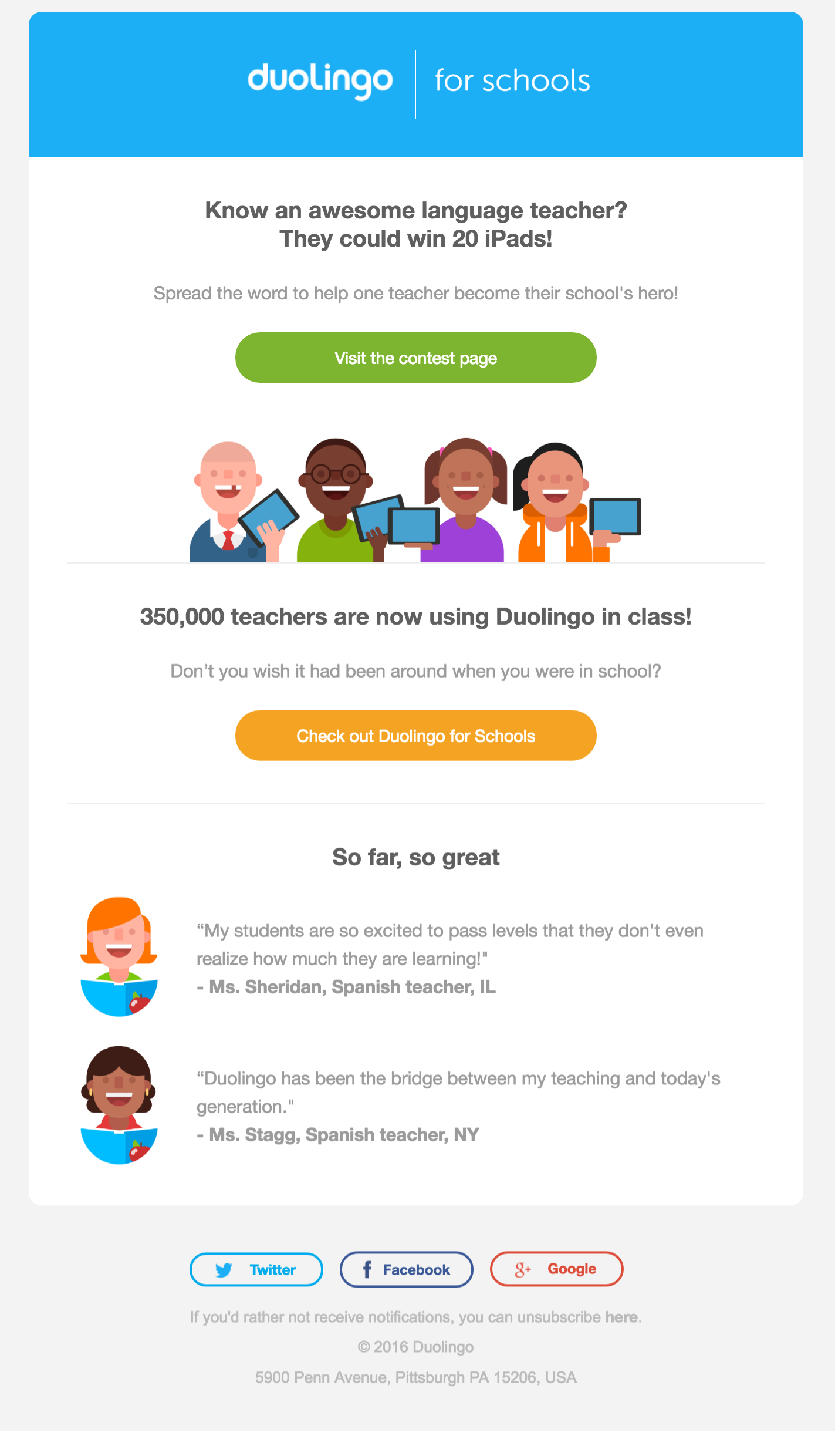
Duolingo capitalizes on its customers’ enthusiasm for learning by allowing them to select a favorite instructor for consideration in a competition. This is a fantastic approach to engage with your audience while also giving them a valuable and entertaining cause to click.
In addition, they make use of two distinct forms of testimonies to support their claims. They encourage the reader to become one of “350,000 instructors,” They provide two quotations from teachers who have used the program—what an excellent use of social proof.
Final Thoughts
Here’s the reality of the situation. First, lead nurturing emails are essential if you want to convert leads and increase open rates. Furthermore, you cannot establish an email marketing lead nurturing campaign without marketing automation, email list segmentation, customization tools, and visually appealing email designs.
